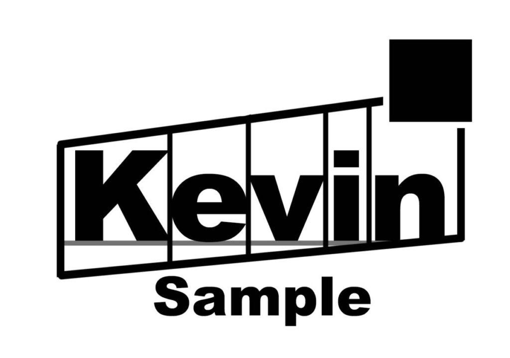
There are different interpretations of designing and how one should approach it. Sometimes art is no only through the colors or materials used, but also from how certain elements are organized. The three articles assigned for this week explain this in further details and what benefits and drawbacks it may have with design.
Some designs explained or given examples within each article reflect what can be done with type in terms of design, one notable thing is how some examples show it constructed is how they are arranged in specific grids or amount of spaces. Some examples in the article show how complex a design may appear in terms of shapes used, but the text itself remains organized. While it is presentable for different language arrangements and quality, it is also seen not to be as a solution when creating designs but instead a part of it. And type itself must be organic to work as part of a design instead of being forced into a design even within a grid like structure.
From my understanding, even if certain type have to arranged to fit languages and cultures of how they are read or whether they are meant to fit a design style with old typography or pseudo-modern type, typography does play an important role within art. Sometimes the structure of the type’s positioning itself is just as important as how the entire piece is made, whether because of how it appeals to certain viewers or if it is legible and makes sense in context to the piece. What some see in typography as organized and natural others may also see as static and forced into a shape.


Leave a Reply