Due: 11:30, Monday, 3/14
Goal: Examine proportions.
Objective: Explore proportion using a grid structure.
Category: proportion
To Do
-
- Proportion
- Icon and Letterform
1. Proportion
layout & composition
-
-
- balance
- proximity: related items are grouped together
- white space, negative space for breathing room
- alignment
- contrast
- hierarchy
- consistence, repeat elements
-
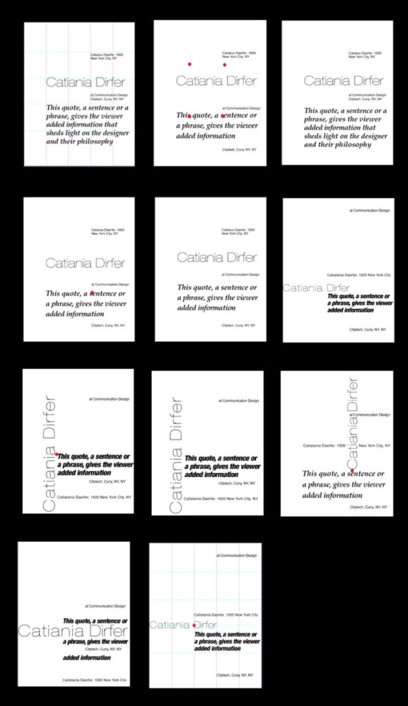
Using the same 5 groupings of text
one quote
designer’s name
designer’s medium/genre (print, web, furniture, etc.)
date/era
location
Process
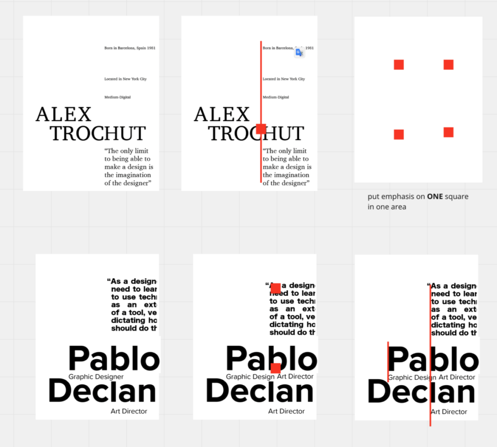
1 Exaggerate hierarchy
• use only 3 levels of hierarchy
2. Position your top hierarchal element in an area that emphasizes proportion
• see example below
3 Group text into several units
4. Position the units so that they align with each other
5 Create 4 different compositions
6. Make a screenshot of each composition
• each composition with the grid
• each composition without the grid
Post on Miro
• you should have a total of 8 (4 with the grid, 4 without the grid)
-
-
- Example
-
Topic
Proportion systems and grids
Goal: Create images that communicate
Objective: Create forms that signify essential qualities
Lecture
Review how we see
see: https://www.linkedin.com/video/live/urn:li:ugcPost:6821094794379501568/
start at 3 minutes – 9.30 minutes
Proportion
-
-
- balance
- similarity
-
watch until 5:40
Review alignment
Proportion systems: design precedents of grid design
https://www.typographicposters.com/
Activity
Workshop: use proportion to position text
grids, proportion, and hierarchy
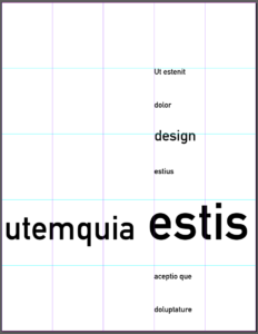
Proportion
1 Use a grid
-
-
-
-
-
-
-
- golden ratio proportion (your 5-column grid) (image below)
- rule of thirds proportion (your 3-column grid)
-
-
-
-
-
-
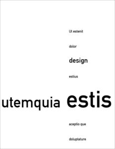
2 Add dummy type to emphasize the grid
You should have a sense of the grid, even when it is not showing
3 Use hierarchy to create a composition based on each proportion system
• use at least 3 levels of hierarchy
• where do you place hierarchy to emphasize the grid?
![]()
Use alignment
Make sure your text is not centered
check that you do not have the same space above and below
Mass your white space
make sure you have a large group of white space
Review & critiques homework
2. Proportion
Revise your 4 compositions
exagerate scale
group like items
align to create structure
create a focal point that is not centered
alignment
Finalize your best or favorite 11 x 17″ composition
1 Present 1 version with and without grid
show a HUGE change of scale at this size
only use 3 different styles and sizes of type
align to the grid, not to the edge of the page
group elements to allow for white space at the top or left side of your composition
2 Make 2 screen shots; with the grid and without the grid
3. Upload to Miro
Remember:
Define your grid on all compositions:
Make the grid structure obvious with the position of your elements.
• To define the grid, one of the edges of the type column MUST touch the grid line. Do not center the text column in the middle of your grid!!!
• Use scale, placement, alignment, typestyle, etc to create order.
• Asymmetrical compositions.
Have you defined your grid?
When you turn off your guides you should be able to see exactly where the grid line is located
• show alignments
• asymmetrical composition
• align to the grid, not the edge
• 5 column grid
• no margins
• black and white — no color
Reference
from class work:
change the emphasis to the quote