Topic: Voice
Goals: Explore typographic voice
Objectives: Give an identity to your composition
Homework
-
- Revise
1. Revise
-
-
- 3 compositions total
Revise your two compositions and create a third - Consider the comments made during the critique.
Revise all both compositions to improve your layouts - Use the typeface that your designer uses.
- 3 compositions total
-
Review
Work in this order:
-
-
-
-
- choose a focal point based on proportion
Position your top hierarchal element in that area to emphasizes proportion
• see example below - group text into several units
Position the units to align with the main element and with each other - use only 3 levels of hierarchy
Exaggerate hierarchy -
Post both on one frame in Miro
- choose a focal point based on proportion
-
-
-
Criteria:
-
-
-
-
- Make your proportion system clear
- Make sure nothing, text or white space, is centered
check that you do not have the same space above and below - Asymmetrical compositions
- Make the grid structure obvious with the position of your elements
- To define the grid, the edges of the type column, not the text box, must touch the grid line
- Mass your white space
make sure you have a large group of white space - Keep your white space towards the top or the left side of the page
- Your poster must be purely typographic:
No colors, shapes, and lines - Asymmetrical composition
Align text to the grid, not the edge of the page
5 column grid, no margins - A viewer should be able to easily understand your text
-
-
-
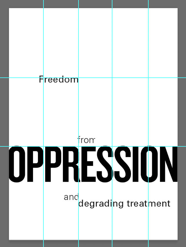
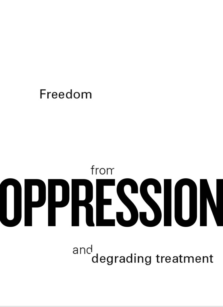
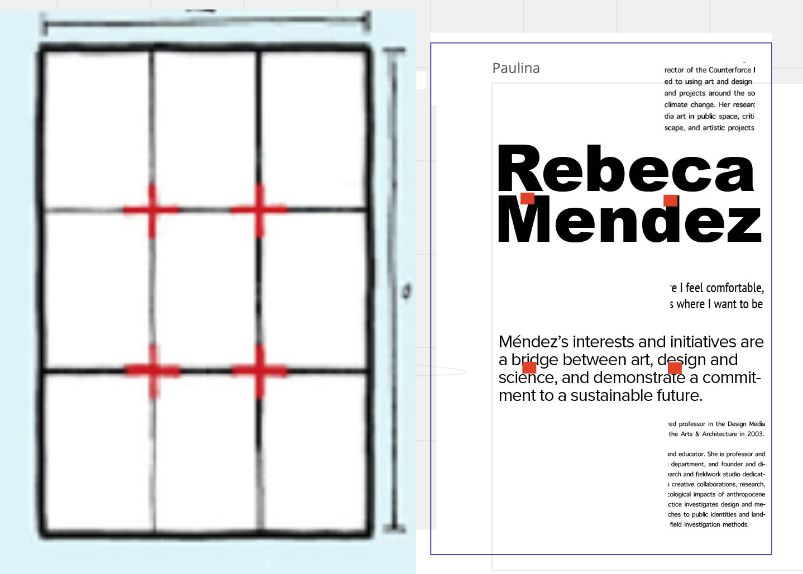
Example for placement:
proportion: golden ratio vs rule of thirds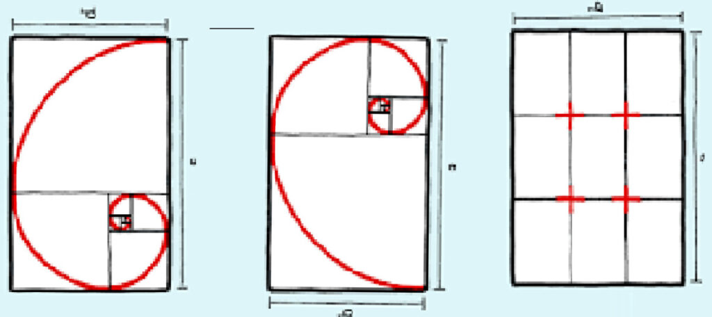
below: placement for emphasis 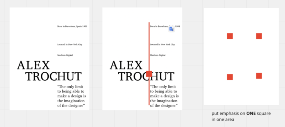
examples
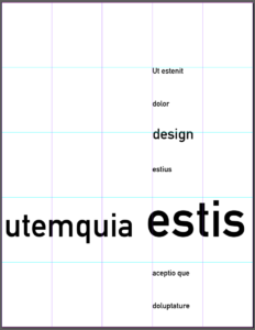
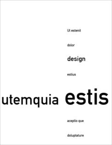
Miro:


