Topic: Proportion
Goals: Explore composition using proportion
Objectives: Create a dynamic composition using proportion
Homework
-
- Watch
- Proportion
- Recreate your designers typography
1 Watch
Watch the first 6 minutes. Mandatory: Take notes to share with the class.
2. Proportion
Create 2 compositions using proportion
Limit your text:
-
-
-
-
- designer’s name
- year of birth
- location (country, city?)
- medium (graphic design, maps, books, branding?)
- approximately 10 word quote
or
approximately 10 word description
-
-
-
Work in this order:
-
-
-
-
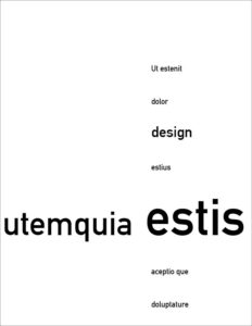
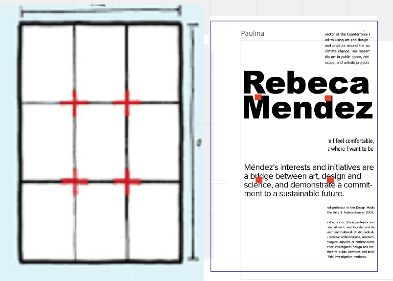
- choose a focal point based on proportion
Position your top hierarchal element in that area to emphasizes proportion
• see example below - group text into several units
Position the units to align with the main element and with each other - use only 3 levels of hierarchy
Exaggerate hierarchy -
Print and bring to class
- choose a focal point based on proportion
-
-
-
In each composition
A Vary proportion
B Vary hierarchy
*****Copy the bulleted points between between the 2 blue dotted lines below
Print the criteria
Compare each point below to your compositions
Revise your compositions so that you have fulfilled all the criteria
With pen or pencil, place a check for each bullet point that you have completed
•••••••••••••••••••••••••••••••••••••••••••••••••••••••••••••••••••••••••••••
Criteria:
-
-
-
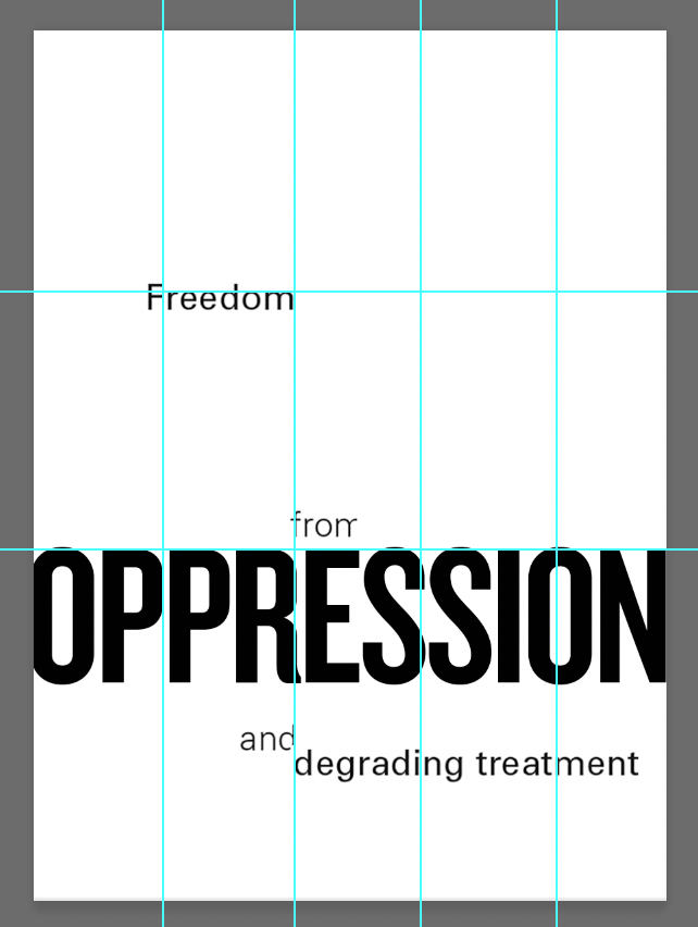
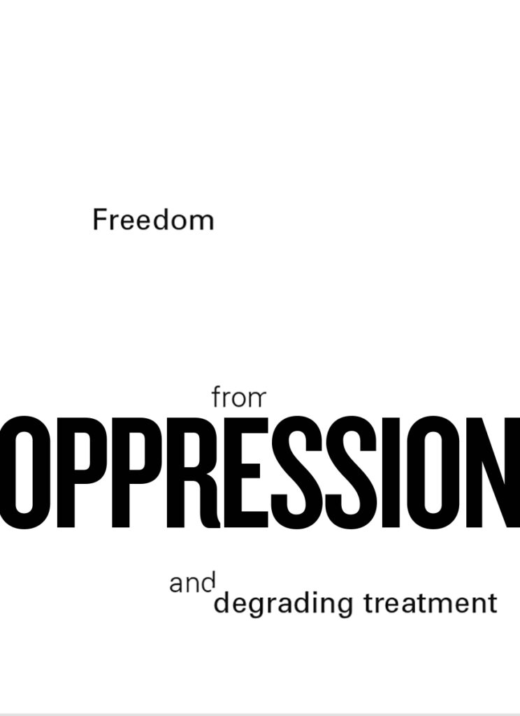
- Make your proportion system clear
- Make sure nothing, text or white space, is centered
check that you do not have the same space above and below - Asymmetrical compositions
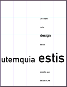
- Make the grid structure obvious with the position of your elements
- To define the grid, the edges of the type column, not the text box, must touch the grid line
- Mass your white space
make sure you have a large group of white space - Keep your white space towards the top or the left side of the page
- Your poster must be purely typographic:
No colors, shapes, and lines - Asymmetrical composition
Align text to the grid, not the edge of the page
5 column grid, no margins - A viewer should be able to easily understand your text
- Black and white — no color
-
-
•••••••••••••••••••••••••••••••••••••••••••••••••••••••••••••••••••••••••••••
Examples
proportion: golden ratio vs rule of thirds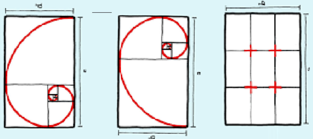
below: placement for emphasis 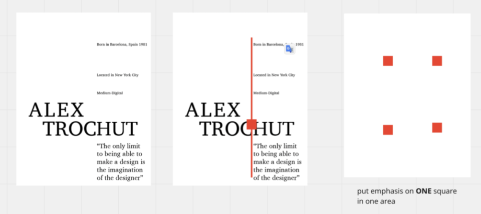 exam
exam
examples
class demonstration on Miro
2. Typographic reference
Investigate your designer’s typeface
-
- Look at your designer’s work
What typeface do they use most often? - Choose one example of the work that includes that typeface.
- Take a photo or screenshot of it.
- Use one of the resources below to investigate the name of the typeface
Choose a few if you are not sure - Take a screenshot of the typeface and its name
- In one frame in Miro:
Post your example of your designer’s typeface
Post your screenshots of the typefaces that match
- Look at your designer’s work
Resources
choose a typeface: http://www.identifont.com/
https://www.fontsquirrel.com/matcherator
https://www.fontspring.com/matcherator
https://www.myfonts.com/pages/whatthefont
multiple sites:https://dezmi.com/design-resources/font-finder/
Miro:

