Class Info:
This agenda provides a detailed outline to give a clear vision of the day’s class.
Category: Influence
To-Do: before class
Prepare to describe your work in terms of graphic shape
Topic
Topic: Design Influence
Goals: Experience the varied universe of design
Objectives: Explore and expand on influences
Prepare to describe your work in terms of graphic shape
Critique
review final icon designs
Lecture
due on Thursday 3/8
Who are your influences?
https://openlab.citytech.cuny.edu/comd1200d052-f2022childers/2022/03/16/design-influence-resources/
You might start here:
https://designarchives.aiga.org/#/entries/%2Bcollections%3A%22Just%20Type%20Two%22/_/grid/relevance/asc/0/48/90
https://www.peoplesgdarchive.org/
Revise your choices of influencer
Who are your influences?
• Revise your influencer based on today’s discussion
• Choose 3 design influencers that interest you
• Look to designers that have created varied solutions and systems––that work with typography.
• Avoid designers that focus on one thing, like only book covers, illustration or photography.
-
-
- Create a separate page for each influencer
- Add basic information about your designer
-
-
-
-
-
-
- name
- dates
- location
- medium
- quote
-
-
-
-
4 Choose 3-4 images of your designers work
5. Upload to Miro to discuss on Monday, 3/6
Resources:

Activity
Workshop: align type to the grid
What is alignment?
Proportion systems: design precedents of grid design
Open new InDesign doc
8.5×11″
NO MARGINS
NO facing pages
NO automatic text box
5 columns
NO GUTTERS
InDesign
Layout > create Guides
5 columns
NO gutter
5 rows
NO gutter
Use your text tool to create a new text box
Dummy text will fill your box
Select all
Font: Helvetica
size: 10
lead: 12
Align your text in the grid
Copy your text box
Alter your font, size and lead
Align your text in another grid positions
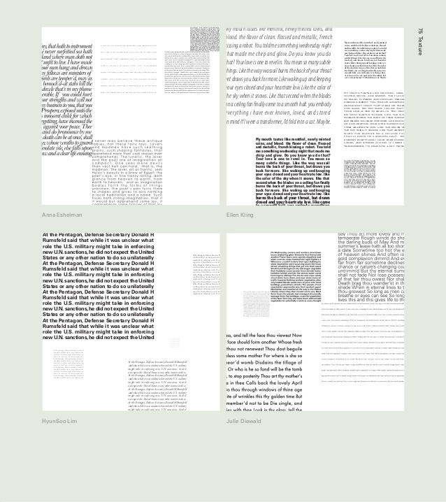
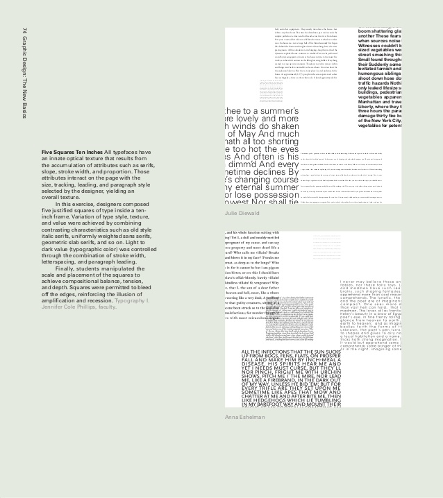
Create “alignments” by using 5 text boxes


Activity: class 2
Alignment Workshop: align dummy type to the grid
grids, proportion, and hierarchy
Align to the grid
Proportion
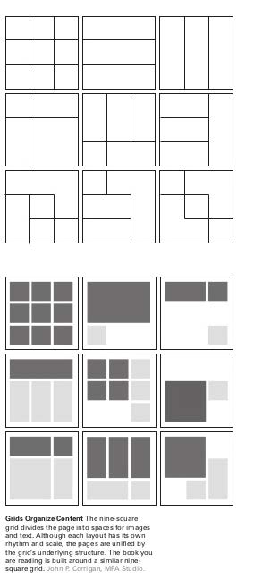
1 Use a grid, 5- or 3-column
-
-
-
-
-
- golden ratio proportion (your 5-column grid) (image below)
- rule of thirds proportion (your 3-column grid)
-
-
-
-
2 Add dummy type to emphasize the grid
we should have a sense of the grid, even when it is not showing
3 Use hierarchy to create a composition based on each proportion system • use at least 3 levels of hierarchy
• where do you place hierarchy to emphasize the grid?

Use alignment
Make sure your text is not centered
check that you do not have the same space above and below
Mass your white space
make sure you have a large group of white space
Review & critiques homework
Next week:
Preparation for hierarchy
How we see:
How we see: visual attention science. start at 2:50 – 9:30
https://www.linkedin.com/video/live/urn:li:ugcPost:6821094794379501568/
start at 3 minutes – 9.30 minutes
Homework
Icon
Influence


