Kevin Kateram
COMD1100 Desiree Alvarez (Images all the way down below)
12/15/20
Project #9
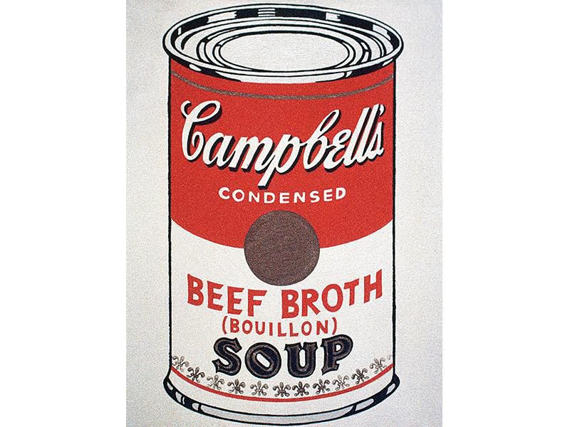
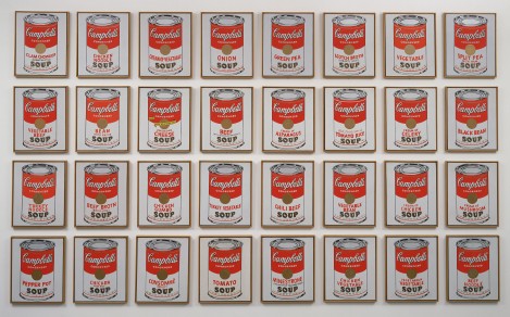
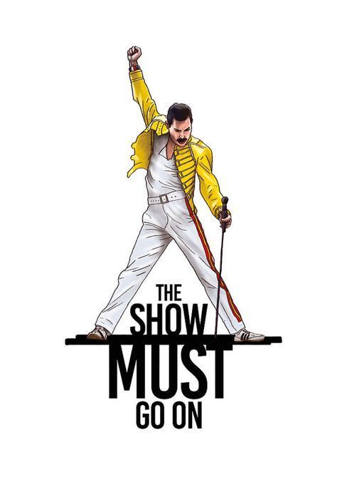
The art movement I chose is the Pop Art Movement. The pop art movement is a movement that started around the mid to late 1950’s which came up in the United States and the United Kingdom as well. The movement was meant to be a counter to many traditions of fine art because it mainly included imagery from popular and mass cultures such as comic books, advertising and mass produced objects. Pop art was used as subject matter and was often physically incorporated into work. Pop art is the style of art based on simple yet bold images of everyday items such as soup cans, comic strips, road signs, and hamburgers. Pop artists created pictures of consumer product labels and packaging, photos of celebrities, and even animals. By creating sculptures and paintings of mass culture objects and media stars, the pop art movement aimed to blur the boundaries between “high” and “low” art culture. The concept that there is no hierarchy of culture and that art may be borrowed from any source has been one of the most influential characteristics of pop art. The pop art movement was important because it represented a shift in what artists considered to be important source material. It was a movement which sought to connect fine art with the masses and involved using imagery that ordinary people could recognize and relate. Pop art is essentially a type of art that provides commentary on world events and consumerist culture. While it can be argued that the pop culture movement did not progress past the 1970’s, there are elements of pop art that are still present in today’s contemporary art. In 1957, Richard Hamilton described the style of pop art as transient, expendable, low-cost, mass produced, young, witty, sexy, gimmicky, glamorous, and big business. Commonly associated with artists such as Andy Warhol, Roy Lichtenstein and Jasper Jones, pop art draws its inspiration from popular and commercial culture such as advertising, pop music, movies and the media. The work of British hyperrealist Mike Francis is heavily influenced by the Pop Art movement. The father of Pop art is Richard Hamilton 1973. Pop art started with the New York artists Andy Warhol, Roy Lichtenstein, James Rosenquist, and Claes Oldenburg, all of whom drew on popular imagery and were actually part of an international phenomenon. Following the popularity of the Abstract Expressionists, Pop’s reintroduction of identifiable imagery (drawn from mass media and popular culture) was a major shift for the direction of modernism. The subject matter became far from traditional “high art” themes of morality, mythology, and classic history; rather, Pop artists celebrated commonplace objects and people of everyday life, in this way seeking to elevate popular culture to the level of fine art. Perhaps owing to the incorporation of commercial images, Pop art has become one of the most recognizable styles of modern art. Pop artists seemingly embraced the post-World War II manufacturing and media boom. Some critics have cited the Pop art choice of imagery as an enthusiastic endorsement of the capitalist market and the goods it circulated, while others have noted an element of cultural critique in the Pop artists’ elevation of the everyday to high art: tying the commodity status of the goods represented to the status of the art object itself, emphasizing art’s place as, at base, a commodity. The artwork I chose to pair with the Pop art Movement is Andy Warhol’s Famous Campbell’s soup can which is displayed below. Andy Warhol famously appropriated familiar images from consumer culture and mass media, among them celebrity and news photographs, comic strips, and, in this work, the widely consumed canned soup made by the Campbell’s Soup Company. When he first exhibited Campbell’s Soup Cans in 1962, the canvases were displayed together on shelves, like products in a grocery aisle. At the time, Campbell’s sold 32 soup varieties; each one of Warhol’s 32 canvases corresponds to a different flavor. Though Campbell’s Soup Cans resemble the mass-produced, printed advertisements by which Warhol was inspired, its canvases are hand-painted, and the fleur de lys pattern ringing each can’s bottom edge is hand-stamped. Warhol mimicked the repetition and uniformity of advertising by carefully reproducing the same image across each individual canvas. He varied only the label on the front of each can, distinguishing them by their variety. Warhol said of Campbell’s soup, “I used to drink it. I used to have the same lunch every day, for 20 years, I guess, the same thing over and over again.” Towards the end of 1962, shortly after he completed Campbell’s Soup Cans, Warhol turned to the photo-silkscreen process. A printmaking technique originally invented for commercial use, it would become his signature medium and link his art making methods more closely to those of advertisements. “I don’t think art should be only for the select few,” he claimed, “I think it should be for the mass of the American people.” An Illustration I chose to Pair with the artwork was an art piece not painted but more like an illustration online, is Freddie Mercury’s “The show must go on” as displayed below. This ties into the artwork of Campbell’s soup as it was created by the masses. Freddie was a rockstar and adored by his fans, as is every rockstar. The art style of this specific illustration displays Pop art style because just like how campbells soup was an object seen as an everyday thing to andy warhol as he drank it everyday, Freddie Mercury’s design is also pop style as it was made by the mass culture and by the people who has seen him as am everyday star. The Campbell’s Soup can and Illustration of Freddie Mercury both employed the use of color very widely and in a variety. The Concept of how he got the exact shade on the soup can almost to unintentionally give a certain aesthetic to our eyes because we almost see everything on tv and in paintings as HD and very crisp and clear with bright and poppy colors and to see this composition of color and the shades of red almost immediately gives you an old 60’s -80’s kind of vibe. As stated in the description of his pop art of the Campbell’s soup he tried to give it the cans realistic texture which I think he really did a good job on because looking at it looks like a really achromatic feel. The best thing I think of the art piece other than the Subtle muted red is the kinda contrasting gold color for the stamp in the middle. And as for Freddie Mercury’s design in this illustration below I think the Bold text really contrast well with the bright white space behind him, especially in black and it complements really well with the yellow jacket he has on as it really stands out in the whole image as the main thing, also with the stripes on his pants as those are bright colors as well but not seen as a main hierarchy, but I also really like the little details they added for the belt especially the shading, as im for one not every good with shading and shadows that it very pleasing to look at.
IMAGES


Leave a Reply