From the brilliant blog, I Love Typography:
The first Modern typeface is attributed to Frenchman Firmin Didot, and first graced the printed page in 1784. His types were soon followed by the archetypal Didone from Bodoni. The Italian type designer, punchcutter and printer Giambattista Bodoni (what a great name! [1740-1813]) drew his influence from the Romains du Roi (with its flat, unbracketed serifs) and the types of John Baskerville (high contrast), for whom he showed great admiration.
Characteristics
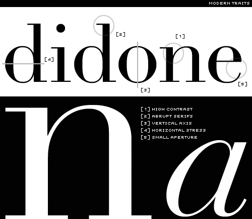
- High and abrupt contrast between thick and thin strokes;
- Abrupt (unbracketed) hairline (thin) serifs
- Vertical axis
- Horizontal stress
- Small aperture
The romans of the Modern types owe very little, if anything to the earlier calligraphic forms; they are too precise, too sharp, too clean. Whereas the Old Style types are Neoclassical, the Didones are Romantic. Though both forms share a common vertical (rationalist) axis, the Moderns have even greater contrast.
What are they good for?
There’s something rather clinical about the Moderns, especially in the roman capitals. Their vertical axis coupled with strong horizontal stress furnishes them with the stiffness of toy soldiers on parade. They are elegant, and like all things elegant, look unhurried, calm, and in control. They’re generally not suited to setting extended text, as the verticality of the letter forms interferes with the text’s horizontal rhythm. The letters don’t lead our eyes across the page, but rather up and down. Unsurprisingly, Bringhurst brings some clarity to the subject when he writes,
Romantic letters can be extraordinarily beautiful, but they lack the flowing and steady rhythm of the Renaissance forms. It is that rhythm which invites the reader to enter the text and read. The statuesque forms of Romantic letters invite the reader to stand outside and look at the letters instead.²
The Moderns need lots of space (white space and inter-line space), so give them extra leading and generous margins; and if you pair a Modern with another face, then make sure it’s not a fussy one, or your page will look like a circus poster designed by a visually impaired dog.


