1 thought on “Type Poster Digital 2_Christopher_Rodriguez”
Leave a Reply
You must be logged in to post a comment.

You must be logged in to post a comment.
Our goal is to make the OpenLab accessible for all users.
Our goal is to make the OpenLab accessible for all users.
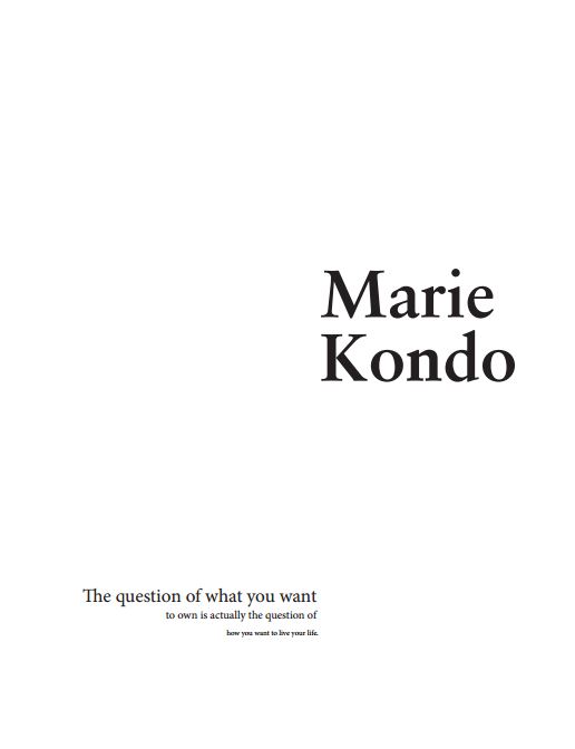
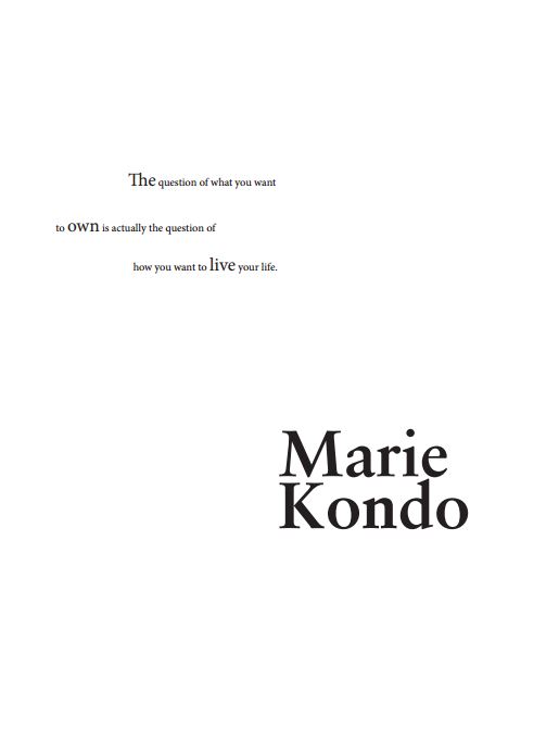

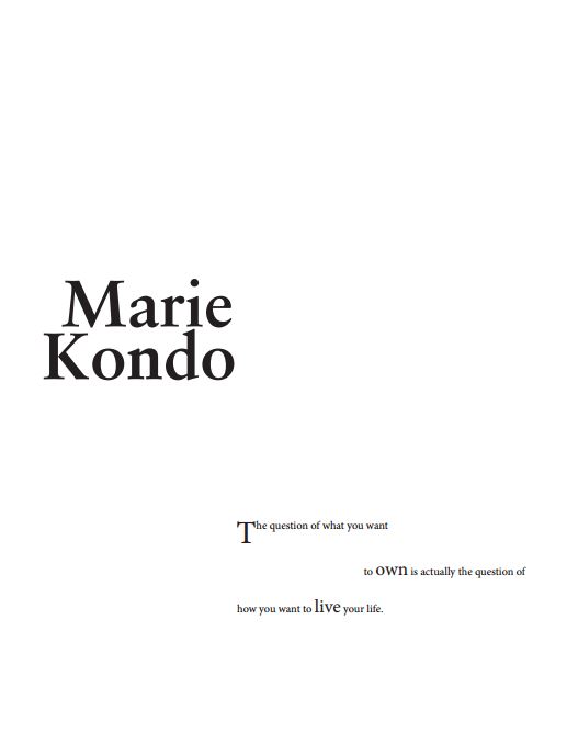
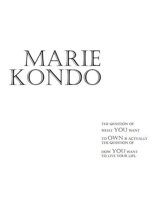
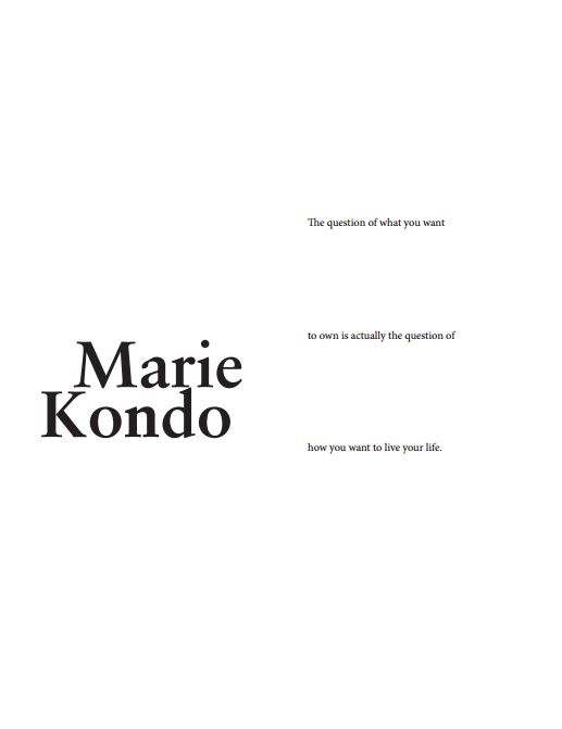
Multiple levels of hierarchy are visible throughout your designs along with vertical alignment. Where design 3 is concerned, I think that your quote could have been aligned toward the center and not toward the edge of the page on the left. Good work!