Due: 11:30, Wednesday, November 3
Objective: Create meaning with emphasis
Goal: Examine contrast
category: type poster contrast
To Do
-
- design
- comment
- research
1. design: contrast
What do you want to communicate?
Create 6 typographic compositions in InDesign
-
-
-
- Choose a typeface that visually explains the quote
• Only use type, not shapes or images
• Limit type to a maximum of 2 different typefaces - Break your quote into phrases to emphasize its meaning
-
- Text: • one quote • designer’s name • designer’s medium/genre (print, web, furniture, etc.) • year
- maintain your alignments
-
- Create more contrast with your typography
- Create 3-4 levels of hierarchy.
- Save as jpg and upload to OpenLab
category: type poster contrast
- Choose a typeface that visually explains the quote
-
-
-
- remember
Don’t be a slave to the document.
For example, the name does not have to be at the top of the poster.
Instead of making one big text box, break up the content and move it around the page.
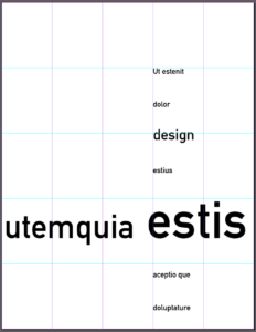
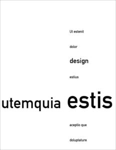
Hierarchy 101: Work with a basic chunk of information and explore numerous simple variations, using just one or two type families. The parts of a typographic hierarchy can be signaled with one or more cues: line break, type style, type size, rules, and so on.
process
-
-
-
- grid
- asymmetry
- alignment
- hierarchy
-
-
example


2 comment: on two different posters
suggestions:
-
-
- What is communicated?
- Do the elements “relate” to one another?
-
3 research: investigate designers of the Pushpin group
suggestion:
-
- Choose 2 printed images that interest you
- Who designed it?
- Post the images and the name of the designer on Discord
https://discord.com/channels/880113791373820014/880113791373820022


