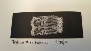
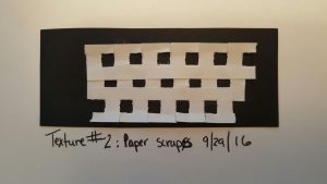
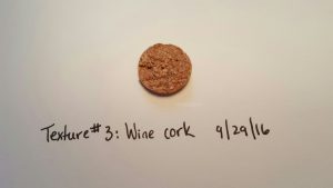
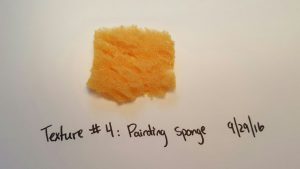
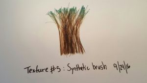
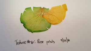
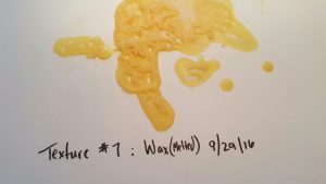
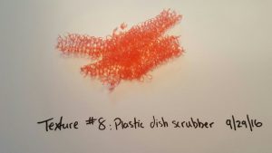
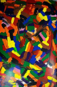
7 out of 8 images represent texture clearly. Texture number 2 reminds me more of a pattern. The edges show some texture, but not as strong as the other examples.
Author Archives: Sarah Serrano
Crayons
Craftsmanship
Craftsmanship is one of the most important attributes I look for when purchasing a product/art work or when designing/creating for a potential customer or for myself. Craftsmanship shows that you’ve taken the time and effort to passionately create a composition or other work of art. Speaking from experience, poor craftsmanship equates to lack of patience, laziness, and not fully caring for the project/composition.
Meet Danish artist John Kenn Mortensen
John created monsters that are connected to our childhood fears. Though they look like quick sketches, further examination shows that he carefully creates detailed patterns in the monsters and background creating a unified composition. This is craftsmanship.
Art vs Design
Art vs Design
Formal Definition: Art is something that is created with imagination and skill and that is beautiful or that expresses important ideas or feelings
Informal Definition: Art is work based on emotion. It can require imagination.
Visual Examples
Coraline: Mother
Formal Definition: Design is to plan and make decisions about (something that is being built or created) : to create the plans, drawings, etc., that show how (something) will be made
Informal Definition: Design is creating work to invoke a message through images or texts.
Visual Examples
Inspired by a designer
Meet Ninoshka Mason! The reason why I enjoyed this portfolio so much was her use of colors and her choices on designing the shape of the bodies. She was able to make the characters look more life like, playful, and something that could be associated with a brand like tokidoki.
======================================================
BONUS! Check a dandypunk (An established designer)
I love the way he connects a haunting fantastical realm to the real world. Most of the backgrounds have a dark shade of color. The subject of the piece is brighter in contrast or is colorful. I made a connection between this designer to the writer Neil Gaiman and Illustrator Dave Mckean.
Music Notes and Figure Ground
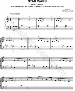
Figure Ground and music notes can be compared to each other. The spaces represent the negative space (ground) and the music notes represent the positive space (Figure).
(See example of sheet music below)
Viewing design with a new set of eyes
After reading Erica Schwiegershausen’s article, Rediscovering Great Female Furniture Designers, I decided to reflect and make connections to my own personal experiences. Below you will find three points that resonated with me after reading the article.
ϟ Rachel Comey and Leanne Shapton came together to fill the missing gap between women and furniture design when they were unable to locate original designs by women. This article resonated with me in terms of being a woman and a Latina who has experienced being in the minority group. I’m currently in the process of creating opportunities for women in every platform.
ϟ Shapton says, “It’s fun to educate yourself, especially on design, because it’s like this whole other literacy.” I’m currently enrolled in Graphic Design I, and after day two I’m already beginning to view design with a more observant eye. Viewing points, lines, planes, and how they can be moved and manipulated in a set space.
ϟ “Shapton made over 100 sketches — a combination of little paintings on top of postcards of 16th and 17th century furniture.” I connected this with our class discussion on thumbnails and creating 60 of them for points, lines, and planes. I reflected on how I could expand one of these thumbnails into a larger project, and how future projects can benefit me from sketching thumbnails first.
Explore and stay connected with Leanne Shapton and Rachel Comey.
Vivir
1. Write out your design goal, why are you taking the class?
Sheba: I’m taking this class in hopes of viewing the world differently. Understanding and seeing my artwork differently.
2. What type of work inspires you? what else inspires you?
Sheba: I’m inspired by emotions, nature, animation, words, cultures, comics, food, and travel. Some of my favorites include: Neil Gaiman, Dave mckean, Jim Henson, Clive Barker, Ralph Serrano, and more.
3. What is your preferred design process – how do you like to work? (i.e. coding, on the computer, with a marker, pencil, in small notebooks, murals, collages, planned out, spontaneous, etc.)
Sheba: I work with acrylics, spray paint, pens, sharpies, water color markers, Indian Ink, and collage materials. I prefer working alone, and tend to do so during the witching hour or somewhere in nature. I recently had the opportunity to travel with other artists to create murals in two towns in Puerto Rico.
4. What types of projects would you be interested in collaborating on?
Sheba: I would like to collaborate on mixed media projects, and animation projects down the line.
