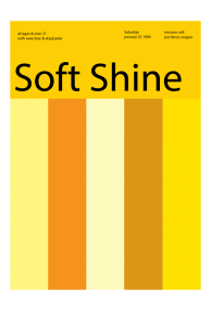
This poster was created using Illustrator. I was familiar using illustrator so I had a sense of what I was doing even If was a little rusty. I only used this program once or twice when I was studying to major in architecture so It was a bit of challenge. After a while I got use to it.
The OpenLab at City Tech:A place to learn, work, and share
Support
Help | Contact Us | Privacy Policy | Terms of Use | CreditsAccessibility
Our goal is to make the OpenLab accessible for all users.
top


I think you did a really nice job with choosing the colors for this piece. I believe that you should have used a different font for the letters because it doesn’t really comply with the swiss poster style lettering. Possibly you could have used a different color for the font at well, maybe if it were white it would feel lighter.