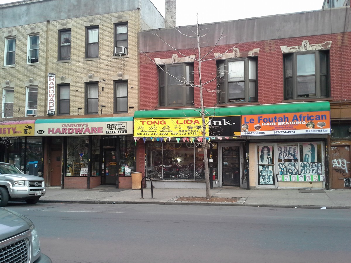
- This Bicycle shop sign is an example of poor letter spacing. The name of the shop, Tong Lida, is spaced so far apart that it feels disjointed. This is made more clear as the other text on the sign isn’t spaced very far apart. This juxtaposition of the text only makes the Name of the shop look worse.

2. This Oscar insurance ad is an example of good letter spacing. The text, “The doctor will see you now,” is evenly kerned together to make the text stand out. This makes the advertisement flow as your eye is drawn to read the text and then look at the picture followed by the name of the company and info on the bottom. The letter spacing makes this ad more effective in catching your attention.

