
Society of Illustrators Exhibit
Every year The Museum of American Illustration at the Society of Illustrators located on 128 East 63rd Street in downtown, Manhattan, presents the third of the three-part Annual Exhibition: Illustrators 54, where worldwide art word is featured by leading contemporary illustrators. The artwork is judge and the best design is honor by the Society of Illustrators with gold, silver and bronze medals. The exhibit includes work for advertisements appearing in newspapers, magazines, television, brochures, packaging among others. Some artwork in the exhibit was made for very well-known clients and companies. During my visit to the gallery, I enjoyed seeing every design and some of them really captured my attention by their effective use of imagery and typography. There were three pieces that I found very interesting, creative and inspiring for my future steps in the world of design and illustration.
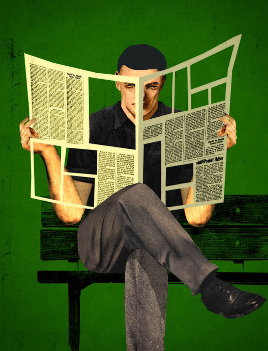 The first piece is from Brian Stauffer, a very known illustrator for his conceptual take on social issues. This illustration titled “No Ads, No News” is a mixed media work designed for client Mizzou Alumni Association. This association primary mission is to keep alumni connected to the university mainly through social media. Stauffer’s piece shows the image of a man sitting down in a bench crossing his legs out and holding a big cutout newspaper. The man is reading the newspaper which has fifty percent of the entire page cut out. The cut rectangles in the newspaper are very visible because of the contrast between the background color (green) and the yellowish color of the newspaper. The message of this illustration is to show how advertisement plays an important role in our daily lives; not only digitally meaning in electronic devices, but in printed material such as a newspaper. As we know, a newspaper delivers a lot of written information in its pages, that the font size is small because newspapers try to avoid the waste of blank spaces. However, Brian’s point is to show how advertisement is taking place not only on TV, the internet, fashion magazines, etc, but in newspapers. I think this illustration is quite effective in its message and found it creative by the way it looks kind of cartoonist.
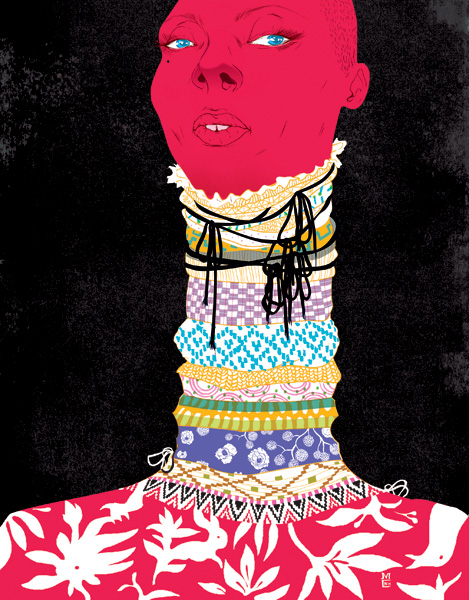 Another piece I found very interesting was Marcos Chin’s “Textile,” Society of Illustrators gold medal winner. This gold medal winner piece was designed for client Stephanie Pesakoff. The piece consists of a red, sharp face with blue eyes and a mole near the left eye. It has a black background which makes the image of the face stands out more. The face is attached to a very long neck decorated with different types and colors of fabrics. The expression of the face transmits authority, arrogance and power. The fact that the face is way up high and the direction of the look is kind of going to the right makes me think of self-importance. I don’t really know what is the meaning of the picture but that is what I got from it. At the top of the neck there is a black thread tied around the neck. There are at least twelve designs of fabrics decorating her neck and the part of her shoulders is decorated with a red top with some white flowers and bird shapes. I like this image because it looks powerful and provocative.
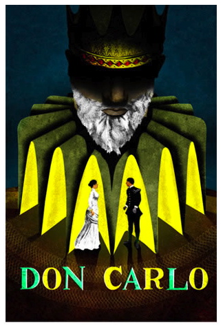 Last but not least, Brian Stauffer’s “Don Carlo.” A poster designed for the Vancouver Opera. This poster displays the illustrations of the three main characters in the play. A big, centered, dark head that represents Philippe II, the King of Spain and the father of Don Carlo. The head is big compared to all the other elements in the poster. It has a yellow crown that cannot be seen very well because of the darkness of the shadow above the head. Philippe’s head is placed on a very organic shape, which represents those old-fashion necks that were worn during that times. In the center, just beneath Philippe’s head, inside the old-fashion neck there are two small persons, to the left is Elisabeth de Valois, a French princess and next to her Don Carlo the son and heir to the King (Philippe). Elisabeth and Don Carlo fell in love, however for Carlo’s disgrace as part of the peace treaty between France and Spain, Elisabeth’s father has given her not to Carlo but to his father, Philippe. I think this poster truly demonstrates the whole idea of the play, which is the conflict between the King and his son over the love of a woman. The illustrations of the three characters are very well done and the colors used are mostly neutral, except for the bright yellow in the old-fashion neck, which makes the two characters (Elisabeth and Don Carlo) to stand out. The title of the play which is “Don Carlo” is on uppercase, serif typeface, with two colors, an aqua green and yellow.

