Visual Quotation
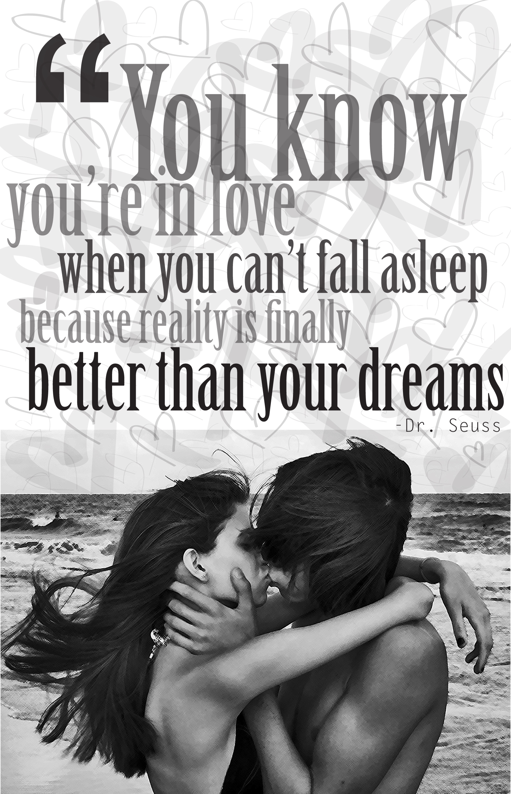
In my Graphic Communication Workshop class I was asked to choose a quotation that I feel interested about and create three designs that would enhance its meaning. The quote I chose is by cartoonist Dr. Seuss, “You Know You Are In Love When You Can’t Fall Asleep Because Reality Is Finally Better Than Your Dreams” I think this quote is beautiful and true for some people. Below are six concepts I developed to visually convey the quote.
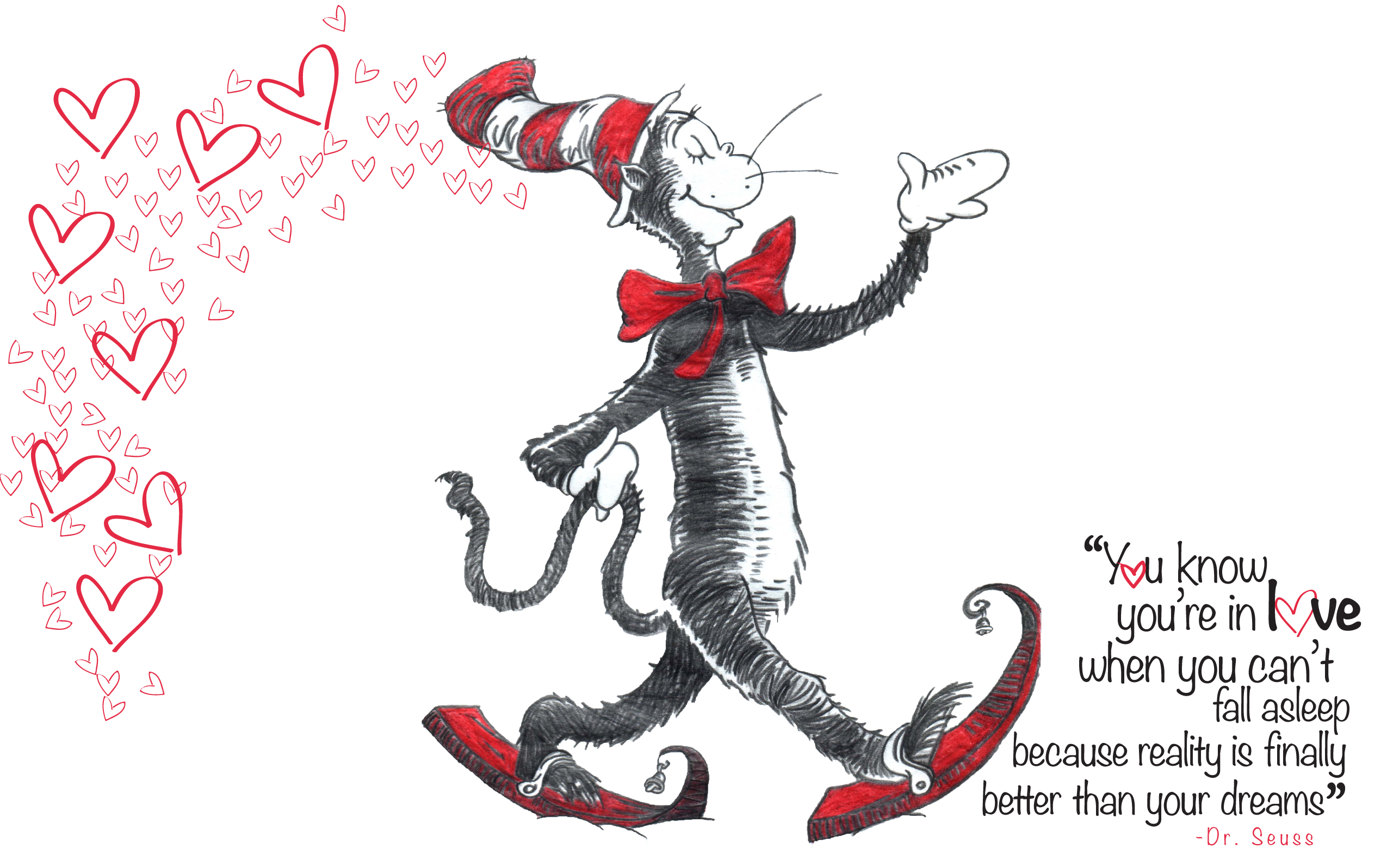
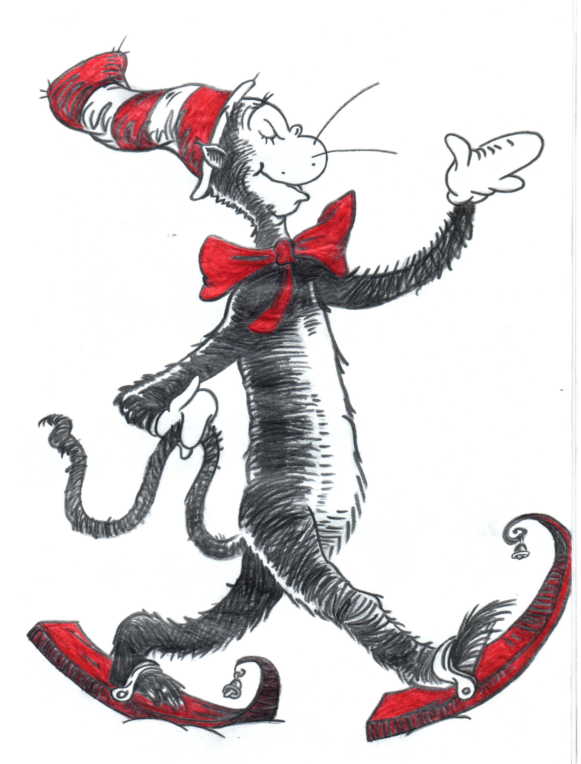
The first concept I came up with was using one of the most known characters in Dr. Seuss books, “The cat in the hat.” I used an illustration of the cat in the hat and draw many red heart outlines and placed them behind the cat as to simulate the cat is leaving love in the air as he is moving. The illustration shows a very happy cat so it really conveys the idea of being in love and spill love all over the place. I placed the quotation at the bottom right corner. For the typeface I used Noteworthy in black color and as for the O’s in the words “You” and “Love” I replaced them with a red heart outline. The quote has a loose alignment because some lines have different font size than others and also to give it a more playful touch.
Illustration: http://fc02.deviantart.net/fs8/i/2005/274/8/f/Cat_in_the_Hat_by_draygyn.jpg
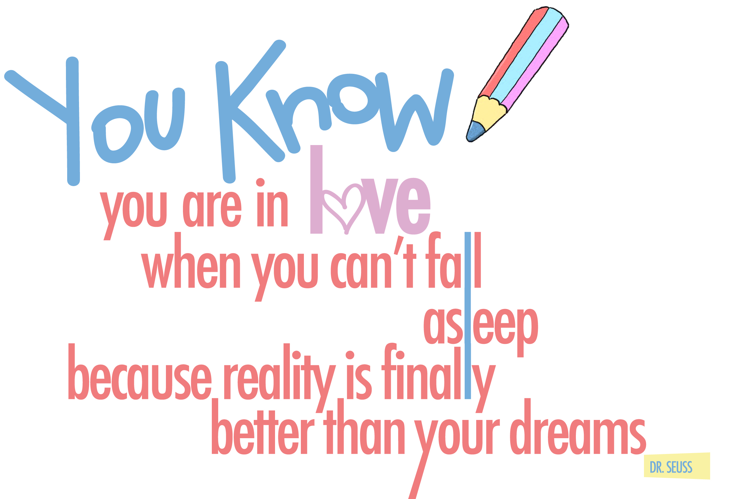
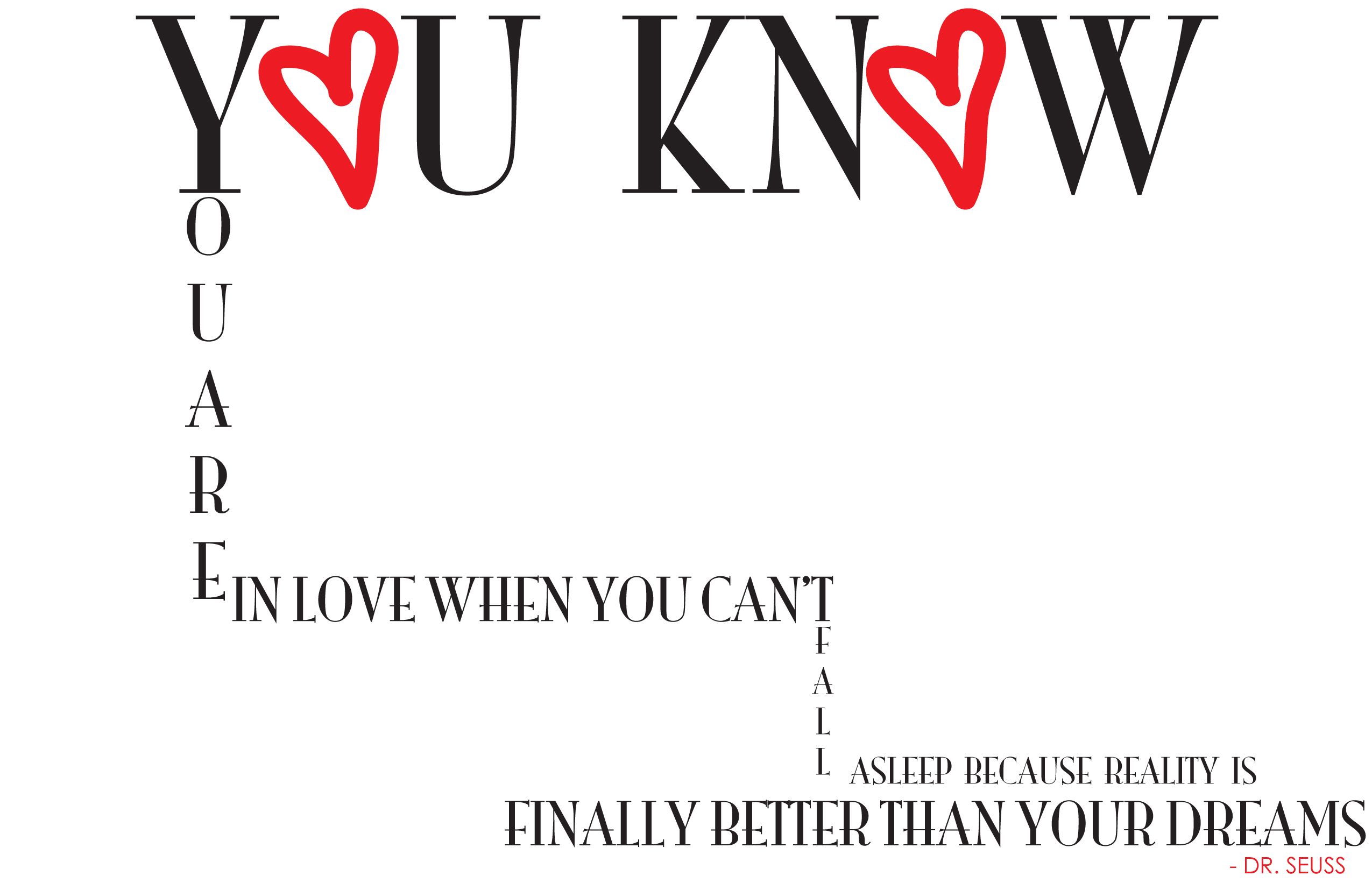
In the second concept I went more into a typographical visual image. The font size is large and occupy most of the card. I used a small illustration of a color pencil to give it that touch of Dr. Seuss style and also to simulate that the color pencil wrote the quotation. The first two words, “You Know” I traced them myself and the rest is in Futura typeface. Same as in the first concept, I replaced the O in the word love with a bold heart outline. Moreover, I connected the three L’s in the words, “Fall, Asleep and Finally” vertically to kind of bring together the meaning of those words with the whole quote. The descender of the letter Y in the last sentence is bleeding off the page. I used four different colors in this concept, the same colors that the color pencil has.
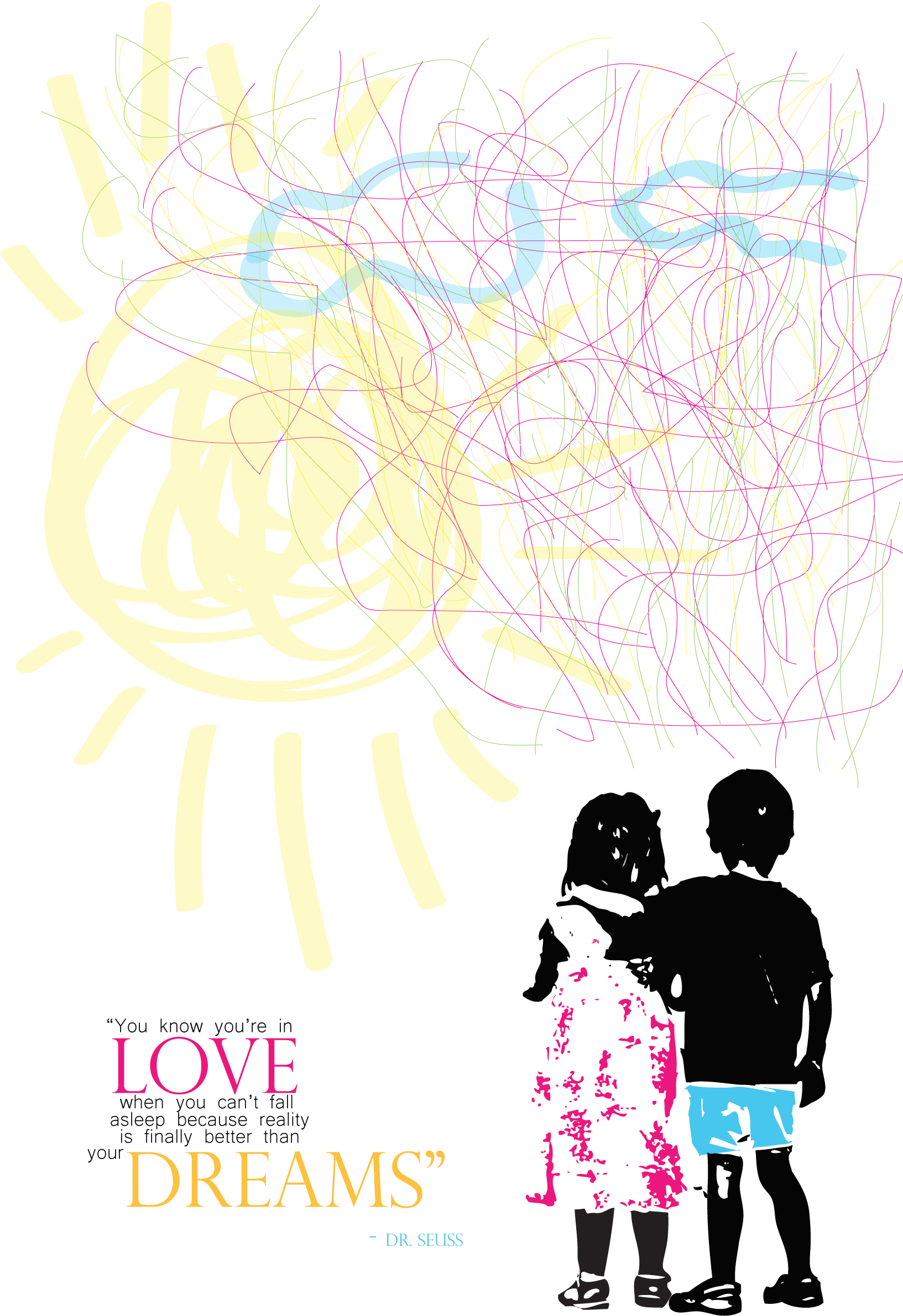
The third concept has a very playful and funky image. In the background I draw a sun and two clouds with very simple and organic shapes. I also traced these long and twisted colorful thin lines over the sun and clouds to represent this whole idea of dreams and reality. There’s also this illustration of two little kids facing backwards, a boy is extending his arm over the little girl’s shoulder. I located the quote at the left bottom side and used a san-serif typeface except for the words LOVE and DREAMS that are in a Modern typeface. The name of the author is also in Modern typeface. I think this concept really conveys the meaning of the quote, for the funky style representing the idea of dreams and reality coming together. And also making reference to Dr. Seuss style by using the illustration of the kids and the colorful and vivid image.
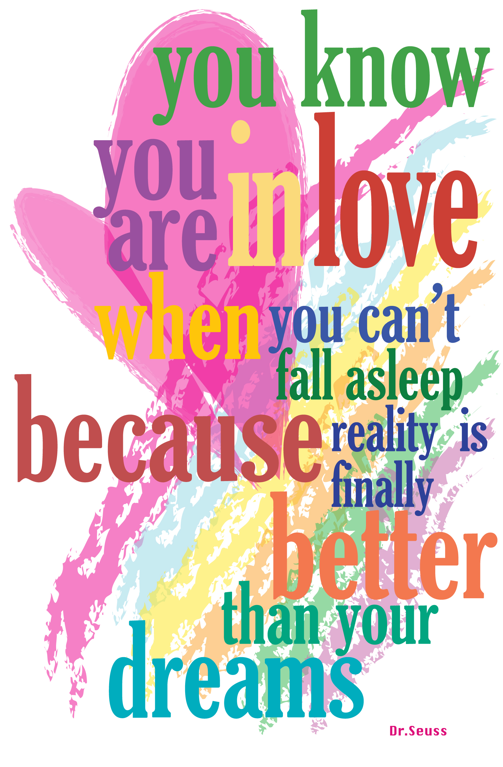
This fourth concept is also very typographical. As the background image, I draw a rainbow with a look as if it was painted with a brush. There’s also an organic funky pink heart and over the background there is the quote, all broken in small sentences and every sentence in different font size. I used GloucesterMT-ExtraCondensed typeface and make every sentence in different color but of course not forgetting of making contrast with the background color. I found this design very fresh and fun and with that essence of Dr. Seuss.
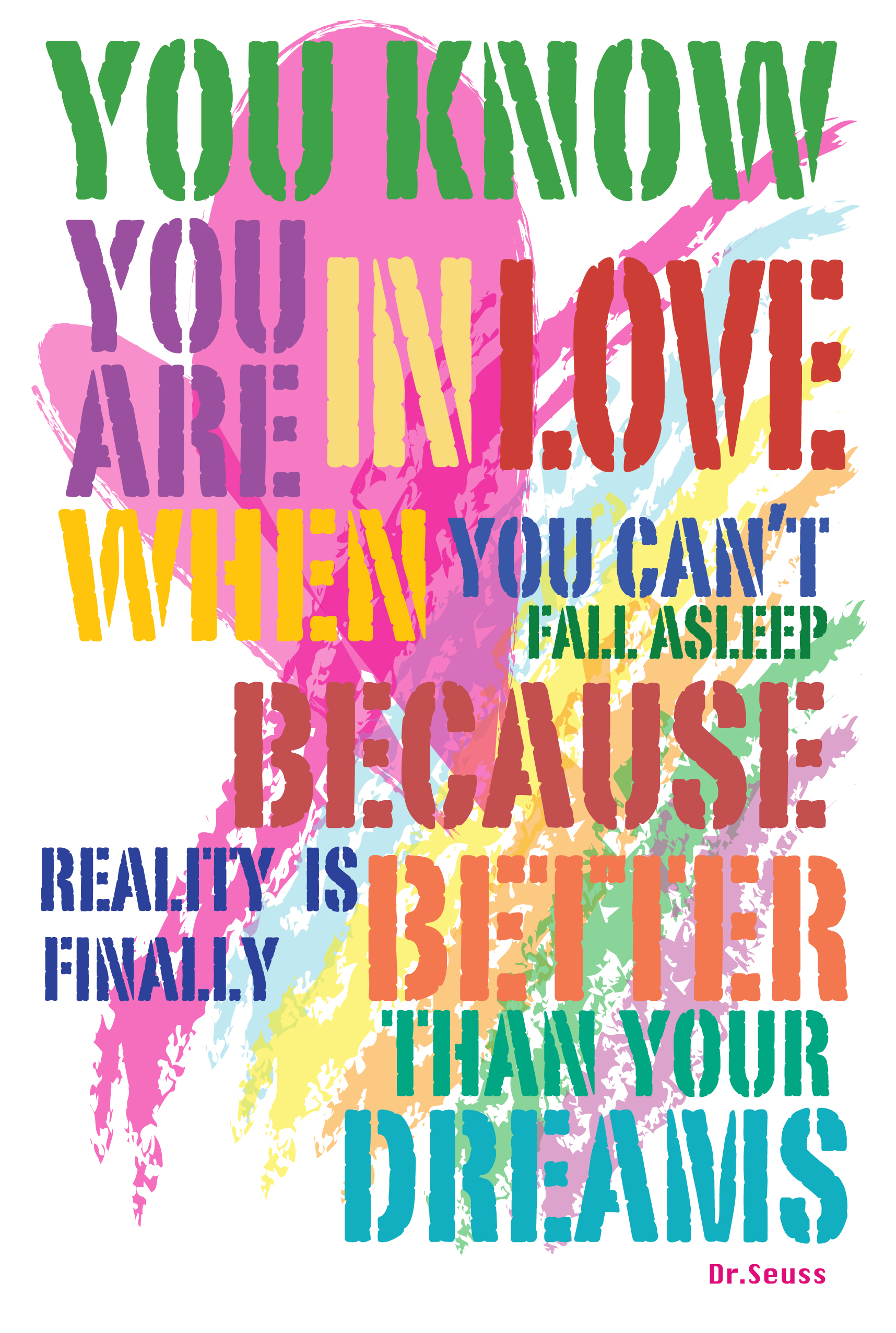
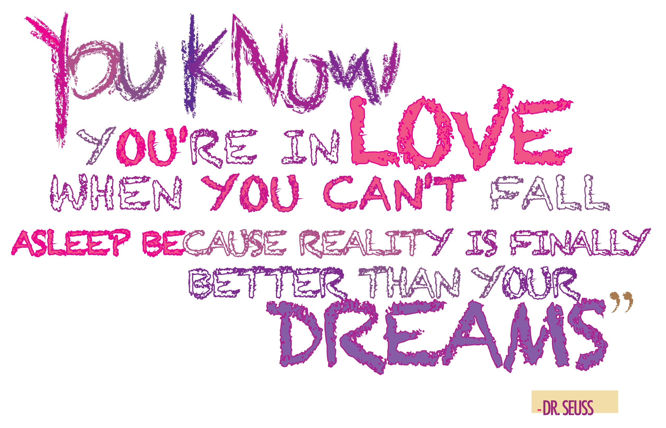
These are extra designs that I made to finally choose the best ones for my assignment. I didn’t choose these designs because they didn’t stand out as much as the previous ones and also because they lack the essence of Dr. Seuss style.

