A City Tech OpenLab ePortfolio

Category: Uncategorized (Page 1 of 2)

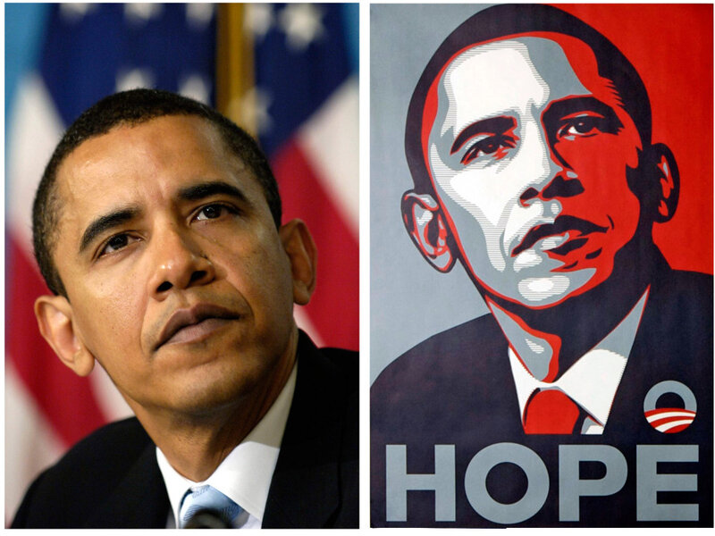
Shapard Fairey’s Copyright Case

This is a case that we’ve talked about many times in other classes, and it’s really worth learning about copyright and fair use.

In this case, an artist was accused by the Associated Press of using a copyrighted photo to reproduce. Shepard Fairey claimed that he used the photo as a “fair use”  visual reference for his own work. But he was later found out that he had lied and that his work was a copyright infringement.

“When a photo is copyrighted, that means that the owner has the right to decide how other people use it. A wire service like The Associated Press makes its money by charging newspapers, magazines, broadcasters, and websites a fee to use its photographs. So AP is very protective about making sure that people are not duplicating or reselling its photos without paying.” – Student Press Law Center

In fact, it is obvious that if you violate copyright, you have to pay the price. This is just like what I said in the last post, copyright is the legal right to protect artists’ creation. Shepard Fairey was sentenced to 300 hours of community service and a $30,000 fine.

Then I also learn what fair use is: (cited from Student Press Law Center)

  1. Who is the user? A nonprofit, journalistic, or educational use is more likely to be a fair use than a for-profit commercial use.
  2. What is being used? A highly creative piece of work – like a movie released in theaters – is more likely to be protected than an amateur cell-phone photo of a family pet.
  3. How much was used? If only a small “sample” is used – 20 seconds of a song, two lines from a poem – then the use is more likely to be fair. The user should use only what is necessary to make the point, and no more.
  4. How does the use affect the original? If the new user does something that is a substitute for the original – such as uploading five complete songs from a 10-song CD to a website – then the use will not be fair, because the new use will take away listeners (and potential buyers!) from the original.
AIGA Ethics

• Clients Guide to Design

Although I did not have the opportunity to write a brief for the client in this internship, I had the experience of working in a studio and meeting a client who was selling children’s toys. I still remember the client I went to see with the manager of our studio. Before meeting the client, we have heard about the design project the client wants to do. Therefore, as the lead designer, I made a corresponding design work and brief according to the information we got. I hope to use these works to show my ability.

But what I can tell you is that none of these works were used by us in the end, because the information we heard was not consistent with the actual design project the client wanted to do. We think the client may have changed his mind before coming to the meeting.

This proves that it is not bad to do some pre-planned work before the meeting, but it may not be what the client wants. Therefore, it is important to listen to the client’s current ideas. However, it does not mean that the pre-planned work is useless. My clients are also satisfied with the works that I have done in advance, and they appreciate my designs. So they had more confidence in our studio’s ability to work, but then they came up with a more challenging idea and wanted to see if we could help him with it, and fortunately, we could help him with this challenging idea.

• Use of Illustrations and  Photography

This is guide is very useful for me because I consider myself a designer and an illustrator. I am pleased to see all the artwork belongs to the illustrator. The process of illustration is very hard. Because you want to express your ideas in colors and lines at the same time. When the illustration needs to cooperate with design, I think it’s even more difficult. Because all design is purposeful, but the illustration is free. It takes a lot of thought to perfectly combine this freedom with the inherent purpose of design. As a designer and illustrator, I can fully experience this suffering. If my creation does not belong to me in the end, I think it will make me very discouraged and disappointed.

• Copyright

As I said just now, we as creators will feel bitter and disappointed if our creations are used without authorization. It’s like having your child taken away from you. Therefore, we must be very careful to deal with copyright issues, such as the term of copyright protection and the use of copyright. This is the lease respect for a designer and a creator, which is also the legal right of all creators to protect themselves.

I finish my internship!

I finished my internship! Overall, I still gained experience during the bad situation of the pandemic.

In this internship, I completed two challenging works. I helped the company to do the rebranding twice. I’ve heard a lot of professors in school said that rebranding is difficult because you need to change an entrenched image and then to make a new and effective image. However, I still designed two new logos for the company.

I think I finished the internship fairly well because I felt that there were still a lot of things I didn’t learn, such as getting along with colleagues. The COVID-19 outbreak happened just as I started the internship. I barely had the chance to get to know my colleagues well.

I have to say, it is very inconvenient to work under an epidemic situation because all the conversations between people are forced to communicate remotely. Therefore, when some problems arise, they cannot be solved in time, which makes it very inconvenient and difficult to work. But for the health, we got no chioce.

Webinar: The Long Distance Illustrator

I’m actually surprised that they will talk about the unintentional connection between political topics and artistic creation. Although these speakers are illustrators, it doesn’t affect the opinions of many artistic creators. Political topics are always sensitive because you don’t know whether your position is really right, or whether the opinions of people around you are opposite to yours. You never know what other people think. Therefore, as a designer and an artist, I always avoid any political topic.

I’m not going to create a piece on a hot political topic and get a lot of publicity. I think in a sense I’m getting myself into trouble. But I agree with Jen Bartel. Be careful what you post and stay professional.

When a work is created, I feel responsible for the public opinion or influence caused by the work in any case. And I think to keep professional is to not be influenced by the outside world, always follow their own concept of art

WIX Webinar

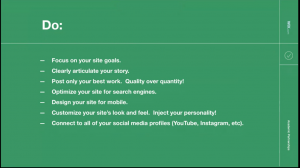
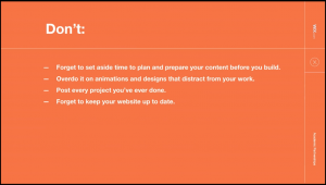
This is a very basic tutorial for free website builder wix.com. The speaker is very understanding of our designers’ needs. In this lecture, she gives us an idea of what to do and what not to do when we build our own website.

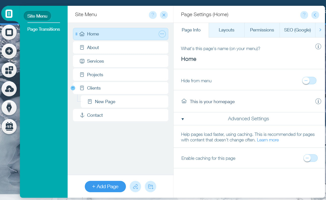
Then she began to show us how to build a website for her works. First, she created a new blank page.  Then she showed us the feature of the site menu. In the site menu we can add new pages, rename, hide, or delete pages, and change the order in which they appear on the menu.

Pages and Menu

Then she talked about how to add pictures and how to format a series of tips for designing a website at Wix.

At the end, she gave us a one-year free premium discount, so we can use more feature in wix.

App review: Teamviewer

TeamViewer is a simple and fast solution for remote control of applications, desktop sharing, and file transfer behind any firewall. To connect to another computer, all you need to do is run TeamViewer on both machines at the same time without installation (you can also choose to install, and after installation, you can set up the boot to run).

Pros: When something went wrong with my computer that I couldn’t solve at all, I can turn to my friends and use Teamviewer to help me out. My friend can control my computer remotely with my permission so that he can help me diagnose what is wrong with my computer. This is very convenient for me because when I was in the coding class before, I had some coding problems that I didn’t understand. I could also ask my friend for help, and he could immediately teach me.

Cons: If the personal version is tested for commercial use, a trial period will be added. Sometimes it may disconnect. And the commercial version is expensive.

New logo to design again

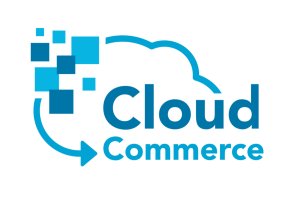
Last week Steve contacted me to say that there is another logo to be redesigned, which is the logo of cloud commerce.

He said that cloud commerce now also needs a new logo to cater to customers. His request is as simple as the last time, he wants the main colors of blue and white.

Since nothing in the original logo had anything to do with data, he wanted to add symbols of data, such as squares.

According to his requirements, I designed the following two logos:

Since the COVID-19, the company is urgent to have new PDF set

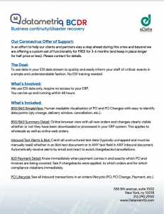
Since the COVID-19, the company is urgent to have a new cover letter and a new PDF set that introduces the company to clients.

Steve contacted me and sent me a copy of their original PDF set. He told me that the PDF set needed to be updated immediately. He needed me to change the PDF set from the original one so that it could match the company’s existing image. And he said please make it look neat and professional if you can, which is definitely not a problem for me.

Below are the cover letter and some of my revised PDFs:

The final version of new logo

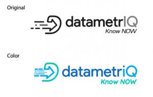
I emailed Steve the three versions of the logo I designed last time. I quickly got his feedback. He thought some of the bars I used to symbolize speed looked like barcodes for shopping which was very clever and insightful. He told me that of the three versions, he was the most satisfied with the last one, but at the same time, he didn’t like the font of “KNOW NOW” very much.

He told me again about his idea of color. He seems to like blue and green very much. I don’t think it’s a problem at all.

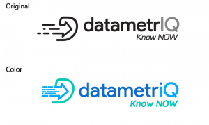
In the process of designing again, I found that the letter “IQ” could be more prominent in all sub clocks. I changed the letter “I” to a lowercase letter “I”, and the dot of the lowercase letter “I” became a feature of the logo. Then I tried to color the logo. Because Steve wanted to highlight efficiency, artificial intelligence, and clarity, he focused on the arrow and the letter “iQ”.

Then I tried to color the logo. Because Steve wanted to highlight efficiency, artificial intelligence, and clarity, he focused on the arrow and the letter “iQ”.

Then I came up with some new ideas and put the “D” graphic at the back to make the whole logo look smoother. And this is my final design.


I started to design on computer

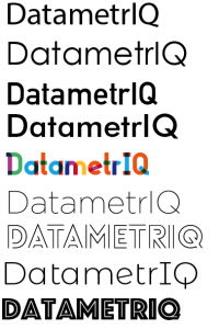
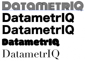
I started designing. I changed my mind to use “Datametriq” as the name. Instead I did a little change for the “iq”. I made them be capital.  So eventually, I used the capital “IQ” to emphasize the characteristics of artificial intelligence of EDI. Here are some of my research on fonts

I ended up with a font called “century Gothic,” which is this one

And then I took a look at the inspiration I had before:

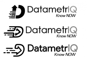
At last, I designed three logos by combining some concepts about speed and data with the letter “D”

« Older posts