I emailed Steve the three versions of the logo I designed last time. I quickly got his feedback. He thought some of the bars I used to symbolize speed looked like barcodes for shopping which was very clever and insightful. He told me that of the three versions, he was the most satisfied with the last one, but at the same time, he didn’t like the font of “KNOW NOW” very much.

He told me again about his idea of color. He seems to like blue and green very much. I don’t think it’s a problem at all.
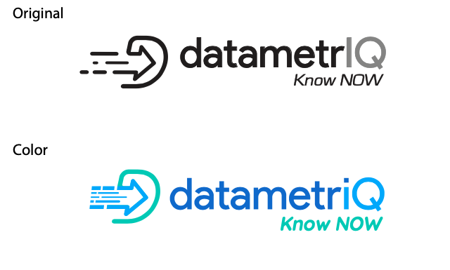
In the process of designing again, I found that the letter “IQ” could be more prominent in all sub clocks. I changed the letter “I” to a lowercase letter “I”, and the dot of the lowercase letter “I” became a feature of the logo. Then I tried to color the logo. Because Steve wanted to highlight efficiency, artificial intelligence, and clarity, he focused on the arrow and the letter “iQ”.
Then I tried to color the logo. Because Steve wanted to highlight efficiency, artificial intelligence, and clarity, he focused on the arrow and the letter “iQ”.
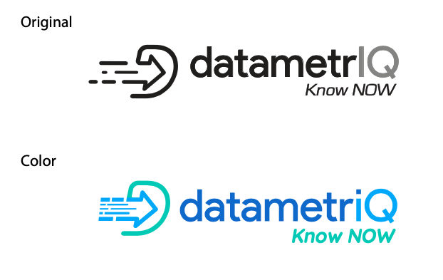
Then I came up with some new ideas and put the “D” graphic at the back to make the whole logo look smoother. And this is my final design.