Category Archives: Coursework

Steve Jobs Presentation

For my final, I created a PowerPoint on Steve Jobs, his accomplishments, and his importance to the ADGA field. To view, click here.

Effective Behavior Poster

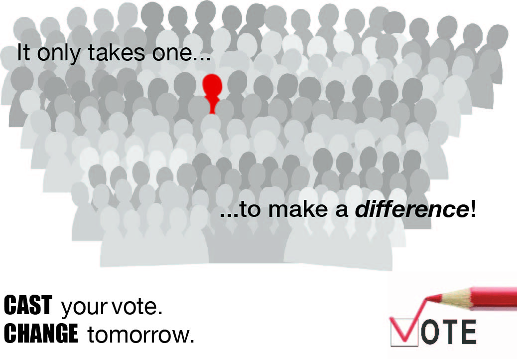
The Effective Behavior poster I created is a poster on the topic of voting. I wanted to target this poster towards young adults because once citizens reach the voting age of eighteen; they often do not register or participate in the voting experience. This is due to the fact that man people feel their vote doesn’t count or it’s a waste of time. I decide to use a crowd of people with one figure standing out, and the phrase “It only takes one to make a difference” in order to relay the message that the reader can be that one person that becomes a tie breaker and that every vote counts. I also added the words “Cast your vote. Change tomorrow” so the young adults of today can feel that their vote can make a change.

Field Trip #2

United Federation of Teachers Print Facility

For our second-class field trip, we visited the print shop at UFT in downtown Manhattan. In this shop, prints that schools request are created and mailed from this facility. Prints like posters, visual aids, pamphlets, bookmarks, awards, even hall passes are printed. Oscar Rivera is the manager and one of the many overseers of this print shop, which services over 15,000 schools – public and private – in the New York downstate area (the five boroughs).

The shop is home to many advanced and old school printing machines that print, cut, laminate, and package materials. The Epson 9800 is one of the large-scale printers the shop is home to. This printer is mostly utilized to create posters and visual aids. It prints the image and/or text on paper, mounts the paper on foam board, and laminates it. The Ryobi 3200 PFA is a traditional printer. The maximum size of paper this printer can hold is 11×17, it can print on the front and back of the paper simultaneously, and uses a fountain solution (ink made of water and oil). The Han Jet press is a machine made specifically to create envelopes. It can produce over 130,000 envelopes within seven hours. The Ryobi 3404 is a digital color press. The machine produces a print by using lasers to “press” the image onto the paper. It also uses dot-to-dot registration for high quality prints and uses soy-based ink to print. This press machine costs about $450,000 on today’s market.

The manager also explained to us that the ink used to run one of the machines in the shop can range from about $30-$200 per press. In order to save some money, the shop associates uses a substance called gum arabic to preserve plates used for printing. The manager then took us to another section of the shop and introduced more press machines. The D.G. 175 is a web press, which prints from a roll instead of single sheets. This press machine is cost-effective because it can produce large quantities (over 500,000 sheets). It has 2 heads, which are used to print on the front and back of the paper, as well as folding and cutting the roll of printed-paper into sheets. It takes only one pressman to run this press.

Logo History

The logo I chose to research is Lego. The very first logo was designed by the Lego Company itself (a designer’s name was not given) in 1934. The lettering was all black and featured the words “Billund – Denmark”, and was stamped on the packaging of their wooden block toys. In 1949, the company started to produce plastic blocks – instead of wooden ones – that interlocked and featured a new black, brown, and tan logo. Between 1950 and 1998, the company would go through ten more logos.

The latest logo was a redesign of the one created in 1973. It features brighter colors, “graphic tightening” (which allows for better digital usage), and larger words. The logo uses a round san-serif typeface that has been custom made for the company. The new logo works better because the round typeface gives it a playful look to appeal to children, has bright colors and boldness that attracts the consumers eyes, and the brick shape of the logo resembles the product.

Visual Quotes


This quote is a saying by Mahatma Ghandi. I chose to signify his work as a civil rights activist by putting extreme emphasis on the words “Live” and “Learn”. I also used these words as key points throughout the quote. The quote conveys the importance of living life, and gaining knowledge.

This quote is also by Dr. Seuss. To communicate the essence of smiling and happiness, I used the type on path tool in InDesign to shape the word smile into an arc. I also used a font with high contrast so the words would be more dominant than the visual, which is a backdrop of a woman smiling with a light layer of pink over her.

This quote is by Dr. Seuss and I believe this quote captures the whimsical part of nonsense and fantasy, with the funky display type. The picture of a pink sheep with a unicorn horn, and rainbow sky as a backdrop also add to the whimsical theme.


My Logo

The logo I designed for my e-portfolio is composed of a Japanese koi fish and text. I chose the Japanese koi fish because it represents strength and perseverance which I consider to be one of my many characteristics. I also have this image tattooed on my back so it resembles a part of me. I chose to color the fish with light hues of white, pale red and pale orange, because I’m a light-hearted and gentle person. The text is in Trajan Pro because I like the elegancy of old-style typefaces. I also decided to color the box a light blue to resemble water. For the text, I used my first and middle name – not my last name – because I wanted to fill in the space of the box and my last name is too short for that.

AIGA Field Trip

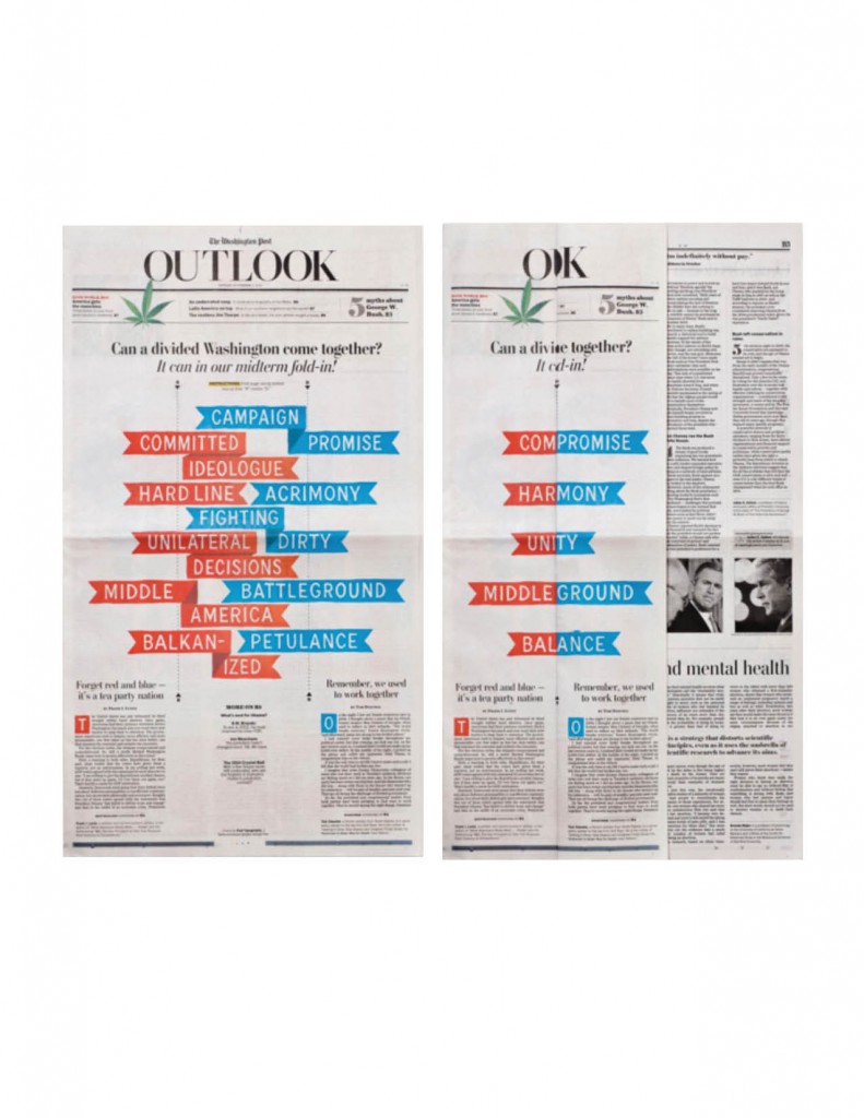
1. Divided Washington (2010) – The Washington Post (Outlook section)

Offset printing

I like how the piece is two colors (red and blue) to visually show the division of the democrats and republicans. The visual piece lists the different aspects of the republican and democrat platforms respectively and when folded it lists the outcome results of a united Washington. I also like how the “OUTLOOK” at the top becomes “OK” when folded, and how the ribbon-like words fit neatly into each other.


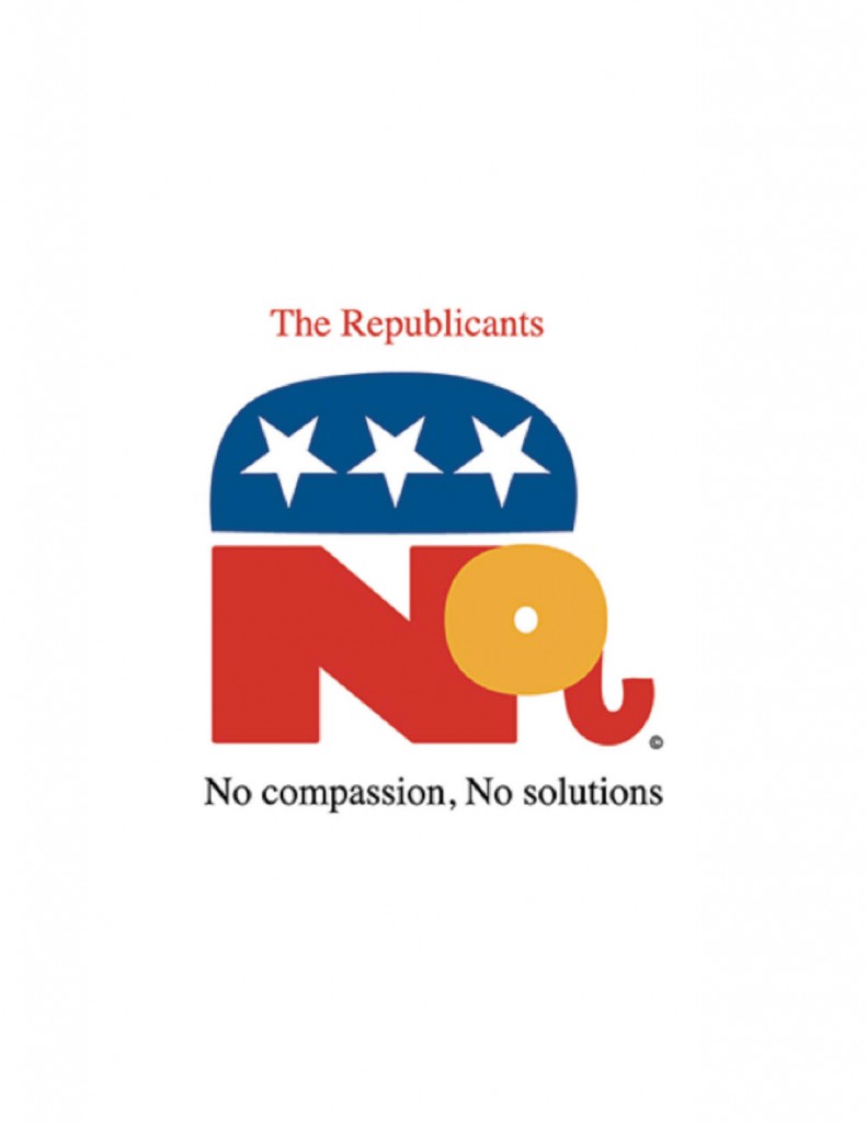
2. Republicant (2011) – Milton Glaser

Giclee print

I like how the party’s name is cleverly changed to signify that they “cant” deliver the results that the nation needs and the traditional elephant has been redesigned in the shape of the word “No”. I also noticed that the stars are upside down, maybe signifying that the party is against America since they make Americans suffer (tying into the words of “No compassion, no solutions”).


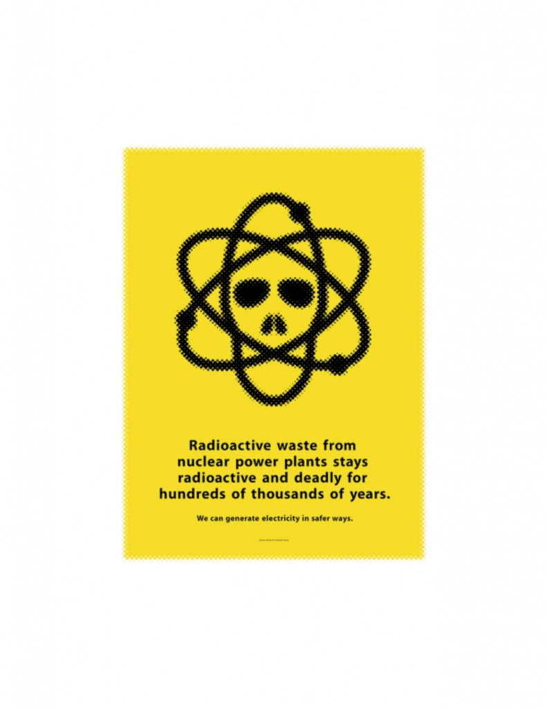
3. Nuclear Energy (2010) – Mirko Ilic and Daniel Young

Silkscreen print and glow-in-the-dark ink

I like how the skull was incorporated into the atom design signifying the death radioactive waste from nuclear energy can bring. The poster was also created using glow in the dark ink, which was a good design choice since it will give the poster a radioactive feel  when shown in the dark. It’s also clear that the poster is more aimed at nuclear energy being a dangerous source of energy than alternative energy due to the size difference of the text.


Letterpress Printing

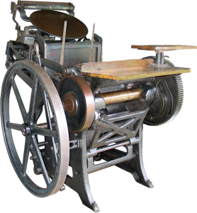
After observing the demonstration of Letterpress printing and being informed about the process, I have learned of the main points of the process. First, Letterpress printing is rarely used today. It may be used for occasions like weddings and such, where the client wants an impression of the type onto the page. Today, there are processes such as offset printing that are more commonly used. Letterpress printing (also known as direct printing) prints a relief of text and images using a reversed raised surface, or a chase, which is inked and then pressed on a page.

This process could use both metal and wood lettering. Metal was used for small type for things like newspapers, and wood was used for large type for things like posters. To print a page, the printer would turn the machine on or start the machine using the pedal, place ink onto the plate, and let the rollers get covered with ink. The machine would then have to be stopped to insert the chase onto the machine. The machine would be started up again, the rollers would cover the chase with ink, the printer would insert the paper in the proper place, pull the lever, and the machine would make an impression onto the page.


Paper Resources

For my Graphic Design Communication course, the paper resource I chose to explore is coated papers. Coated papers consist of a base paper (usually free sheet or ground wood paper) with a smooth clay finish applied to the paper. Coated papers are used to reproduce photographs and four-color graphics. The coating on the paper can vary; some have shiny, glossy finishes and others have matte or dull finishes, depending on what the paper is being used for. Coated papers are categorized by their brightness and glossiness. Some of the common categories are Premium Coated, Coated #1, Coated #2, Coated #3, Coated #4, and Coated #5. Premium Coated has the highest quality of brightness and gloss, while Coated #5 is the dullest and matted of the categories. Premium Coated paper would be best used for a magazine cover or prestigious advertising and marketing of high-end products. Coated #5 would be used for the pages inside a newspaper or high volume catalogs.