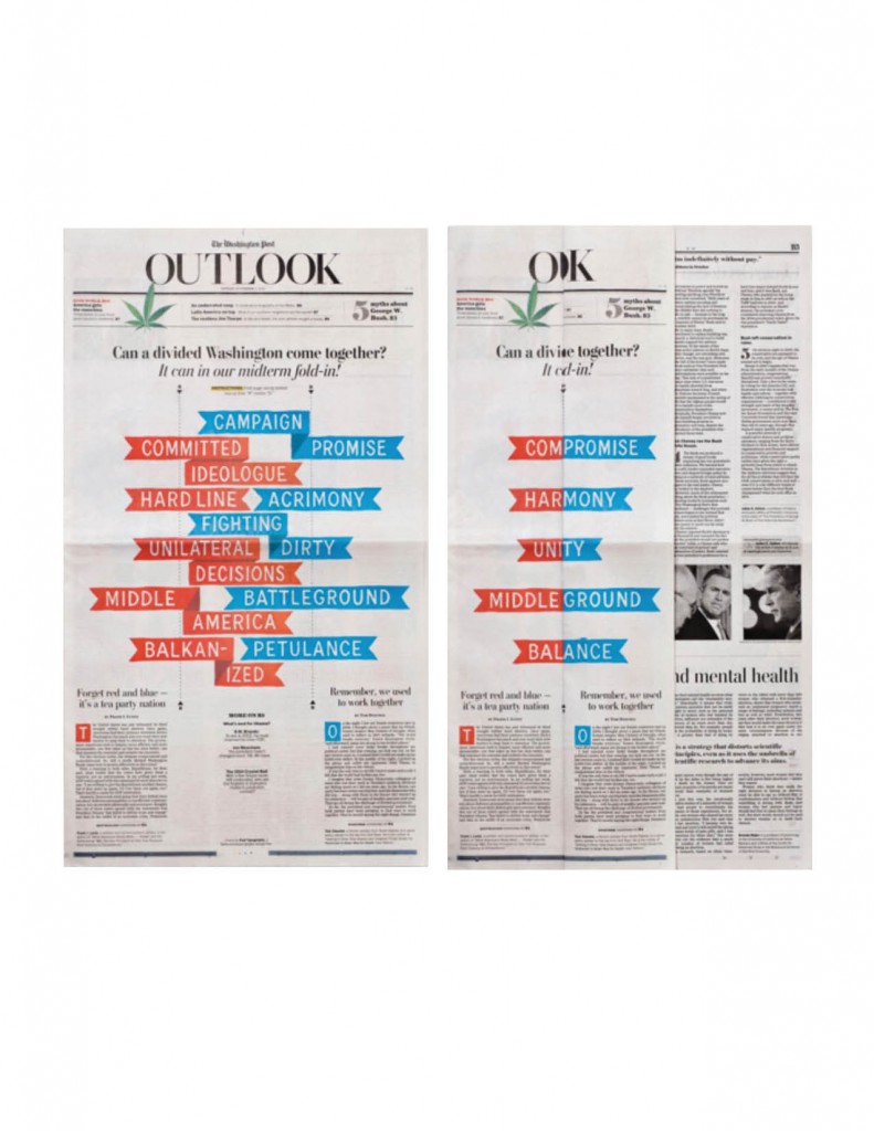
1. Divided Washington (2010) – The Washington Post (Outlook section)
Offset printing
I like how the piece is two colors (red and blue) to visually show the division of the democrats and republicans. The visual piece lists the different aspects of the republican and democrat platforms respectively and when folded it lists the outcome results of a united Washington. I also like how the “OUTLOOK” at the top becomes “OK” when folded, and how the ribbon-like words fit neatly into each other.
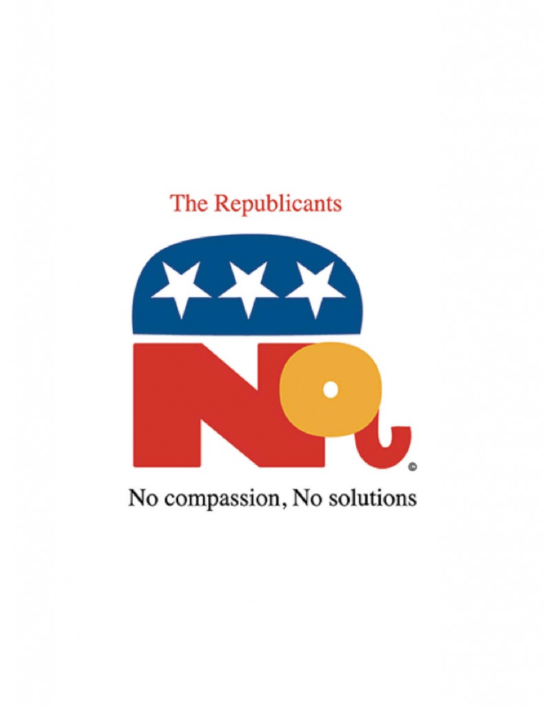
2. Republicant (2011) – Milton Glaser
Giclee print
I like how the party’s name is cleverly changed to signify that they “cant” deliver the results that the nation needs and the traditional elephant has been redesigned in the shape of the word “No”. I also noticed that the stars are upside down, maybe signifying that the party is against America since they make Americans suffer (tying into the words of “No compassion, no solutions”).
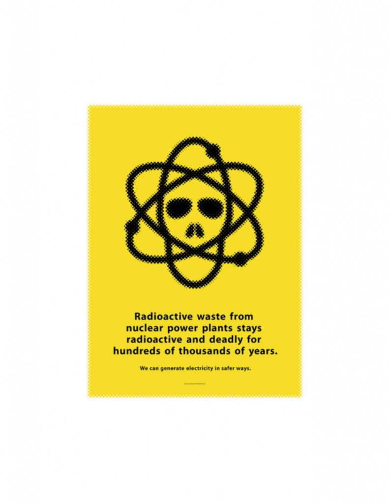
3. Nuclear Energy (2010) – Mirko Ilic and Daniel Young
Silkscreen print and glow-in-the-dark ink
I like how the skull was incorporated into the atom design signifying the death radioactive waste from nuclear energy can bring. The poster was also created using glow in the dark ink, which was a good design choice since it will give the poster a radioactive feel when shown in the dark. It’s also clear that the poster is more aimed at nuclear energy being a dangerous source of energy than alternative energy due to the size difference of the text.


