Background
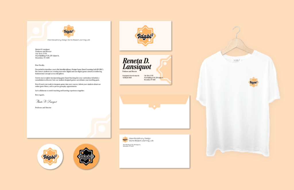
We are required to create a logo and a brand board for ID GBL2. The Interdisciplinary Design Game-Based Learning Lab (ID GBL2) is a place to create games for students by students. Honors students design a variety of digital and non-digital games that they feel will help students learn the fundamental concepts from different disciplines.
Reflection
I got inspiration from dice. The shape of my logo is two dice overlapping each other. The geometric simplicity of dice, with their clear edges and faces results in a clean, modern look that is visually appealing and memorable. This minimalism aligns with current design trends and ensures the logo remains relevant over time.
Dice is a fundamental component of many traditional and modern games. Each roll of the dice brings a new outcome, even the smallest number can affect your game, which embodies the excitement and unpredictability inherent in gaming. This dynamic quality is something I wanted my logo to capture, suggesting that every game session offers a new adventure or challenge.
Dice games often involve multiple players, fostering a sense of community and connection. It suggests a welcoming environment where gamers can connect, compete, and collaborate.
Orange is often associated with creativity and innovation. Using this color in the logo reflects the innovative and imaginative aspects of gaming, appealing to gamers who appreciate new and creative gaming experiences. Incorporating orange into the logo also helps convey a sense of excitement and passion for gaming, which resonates with the dynamic nature of the gaming community.


