This is a report about a poster designed by Art Chantry for “The Rocky Horror Show”. Punk was a brand new concept at that time that challenged the traditional rules. It is a significant work of Postmodernism and represents the energy of rebellion and anti-authoritarianism, which resonates with the energy of this musical.
For this project, we are required to choose a quote and develop three postcards concept. It could be photographic image or typography with line art. I decided to go with the quote “What you see in others exists in you”. This quote have specific connection with people so I added related image in my design.
Drafts
In my first design, I want to emphasize “you”, so I am planning to use a picture with a crowd and highlight one of them, and the highlighted one is “you”.
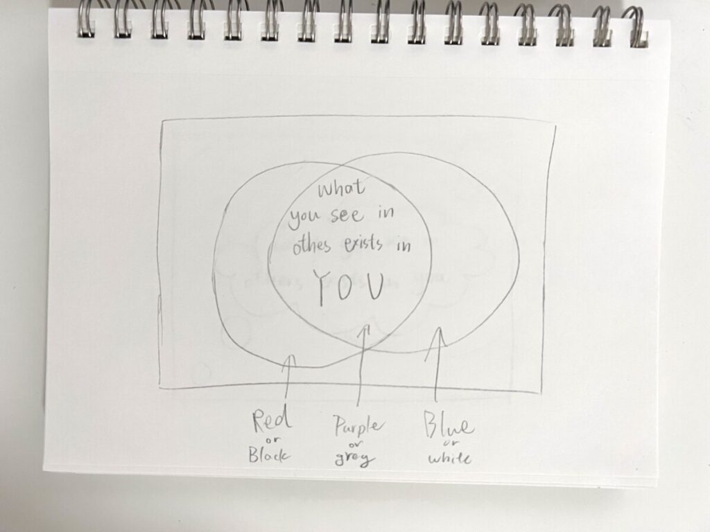
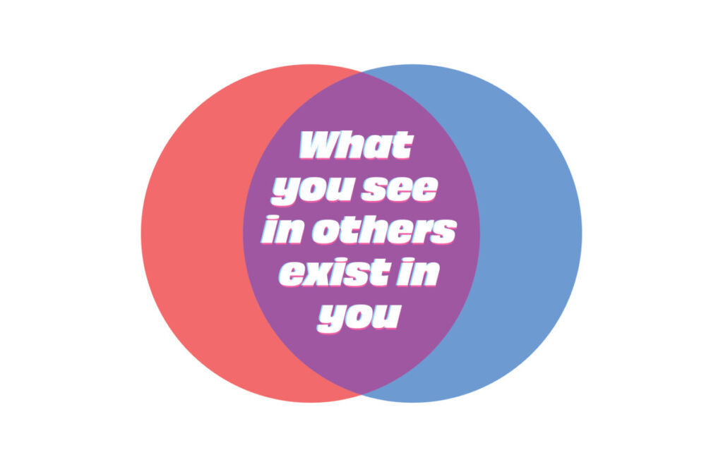
For my second design, I decided to do two circle shapes overlapping each other. These circles represent “you” and “others”, and the overlapping part is what you have in common. The two circles will have their own color, and the part that is overlapped will be a mix of that two colors.
In the third design, I want to create a thinking bubble. Small bubbles come from two different corners and represent two different perspectives: you and others. These bubbles will eventually combine together and made a huge bubble in the center of the postcard. People have a different perspectives and they don’t show that, but they might have the same thoughts as we do, we are connected.
Final design
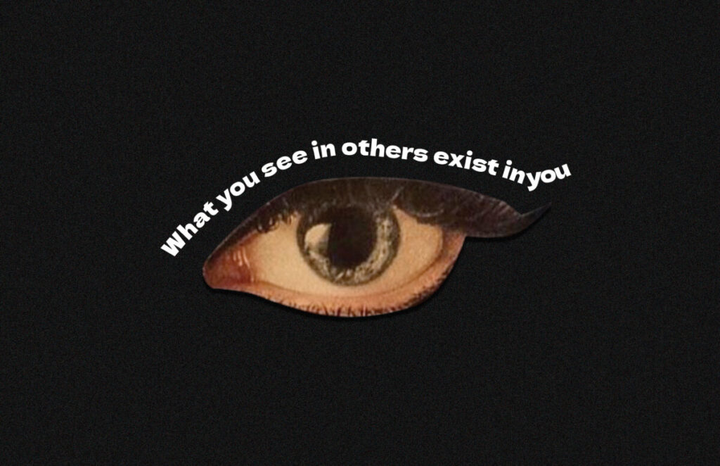
The first one is a lot different from my draft. I ended up using a picture of an eye to emphasize what you see in others. I cropped out an eye and placed the text above it to pretend that it was the eyelid.
The second one didn’t change much. I used red and blue for circles, purple for the overlapping part, and placed text on top of it. I chose a typeface with sharp lines to balance out since there are too many round shapes in this design.
I made a lot of changes to the third design as well because the draft I made cannot present what I have in my mind very well. I separated a sculpture into 4 pieces and added shadows to create an illusion. I place the text behind the sculpture to create layers.