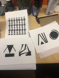
This was our first project in my graphic design class. The point of it was to use the positive space to activate the negative space in a cool and personalized way. We learned how to cut shapes out with an exacto knife and paste them on to a page using glue. Placing well crafted shapes in creative places opens up the art and creates complimenting negative space. I found out by doing this project that I am terrible with an ink open and simplicity is key in geometric projects. In two of the projects i tried using organic shapes like free flowing triangles or crescents. The other two were more geometric and created a more creative negative space.
Anthony Foti's ePortfolio
A City Tech OpenLab ePortfolio


