internship journey fin
Anderley’s internship journey
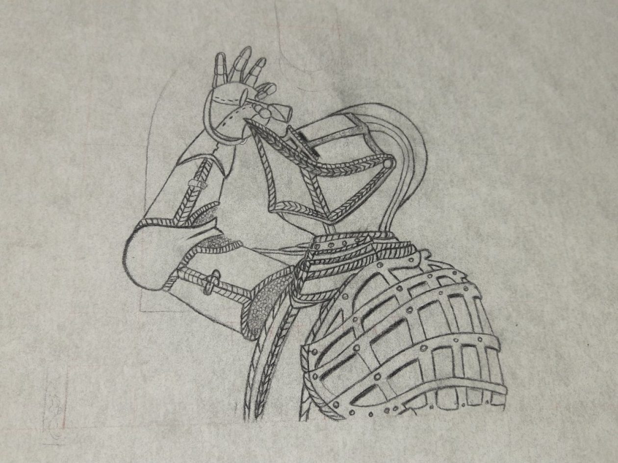
Hi my name is Anderley Fequiere A senior at city Tech and I am expecting to graduate on fall 2021 God willing and throughout this journey of finding an internship I have suffered many pitfalls dead replies scams and having to redo my bank account before the class even started here I am searching for my dream jobs which are concept art positions which I for one want to become because of the skills I’ve grown and matured throughout the whole school semesters before and I believe I am well fit in capable for the job so with that being said I listen to what My professor told me by signing up for a webinar which my first webinar was illustration isolation and I met someone who is in Hiro’s Studios who told me the difference between a concept artist and a illustrator and the big difference was a concept artist basically is getting pulled in multiple directions until the art director and the company that the art directors working with are OK with it whereas the illustrator finishes in polish is what the concept ours is made and sometimes you get both positions if you’re lucky that’s what he said to me and in all honesty I didn’t know the difference between concept artist and an illustrator till that moment because I was always under the impression that they took you drop the whole process but there’s people who do the sketches for the characters then they break it down and send it to an illustrator and once the illustrator is done with the coloring and what not and adding the lights sometimes if they want to add extra touch to it they have someone who’s a lighting specialist who deals with lighting and that to me is amazing it’s kind of a part of the workflow that my professor mentioned for businesses and it All together makes sense because pushing all the work on one artist can be taxing especially in my experience of trying to draw a comic book for myself and also rendering characters which is why when I was told trying to find out our internship is kind of hard during this time I agreed because it takes a lot of time for them to except you and you would have to do it before hand in order to even get a footing especially if you’re looking for a spring internship close deadline so I decided to to switch gears and go for poster designs for now because I like doing posters but I like doing illustrations more so than poster design because illustration allows more of my personality and creativity to extend out not that there is no way to express yourself through text but to me I feel like illustration is a lot stronger of a love for me. The next webinar I did was a Wacom webinar series with Jose Vega, he showed how he went about the different perceptions of lighting and how he built his background using elements of 3-D modeling and pretty much compositing in Photoshop as well since his main way of work is true to photoshop which inspires me as an illustrator to study light more and also 3-D so that I can appropriately re-create realistic lighting in my images as best as I possibly can. Now we move on ahead to the main things which were me getting my résumé fixed up to the best of my ability and resending it to the Jobs I sent it to before so that it could update the way they see me in the process of hiring as a means to show growth. Now that we’ve reached midterms I’ve decided to apply for NYPIRG since it would be an option that I know I could get hired for from what the professors told me and it would improve on my work experience in the art field so now I wait for the recruiter to respond with me this next coming week.
I declined NYPIRG because this was not the thing for me, and this is what happens the weeks after. Finally, after weeks of waiting and agony and pain, I finally got calling all artists it was by far the best thing that could happen to me I went through with it, and honestly, the weeks flew by so fast that I did not know I did my 120 hours and honestly food and design are possibly the best combos of entertainment that could possibly ever happen. In a while it started off kind of awkward’ cause of my perception of how things would be at the start of you know working but initially, it wasn’t the way I thought it would be I was welcomed and then we just started working and during that time we got to see a lot of the work that we were doing for restaurants done with him not frame up time but unfortunately, we don’t really have many shots of what it looks like inside right now at the moment which is by all means fine given circumstances of covid there is a chance that covid may die off soon maybe. So while this was happening the Golden parks exhibition was also there too with many of our CUNY students joining in here and there doing their lovely pieces for the Gordon parks expedition and honestly, my favorite pieces were the ones that were very metaphoric like the one with the food images that one stood out to me the most because of the quotation it had and in the context that it put the image in’ cause at first glance you just see oh that’s some good food but it went beyond that in the image. Overall having a deeper meaning in each image that you make makes the art piece more artistic and more powerful throughout the whole piece which is what makes art such a beautiful living life form. After that we had a lot of ethics talk from one of my favorite shows being included the good place which I am for sure Chadi because of my old nature of indecision which made it funny to me but now I can make decisions compared to what I used to do before which in honesty is what makes me happier for what I have now’ cause Marla Gotay allows us to have some visual direction for some of the projects and helps us how here in there she initially makes everything a lot less hesitate to pursue like there are obvious landmines but there are certain lands you could tread.
Anderley’s Bio
My name is Anderley Fequiere and I am graphic design artist here In CityTech. I was born in Jamaica hospital and grew up around my sister who loved art and drawing then after a while i fell in love with drawing since always watched Disney movies, 4kids tv, and all kinds of animations that aired on tv while I was young. When I to Highschool thats when I began to start my dream of drawing and going heavy into art. I am now in City Tech with my major being Communication Design and improving all my art muscles.
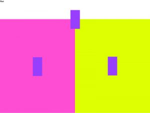
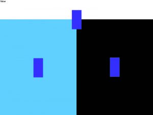
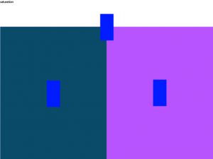
Monochromatic:

Analogous Complementary

triad

tetrad

design journal
monochromatic: containing or using only one color.
Source : Google.com
My definition : involves the use of one color
Example : 
Analogous Colors: Analogous color schemes often mimic the color schemes found in our natural environment and can create a calm and relaxed feel when applied in design.
Source : http://graf1x.com/definition-of-complementary-analogous-triadic-and-split-complementary-color-schemes/
My definition : Analogous colors are colors that utilize up to 3 or more colors that are complements, and are adjacent to each other.
Example :

Triad : The Triadic color scheme is aptly named as it consists of three colors that are spaced evenly around the color wheel; when the colors are linked by a straight line, they form a triangle.
Source : http://graf1x.com/definition-of-complementary-analogous-triadic-and-split-complementary-color-schemes/
My definition: a color scheme that utilizes colors that are lined up to create the shape of a triangle.
Example :
Tetrad: A color scheme arrangement derived from the color wheel that contains four colors.
Source : http://www.creativeglossary.com/color/tetrad.html
My definition:any four colours which are equidistant on the colour wheel that form a rectangle shape.
Example : 
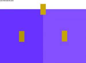
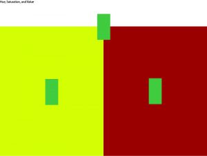
what i think about the gray squares commentary
its not a surprise to me any more because of the fact that they guy described it as an optical illusion and that they both have the same color. also we create our own equivalent to that iullsion.
Classwork of the day
color post
http://www.nytimes.com/2007/03/28/arts/artsspecial/28uspiks.html
this one stood out to me because it showed me their interest in the color gray and the artwork that this man did which be in a museum sooner or laters.
Design journal quest
Prismatic color

muted color

graphicdesign.stackexchange.com/questions/62915/regular-colors-vs-muted–colors
achromatic gray and chromatic gray
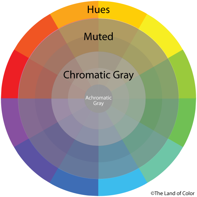
http://thelandofcolor.com/wp-content/uploads/2013/08/MUTED-AND-CHROMATIC-GRAYS-WHEEL.png
additive color

https://upload.wikimedia.org/wikipedia/commons/thumb/c/c2/AdditiveColor.svg/1024px-AdditiveColor.svg.png
subtractive color

https://upload.wikimedia.org/wikipedia/commons/thumb/1/19/SubtractiveColor.svg/220px-SubtractiveColor.svg.png
Bezold effect

https://upload.wikimedia.org/wikipedia/commons/thumb/6/6b/Bezold_Effect.svg/1280px-Bezold_Effect.svg.png
and color interaction
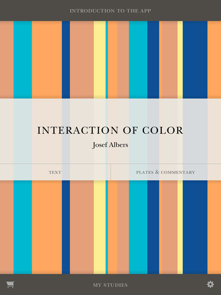
http://yupnet.org/interactionofcolor/wp-content/uploads/2013/05/Home-screen-shot.jpg
Examples of the Day
Simultaneous contrast

texture density

venn diagram


