Author Archives: MCruz

Location – Early Evening

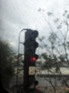
For the third and final part of the location photo shoot I took pictures at the train station during late afternoon/early evening. After I arrived I was very shocked to learn that there is construction on one half of the entire station and that that half of the station will be closed until August! I took mostly pictures of the construction but I also took a few pictures from inside the train. The train passes by all of these graffitied walls as it makes its descent underground but unfortunately they were all blurry because the train was moving and I did not have enough time to adjust my camera. However, I did get a really interesting shot of one of the railway signals but the focus of the camera is on the dirt on the window:

FinalProject20140512_0006

This was definitely my favorite photo from the last photo shoot because of the blurry train signal and the red light that stands out.

Location – Afternoon

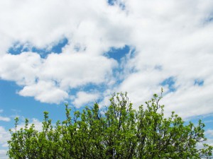
I found this second third of this photo shoot a little harder, just because the train station was just as vacant as the first time and I felt like I was running out of things to photograph. I tried to focus on odd or strange things that I saw and I used a lot of close-ups. I also included the sky in a lot of photos because it was so bright blue. My favorite picture was one taken on the way out of the station, on the stairs. its a picture of this bright green tree against a bright blue sky:IMG_7254

For the last part of my shoot, I plan to photograph in late afternoon/early evening, around 5pm.

Location – Morning

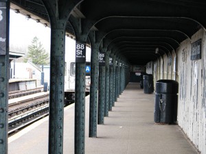
For the final project, I chose to shoot at the train station near my house. The first third of the final project, I did at morning and it also turned out to be a day with lots of overcast which I originally did not plan. I mostly looked for odd things at the train station and not so much for people because it was early and not many people were at the train station. What makes this particular station so unique is that one side of the platform has an entrance that hasn’t been in use for years. It is closed off and is mostly covered in pigeon poop with a sort of eery feel to it. As a double feature, there is a very old cemetery on that same block with graves dating back to before the early 1800’s. My favorite picture is a picture I happened to take as the train was pulling out of the station and the letter “A” is framed between two poles of the train station:14033128203_2b7dc65fee_b

For the second shoot, I will shoot in the afternoon.

Self Portrait

For this photoshoot, I really didn’t have any idea about what I wanted to photograph. In this day and age, when I think self portrait, I think, “selfie.” So I chose to take pictures of things that I like with a small part of my body in frame like my toes or hand. I also integrated some photos of just my face which would be an actual portrait. However halfway through, I ran out of ideas and am still thinking up some new ones.

A World of It’s Own

Visiting MoMa was a pleasure as always. We saw the photography exhibit, “A World of It’s Own” and it was especially enjoyable because I am currently taking graphic design history and I knew a few of the artists we saw today, such as Eadweard Maybridge, Man Ray and Nadar. Seeing this exhibit redefined studio photography because there was such a wide variety of content/subjects displayed. There were chromolithography pieces, motion photographs, more modern and HD photos, colored/black & white pieces, portraits and objects; a wide array. Most of what I have photographed in a studio setting has been mostly simple and commercial rather than out-of-the-box ideas.  This exhibit really showed the evolution of photography as a whole which was very nice to see. My absolute favorite piece was Christian Marclay’s piece, Allover, which was a blue background with a white overlay of cassette tapes that were taken apart and strung, messily, across the whole piece. This was done recently (2008), which I found interesting because cyanotypes are sort of an out-dated photographic printing process, which I feel opens up a whole new, yet old, type of photography. For a little less than a century, all photographs were black and white and the first color photo wasn’t invented until the late 1800s.

The exhibit also had a few photos that had videos that went with them. These videos showed how the photograph came to be which was very interesting to see. Some of these photos didn’t look motion-oriented but the process of taking them was and the photo wound up being almost a screen-grab of that process. There was another video that showed a bunch of photos showing a cabinet in different positions, so that when they were strung together, it looked like the cabinet was moving in a flip-book kind of way. The video looked very grainy and was black and white so that indicates it is very old and could have been used then, to demonstrate how motion pictures work. These videos inspire me to want to photograph things in motion, which we have sort of touched upon in class with the colored water photo-shoot.

I completely disagree with the NYT article’s first line, that there was “not enough color.” In order to understand what you have now, you have to know where you come from, and photography is roughly 200 years old. Yes, this exhibit largely favors black and white/non-modern photos, but that does not diminish the meaning of it at all. I do agree that “the curators set out to trace the medium from inception to the present in a way that has never quite been done.” I also agree that the exhibition did “ignore(s) the great stream of images with which the Modern’s influential photography department has been most identified.” There was a lot of human interest/portrait and inanimate objects but little to no landscapes, animals, advertisements, urban life, etc. It does, however, accurately portray the different mediums of photography throughout the ages. Lastly, I feel like the fact that there was a lack in female photographers wasn’t entirely important. Sure, as a woman, I would have loved to have seen what women have brought to the photographic table, but this exhibit isn’t about a battle of the sexes. It is about showcasing photography, and I guarantee, from the time the camera was invented – 2014, photography is predominantly male.

Spring

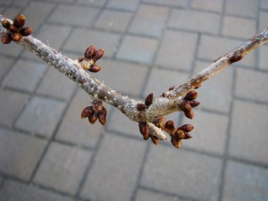
This weeks photo shoot was a welcome change from the indoor shoots we have done all semester. I shot in daylight/sunshine around my neighborhood and decided to focus primarily on nature. The only problem I encountered was that I was hoping to photograph budding flowers and such but even now, there wasn’t much of that and everything still seemed to be dead, and there were only a few minimal flourishes. My favorite photo from this shoot is:

IMG_6930

because it has a good contrast in color of the red bud against the dull cement,  and most importantly it show the budding that I was hoping for!

Midterm Part 2

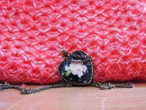
This weeks photo shoot went surprisingly smooth. I didn’t really run into any complications, I just tried a whole bunch of different things with the subject and had a lot of fun with it. I also had to slightly brighten a few photos bump up the contrast on a few, and make some minor corrections in the fabric, but other than that, as I said, everything went pretty smoothly. My favorite photo this week would have to be this one:

IMG_6823

For the background I used a pink sweater of mine which I think compliments the pink flower on the locket, to create a (hopefully) happy feel.

Midterm Part 1

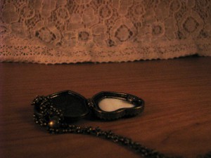
This first shoot actually went surprisingly smooth. I chose to photograph something rather easy to manipulate, which was a locket necklace. I think maybe the sad part of the shoot might not come across as strongly as the happy part, or maybe even some of the photos could go either way, depending on the person judging them. I did some minimal adjustments to each photo in photoshop (brightness mostly and a grayscale in one particular photo), but nothing too major. I decided to do 10 happy photos and 10 sad photos, and I also chose to shoot at night with indoor lighting, and for the next shoot I will try doing it with some daylight. For the background I used a light lace material, and for the ground I altered between a wood desk, pillow, and a scarf. I had some trouble picking my favorite photo because there were a lot of favorites, but I settled on this one:

IMG_6746

I like the soft lighting and darkness of the photo, and the way the necklace is situated, and it is positioned so far from the lace background that I think it makes the photo sort of distant and lonely.

Buy Me!

This shoot was very enjoyable to do and I played around a lot with the products. I chose to photograph my favorite perfume, Incanto Dream. The biggest hardship was, once again, the lighting, but I added a few more lights and it made everything brighter and vibrant. For a few of the photos I added just a bit on contrast and I feel like it really punched up the feel of it. I decided to shoot at two different times, once in the daylight with natural sunlight coming through, and once at night with just fluorescent lighting. I changed the background a few times as well as the surface, just to add variety. The second hardest part was doing everything myself, such as the lighting, arranging the product, coming up with new ideas, etc. Overall, I think the photos come off as fun, flirty and girly, which is usually a good approach to advertising for women’s products.

Childhood

The toys project was actually very fun to shoot. For me, the sad portion was harder to shoot than the happy part. Most turned out to be more creepy rather than sad. Lighting was again an issue (like with the shoe project), because I wound up with a lot of blurry, dark photos.  I honestly had multiple favorites and could not settle on my favorite photo from the bunch. The happy shots were taken with aided daylight and the sad shots were taken at night. I also moved my home studio so that my red wall would be the background as opposed to my closet curtain.