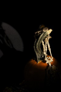
For the first picture, We used stroke lighting. Only one specific area was lit. Everything in the background is much more dark compared the the only lit area. This lighting makes the picture feel more mysterious and scary. You can see the pumpkin top and the skeleton. Everything else you can faintly see it. You can see the other skeleton and candy corn, but it is not as visible as the skeleton in the light. You can see the contrast between the lighted area and the background.
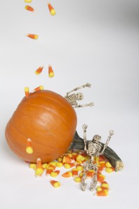
The second picture is fully lit and there are no shadows. My group made the picture look like it was raining candy corn. It seems more fun and happy than the other picture. It seems like the skeletons are enjoying the candy corn. The skeleton in the back look like it is trying to scare the other skeleton. It looks more playful and less mysterious because of the lighting. Compared to the other photo, the lighting makes this photo more energetic and happy because it is bright and not dark.


