Ethics 1

Ethics A
Working at this internship, I was instructed to read the Institution’s branding guidebook. I knew that the logo was essential part of the brand because it is used on different channels of communication such as, flyers, posters, ads, brochures, web content, and social media. Consistencies of the usage of the brand assets are important especially when designing collateral material. The guidebook illustrates clear explanation and example on instructions of using the logo/trademark accurately. Clear communication between the audience and institution is an objective that must be met, and all departments, centers, and programs must be aboard because they contribute to the brand. The branding guidebook talks about acceptable copy writing, social media guidelines, and brand assets. When implementing the logo I always used the guidebook for reference to make sure the trademark is being used correctly.

The Office of Image and Visual Communication provided me with photography, so I never had to handle sourcing of images. Some of the photography was scenery of institution, students, and professors. I was thankful for the imagery because sometime I used them as a design element for posters and flyers. Because the office who oversees the institution branding identity determined that the imagery met branding standard, I always felt confident that I was producing content that did not violate ethical guidelines.

https://www.aiga.org/design-business-and-ethics

Ethics B
I was never given a non-disclosure or confidentiality agreement to sign. I only spoke about the projects that were assigned to me with my peers from my internship class. I wanted to have the highest ethical standards by keeping the projects and information of the institution business confidential. Through meetings with my supervisor, we discuss how the department could improve on attracting more students to apply by digital marketing. This would serves as a huge outlet for communication with their target audience.

AIGA Busines_Ethics 47556721-Client-s-guide-to-design-1-1-MB.pdf

https://www.scribd.com/document/91894008/Non-Disclosure-Agreement
Ethics 2

Ethics A
I have used creative work from artist before and always credit the artist. I have designed several magazine and newspaper layouts were I use photography that was not owned by me. I made sure that the photography was free to use, share, and modify. I learned much earlier in my design career that the artist is held responsible for proper sourcing of an artist design work, and the consequences that one could face if sourcing and copyright are not respected.

AIGA Business_Ethics 47556757-Guide-to-copyright-1-MB.pdf


Ethics B

The New York Times felt that this case would have addressed the fine line issues surrounding copyright protections, but I thought that this case reinforced how crucial it is to adhere to ethical standard at all time.
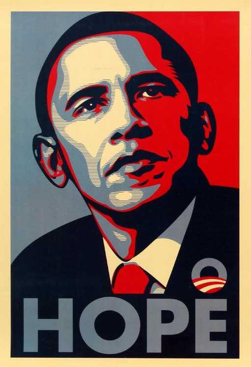
Shepard Fairey clearly forgot his ethical standards, and when he remembered he tried to cover it up by destroying documents and fabricated others to try to conceal the fact that he had used a particular Associated Press photograph of Mr. Obama as the source of his well-known “Hope” campaign poster. When designing it’s easy to forget good ethical practices because you get caught up in the design process, so implementing ethical practice must be a habit that you must train yourself to do. Even if Fairey wasn’t used to properly sourcing imagery or was unaware, he should have admitted his fault right away instead of lying and covering it up this showed a lack of ethical self-awareness which made situation worse.

Hope_Poster_Case_Study-1.pdf

https://artsbeat.blogs.nytimes.com/2012/09/07/shephard-fairey-is-fined-and-sentenced-to-probation-in-hope-poster-case/

Digital Flyer

My internship was pretty busy this week because I had to design two email blast flyers for incoming freshman. The objective was to attract incoming students to accept their admission offer, and to inform students about an upcoming event that would allow them to register for classes and to receive information about Student Affairs, SEEK, ASAP, CUNY EDGE, Financial Aid, and Public Safety.­­­ I had a meeting with my director and supervisor where I created a brief on the need to know information that must be on the flyer, and what are their expectations.  I decided to use a picture of the new Academic Complex building because it’s an attractive feature of City Tech. The other flyer was much more difficult because it incorporated much more body copy and no initial design elements like pictures to work. I had to design a graphic that was visual pleasing and fit the layout that consists of lot of typography.

Admission Offer Flyer
Accepted Student Day


The value of Communication

Being a graphic designer is more than creating design solutions, you must be able to communicate verbally and via email to your supervisor or client. Through this internship, I constantly had to touch bases with my with my supervisor about the tasks he designated to me. Sometime he worked from home, so I had to update him on designs layouts by sending emails with attachments. We also email other supervisors from the office for revision on our copy writing and their thoughts on final design layouts. Now, I feel confident on using emails to correspond about various design objectives with my peers or supervisor in my future job.


Branding Yourself

All of my suggested readings about networking had the same bullet points, but one article resonated with me the most. It explain in great detail how critical networking is to enhance and to start your graphic design career. What I took away from the article was that branding yourself is a mentality that we as design students must embark on as we are still in college. As a designer, you are already a brand whether you embrace it are not. I like how they mention to visually think about how you would like to be represented then translate that into reality which will be the structure of your business, and never forget to be kind and considerate to others, not rude.


Presentations

The articles I read about presentation were interesting and informative. They cover a lot of information that I already knew from experiences of presenting presentation, which some were awesome and few I let my nerviness get the best of me. In, How to Create the Best PowerPoint Presentations, it breakdown the importance of simplicity, info-graphics, color, typography, imagery, and multimedia to produce the best presentation that would grasp your audience attention. The most vital point from this article was less is more and keep text to a minimum. Unfortunately, most of the presentation I have witness had overload body copy which was overwhelming and boring, even if they were supported by imagery. White space is a priority to put together an effective presentation.

Internship Presentation PDF

Work Etiquette

In “Modern Etiquette: Minding your manners in the workplace,” Pamela Eyring states how manners could advance your work career: “It’s been said that good manners will open doors that the best education cannot.” I find this to be very true because good etiquette equals to good behavior regardless of the situation. However, in today society there is a thin line between appropriate and inappropriate behavior. A lot of the norms I grew up installed into my DNA are not norms in today society, and it has spilled over into the workforce.

Almost half of my coworkers are conversing on their cellphones, loudly, while on the clock. I personally know that this is a no-no from previous work experiences and from my morals. This is one of the bad etiquette in a work environment that the article mentioned.  This bad behavior is linked to, “Don’t sink to someone else’s standards”, which mean to always stay on track with the company’s Code of Ethics regardless if your coworkers abused them.

Creative Block

I used to fill extremely guilty about having creative block because I did not know how to overcome it. Reading the article from Creative Bloq, 20 pro tips for design graduate, gave me a few pointers on how to deal with it. I must identify what triggers my mind to go into creative mode. Going to the art museums, art friendly neighborhoods that have a lot of graffiti stimulates my creative juices to flow. Visiting the design and magazine section at Barnes and Nobles inspires me on many different ways, for I could discover a color palette or layout that I never thought of. This article reminded me how creative block is something that would happen after I graduate college, so I must practice on working through it.

Rubbing Elbows Professionally

My networking event I decided to attend was the Daily News Innovation Lab, Conversations. They spoke on how design has many influences such as political, ethnical, and fine arts that could be used for good or evil. I was also able to network with other design students from The New School.
I was greeted by the Daily News web design team and was given a name tag. The floor was fully branded with Microsoft’s logo, brand colors, and merchandise. There were snacks like popcorn, cookies, brownies, sandwiches, and beverages. While eating the refreshments, I met two design students, Ashely and Chris, which we spoke about our major and the design culture.

Ashely is from New Jersey and been drawing since she was five years old. She is a sophomore at the New School and her major is Fine Arts. She explained to me how one of her project was to create a composition by using her professor as inspiration, which I found to be weird for the professor to assign. After graduated, she would love to own her own studio one day and teach art to the youths. Chris also attends the New School, and his major is Animation. I thought it was so cool to be at a school which is well known for its contribution to the design culture. As being a gamer, he always been interesting in animation and motion graphics. He encouraged me register for motion graphics next semester because I love typography and color, and I could create amazing design/motion graphics with those elements. We all exchange contact info to keep in touch with one another for future free design events or networking opportunities.


Relocation

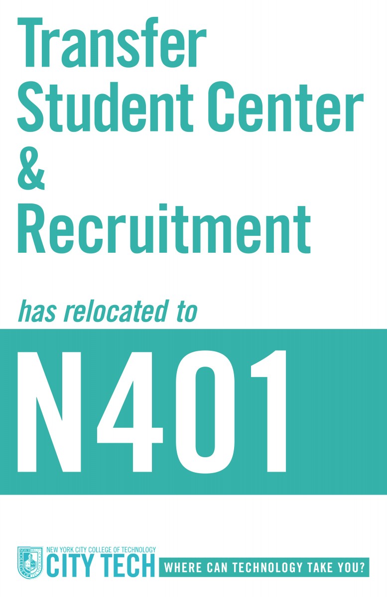
My supervisor informed that the office will be relocating to a different space, so we would need to design new signage that will inform incoming and current students where to go. I also have to redesign the current signage because it does not have the new City Tech’s branding standards such as, the school colors which changed from a deep royal blue and gold to a pure royal blue and white. First, I research inspirations on wayfinding and signage by using Pinterest, Behance, and Pentagram. I came across Pave Academy Charter School environmental graphics designed by Paula Scher. The design was very clean, easily to understand, and visual pleasing. I also discovered the importance of the use of white space. Incorporating white space is essential for legibility when you have a lot of type on the page. So my goal for this week is to complete a draft of the signage, which would be 4 -5 pages, then print them out to make the final decision on the layout and composition.