For the visual quote assignment, we were instructed to create three various postcards with a quote of our choice. From all the quotes I looked at, I favored lyrics from the muppets which was “life is a piece of cake with someone to give and someone to take.” The song itself “Life’s a Happy Song” is pretty wacky, and sometimes the lyrics don’t make a whole lot of sense, but it’s just a feel-good song to put a smile on your face. That the message I wanted my design to convey that if it were real postcards a person would send it to loved ones to spread joy.
Sketches
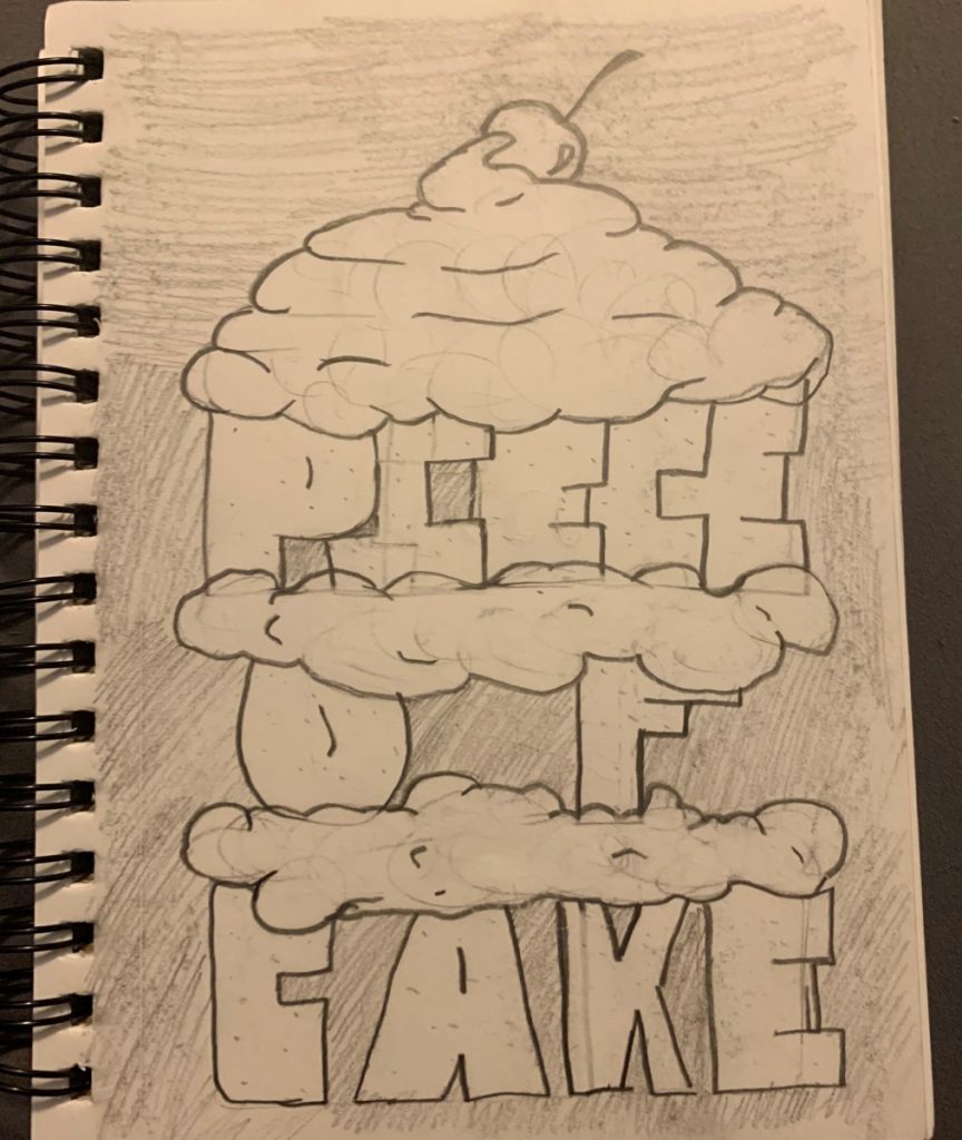
For this first sketch, it to be a bight fun illustration. I didn’t want all there designs to be a literal cake, so I decided on having the text “piece of cake” super bold with layers of icing in between to create the “cake.” This sketch was very rough and quick to jet the idea on the page in no way was this going to be close to the final design I was just really inspired by the general design and structure of it.

This second sketch I was thinking of a design that was a little less bold. I wanted elegant and straightforward I thought it would be a great idea to put lyrics from a muppets song in an exquisite and fancy design and text.

For this final sketch, I wanted something very minimalistic and trendy. From the three drawings, this one is my favorite because it’s a slice of cake which I was very pleased about. I wanted this design to have a lot of bright colors to add the bold and fun part without the design being crazy.
Final Postcard Designs

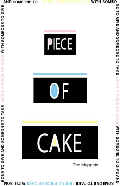
For this postcard design, I took a detour from the first sketch I created. I decided to go a more minimalistic design that what I sketched. For this illustration, I used light Helvetica font wrapped around the border of the model with “piece of cake” separately on each tier of cake with simple lines between to represent the icing on the cake. For the colors of this design, I opted for black and white with contrasting pastel colors.
For the second illustration, this is where I express my creativity. Out of the three I wanted this one to be the most bright and fun and childlike. This design ended up being nowhere close to the sketch that inspired it. For this one, I used regular Helvetica font for “life’s a …” and for ” with someone to give and someone to take.” For the word cake, I used white ad very light grey to design the word ‘cake’ as icing that would be on a cake which all sits on a Getty image of a family together enjoying the cake.
For the final illustration, I am the most pleased by this one. For the text, I chose skinny Helvetica white text on a black background with bright pastel piece of cake illustration. This postcard design reminded me of a lot of advertisements all over New York City with its straightforward designs. This design was what I was looking to achieve. It’s a postcard that people would buy for adults or late teenagers that is fun with a light massage but not look like its made for children in mind.


