
Google’s Logo History
Every day millions of people worldwide click on a site called “Google.” Since the past decades of Google’s development, it has changed from just a search engine to a huge corporation that owns social media sites, email, and even technology like phones and programs like Google Docs and Google+.

It all started September 15, 1997, Stanford University students Larry Page and Sergey Brin officially registered the domain name ‘google.com.’ During that same month, Brin designed Google’s very first logo on a little program called Microsoft word. The letters were blocky with very bright neon colors and bold red coloring underneath to create the 3d effect. At that period, Google was just Page’s and Brin’s graduate research project, was never intended for a real company’s logo. Eventually, in October 1998, Page revamped the logo giving it a new look, slowly getting like the logo that we all know today. He created the logo using free software called GIMP. The logo had a typeface of Baskerville bold font but with a different color combination of bright colors. Away went the blocky 3d lettering and in came drop shadow.


In 1999, Page and Brin found Ruth Kedar, who was an art professor at Stanford. Since then, Kadar eventually became world famous for creating a logo that is still being used on specific Google sites and has received many awards and artwork is showcase around the world. They enlisted her to create a website and logo after seeing her design style and ideas. According to Kadar, the duo was looking for a unique logo that was also playful and simple. In a 2008 interview with Wired, she was quoted saying “the idea was, ‘Can we create the sense of playfulness without having recognizable or identifiable objects that are going to end up limiting us?’ As a team, they picked a logo with a slimmer Catull typeface and more of a cohesive color combination that is still used today. Kadar came up with the combination of using primary colors of red, blue and yellow but decided for the ‘l’ to use secondary color green to show that Google is innovated and does not follow the rules. This design is probably the most recognizable since it was their logo for the duration of May 1999 to May 2010. The design at previously also featured an exclamation point but was later thrown out as it was too being not unique enough against competitor Yahoo.
On October 25, 2013, Google officially went flat. The logo loses its shadow altogether leaving the text looking a lot brighter and minimalistic but keeping the same primary typeface from 1999. By this time Google was becoming bigger and bigger by purchasing other companies and became a lot more than just a search engine. The company average was purchasing one company every week.
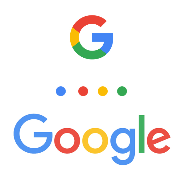
On September 1, 2015, the logo changed for a simple more modern era look. The logo design still has the same colors combination but with a sans serif typeface. This new logo is the most drastic change to the logo since Kadar developed the logo. These changes were done to be more comfortable for the eyes to see on the small screens of smartphones. They also design the Google ‘G’ and dots that feature the same colors. In 2015, The Google blog showcased this new logo by saying “As you will see, we have taken the Google logo and branding, which were originally built for a single desktop browser page, and updated them for a world of seamless computing across an endless number of devices.” Now that Google was a home name brand that showcased a simpler logo without having to say google. They have developed into a lot more than a website with their research and products and charities.
Bibliography
Frost, Aja. “The Secret History of the Google Logo.” HubSpot Blog, HubSpot, 24 July 2018, blog.hubspot.com/marketing/google-logo-history.
“Google Logo History Facts: 5 Things You Didn’t Know About the Iconic Logo.” Entity, 10 Mar. 2018, www.entitymag.com/google-logo-history-5-things-didnt-know/.
“Google’s Look, Evolved.” Official Google Blog, 1 Sept. 2015, googleblog.blogspot.com/2015/09/google-update.html?m=1.
Jones, Brad. “A History Of The Google Logo: How It Has Changed Over 20 Years.” Digital Trends, Digital Trends, 9 Oct. 2017, www.digitaltrends.com/web/history-of-the-google-logo/.
Lenssen, Philipp. “Ruth Kedar On Designing the Google Logo.” Google Blogoscoped, 14 Jan. 2008, blogoscoped.com/archive/2008-01-14-n16.htmlt.Ron, Chesky. “10 Amazing Facts About Google’s Logo Design History.” TechWalls, 30 Mar. 2018, www.techwalls.com/amazing-facts-google-logo-design-history/.

