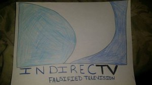
The photo directly below is my manipulated version of the DirecTV logo. This is almost identical to the draft I sketched a couple of weeks ago (also included below). For this image manipulation I used Adobe Fireworks. I preferred to use this program over GIMP because I am already familiar with it. The logo itself was not that difficult to manipulate. I say this because it doesn’t include very much. It’s clear and straight to the point. I also wanted my message and reason for manipulation to be clear and straight to the point, or “DIRECT.” I had to crop the original logo off of the bottom half of the original image, and then re-added an empty white box in which I retyped the revised logo. I used Fireworks to find the exact same color of the font used in the original logo, however, I was not able to find the exact style of the font. I researched thoroughly and came up empty. The font I ended up with was very similar to the original text, and since it’s supposed to be a revision of the actual logo, I didn’t think it was a big deal to not have identical font styles.
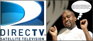
Below is an example of how I will use the manipulated logo. The finished product will be similar to a storyboard with images and captions. I chose Kanye West as the representation of a customer because I feel as though his facial expressions are amusing. I will be able to apply photos of him well. The images will express an excited customer to a disappointed and disgruntled customer. This is just one example of a photo in a series of photos and the direction the culture jam will be taking.
*These ideas may be subject to change.


