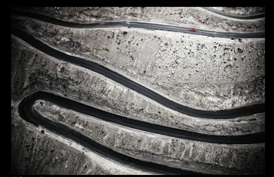
For this campaign, i choose the photographer Client Clemens, rather then the other two because what Client Clemens has to offer that the others don’t is a sense that you can go anywhere no matter the distance and feel good getting there no matter the look of the car, he gives you that feeling of adventure and where you go next is up to you but no matter where you go you will alway leave a trace behind because it was memorable for you. Its not pretty with green nature or show blurry lights in the background showing the speed of the car no thats too old fashion. This imagine above is just an example of what we might use for the new campaign because it gives you a sense of mystery,something original that we don’t see like where are you going, or is that a road? The way this image has mostly dark tones. The lighting of this image i would say is front light the reason is because ewe don’t see much shadow just the dark color around the image corners. We clearly see that this is a road, however is doesn’t show much of death of field just tones of grey, it just a small slightly depth of field at the bottom where it is more focus and a bit more shaper then the other lines. Lastlty this image was taken by overhead, low level view because if this is a road then they must have taken it from an unusual view and kind of like a birds eye view because of the way the lighting is glowing towards the center of the photograph then showing the car.
In addition all three photographer are great at there work but Tim Wallace photographer uses cars that are very experiences and they look awesome in the photographs but in todays world people don’t want to see what they can’t have they want to enjoy what they can have.

