Karin Fong

Karin Fong
By Co.Design
Karin Fong is a founding member of Imaginary Forces and she is a graphic designer. She was born in 1971 in the USA. She began her career with an art degree from Yale. She likes to find inspiration in everything from surrealism to Schoolhouse Rock, and it shows. She has directed movies, games, televisions, and advertisements. She has earned five nominations and two Emmy Awards.

The Island of Dr. Moreau (1996)
By Don Taylor
In 1996, Karin Fong was involved in the design of the movie The Island of Dr. Moreau. In this movie, Karin Fong’s team decided to focus on the eyes, to express the variation. They made animals’ eyes similar to different humans’ eyes to represent the variation of animals. They used different eye iris from animals to identify animal populations. This is a successful design. Wikipedia, The Island of Dr. Moreau (1977 film), “On review aggregator Rotten Tomatoes, The Island of Dr. Moreau holds an approval rating of 56%, based on 25 reviews, and an average rating of 5.1/10.” The audience of the film think that the materials are interesting. Karin Fong’s team had made a good design for this movie.

Black Sails (2014)
By Robert Levine, Jonathan E. Steinberg
For the television, Black Sails, Karin Fong was a creative director for it. The sculpture, soldier’s weapon, porcelain, the design of the ship and the lens using of Black Sail are beautiful. Karin Fong’s used 3D version for bone, buildings, seaweed and so on. It brought different views and feelings for audiences. The Black Sail used deep color to make the tone in somber. At this point, the Blcak Sails won 66th Primetime Creative Arts Emmy Awards in 2014, 68th Primetime Creative Arts Emmy Awards in 2016, 15th Annual Visual Effects Society Awards in 2017, and 16th Visual Effects Society Awards in 2018.

God of War III
By Sony PlayStation
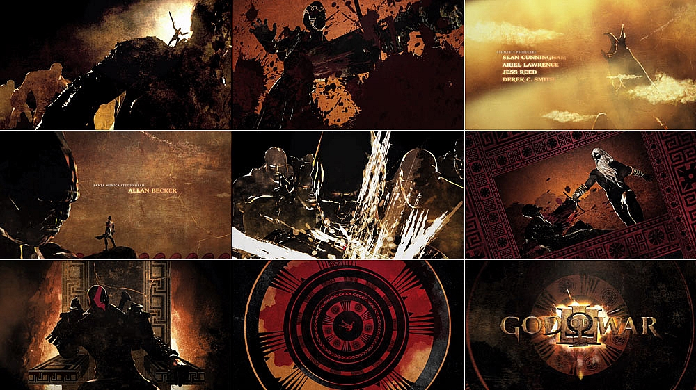
She also has helmed spots for Herman Miller, Target, and Honda in advisement. She has also created animation for the game God of War III and large-scale video installations for sites such as Lincoln Center, Las Vegas, and the LA Opera.
In conclusion, Karin Fong had designed a lot of successful projects. Her productions are having a unique style and impressive. As a founding member of Imaginary Forces, she brings her team into a higher place.
Reference:
Wikipedia, The Island of Dr. Moreau (1977 film), https://en.wikipedia.org/wiki/The_Island_of_Dr.Moreau(1977_film)
Art of the Title, Karin Fong, https://www.artofthetitle.com/designer/karin-fong/
Imaginary Forces, Director / creative director Karin Fong, https://imaginaryforces.com/director/karin-fong/
Art of the Title, The Island of Dr. Moreau (1996), https://www.artofthetitle.com/title/the-island-of-dr-moreau/#
Art of the Title, Black Sails (2014), https://www.artofthetitle.com/title/black-sails/
Caveman, Black Sails Wallpapers, Wallpapercave, https://wallpapercave.com/black-sails-wallpapers
Debbie Millman, Karin Fong, https://www.aiga.org/medalist-karin-fong
Watch the Title, Karin Fong, https://www.watchthetitles.com/designer/karin-fong


