This page includes some the works that I’ve done for my Graphic Design Principles class,
Understanding Simultaneous Contrast
Since my last update, I’ve done some more work involving color studies.
This piece of work was done to study how certain colors can look lighter or darker dependent on what other colors are around them. Simultaneous Contrast is based on the theory that a color can look lighter or darker despite being the same shade or tint, based on what colors are around it.
In this image, the two pieces on the top are simple designs, using orange as a control color, i placed them over a burgundy and cream background. One will note that the orange looks lighter when the burgundy is used as a background, compared to it’s darker shade relative to the cream background.
The two pieces on the bottom are similar in effect to the two at the top, but they use a more complex design to show how it might look in an actual piece.
At the very bottom is a palette line, showing all of the colors that the bottom pieces used. One will find it important to note that there is only one orange value, rather than two different shades/tints.
Color Triads
I created this piece for my Graphic Design Foundations class, and for the assignment, I studied color theory, mixing and profiling. We were to put together an image that demonstrated three different sets of color relationships, as well as taking a look at values and shades.
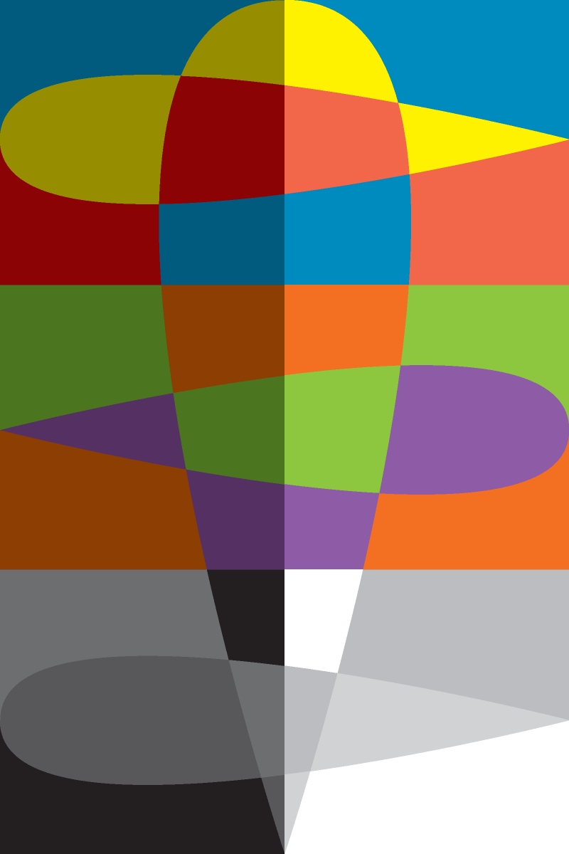
In this image, each of the values on the right half of the image are without any grey added to them for shade, while those on the left have grey added to them to produce a darker variant. Each section is also split into three rows based on the values used. The topmost row makes use of primary colors, yellow, red, and blue, the second row uses secondary colors, purple, green, and orange, and the last row is monochromatic, using only shades and tints of grey.
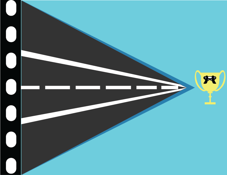
Personal Flag Project
 The piece displayed here was made for a project on creating art based on the wishes of a client. In this case, I created a flag based on the client’s personality and interests after talking with them. As part of the project, I was to take those traits, and represent them in a manner that was somewhat abstract, but still recognizable.
In this case, the client had noted that he enjoyed films, road trips, and e-sports. I chose to represent those in various levels of abstract representation. The road trips are represented by the center triangle, and taper out towards the right to represent traveling into the distance. The interest in e-sports was represented more literally, as I chose to use a trophy with a game controller on it, and the film was represented by the “film strip” running along the left side.
The client also described himself as extroverted, and I chose to represent that using the colors in the flag. In this case, it’s dominated by a light blue, which I used to symbolize the sky, and openness, both being elements related to an extroverted nature.

