Design Journal Entry #15

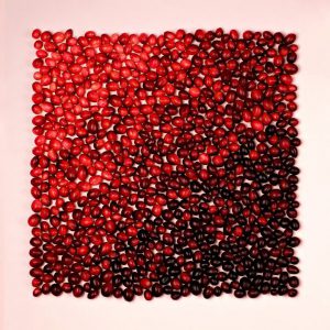
Value:

“Value is defined as the relative lightness or darkness of a color. It is an important tool for the designer/artist, in the way that it defines form and creates spatial illusions. Contrast of value separates objects in space, while gradation of value suggests mass and contour of a contiguous surface.”

Source:  Color, Value and Hue – Art, Design, and Visual Thinking
char.txa.cornell.edu/language/element/color/color.html

My definition: The relative lightness or darkness of a color.

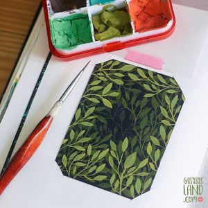
Gouache:

 “ɡwäSH,ɡo͞oˈäSH/
noun
a method of painting using opaque pigments ground in water and thickened with a gluelike substance. “

Source: Google dictionary

My definition: type of paints that use opaque pigments combined with water and thickened with a glue type of substance

Subway hiarchy


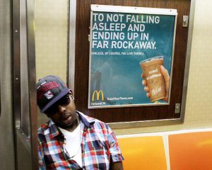
I like the way this ad’s visual hierarchy  interacts with people around it. I think it is successful because it is bold, all caps and works very much like coffee/ caffeine does- obviously this guy in front of the ad needs some because he most likely will wake up in Far Rockaway.3

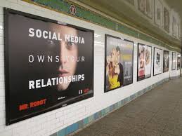
Mr. Robot ad uses visual hierarchy  in  the ad.  I see “social media” and “relationships” in bold then the image of the actor. Across the person’s lips reads in a much lighter line  weight “owns your” which  gives the impression of being a whisper.

I was automatically drawn to this poster in a rush, the vibrational pattern grabbed my attention immediately. This SVA poster uses repetition and movement to make a high vibration background, contrasting more solid looking “SVA” vertically placed letters stand out first, then “where art happens” in black smaller text and placed left to right.

Another current design student’s work that I enjoy

http://portfolios.pratt.edu/gallery/10794673/Career-Choice


This person’s name is Ryan Goldberg

Their career choice is Graphic Design and Typography.

I like the things that they are interested in: Website Design, Film Making, Illustration, Animation and Game Design.
I feel like they have a very good concept of what they like and where they want to apply their work. I like the confidence that this person gives off based on their E-Portfolio.  It seems like having skills in all of these areas will also give a variety of options or routes to take career wise.


Contrast at the Cooper Hewit Collection

I found these three examples of contrast below.


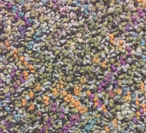
TEXTILE, PARADIS TERRESTRE (EARTHLY PARADISE), 1925

This is a textile. It was designed by Jean-Georges Beaumont andmanufactured by Tassinari & Chatel. It is dated 1925 and we acquired it in 1931. Its medium is silk and its technique is compound satin. It is a part of the Textiles department.


I like that there seems to be 3 patterns overlapping, using pastel colors to contrast each other. This looks like it could be couch material.I think that the colors and textures contrast each other as well as the figure ground when looked at closer.

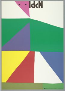
POSTER, INTERNATIONAL DESIGN CENTER NAGOYA: TANAKA, LATE 20TH CENTURY

This is a poster. It was designed by Ikko Tanaka. It is dated late 20th century and we acquired it in 1996. Its medium is offset lithography. It is a part of the Drawings, Prints, and Graphic Design department.

I like that this plays with off white and primary colors as well as  different geometric attaching shapes. it has great use of contrasting primary colors as well as geometric vs. organic shapes.


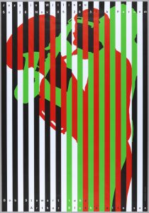
Matt Flynn 006

This 3rd one:  is very visually appealing and take a bit of focus to figure out what this image is. I like that it plays with bars, black+white as well as the bright green and red then how these colors are all mixed in together differently throughout . My eyes are playing tricks on me!

The perks of being a student at City Tech

After doing some research, I learned that City Tech has a TON of perks for the students who go there: free garden & museum access, a bunch of food and restaurant discounts and access to free healthcare related services.

Free gardens and museums:
American Folk Art Museum
*
American Museum of Natural History (general admission)
Bronx Museum of the Arts
Bronx Zoo (college students enter for free)
Brooklyn Museum
The Cloisters
El Museo del Barrio
Green-Wood Cemetery
International Print Center*
Jamaica Center for Arts and Learning
Leslie-Lohman Museum of Gay & Lesbian Art
Metropolitan Museum of Art
MoMA & MoMA PS1
Museum of the City of New York
Museum at the Fashion Institute of Technology
National Museum of the American Indian—Smithsonian Institution
The Public Theatre’s New York Shakespeare Festival
Queens Botanical Garden (free from November to March)
Queens Museum of Art
Sculpture Center
Socrates Sculpture Park
Storefront for Art & Architecture
Studio Museum in Harlem


Food/Restaurant Student Discounts:
1. Arby’s: The next time you are craving a Beef ‘n Cheddar at 2am, you can save 10% off your entire meal when you whip out your Student ID.
2. Buffalo Wild Wings: At many BWW locations you can score 10% off your meal. Just ask!
3. Burger King: Who knew The King handed out deals to students? Not I. But yes indeed, you can use your Student ID to get 10% off your next meal.
4. Chick-fil-A: Thirsty? Use your Student ID to get a free drink when you buy anything at Chick-fil-A.
5. Chipotle: The next time you get a burrito the size of a log, use your Student ID to score a free soft drink.
6. Dairy Queen: From Consumer Reports, “High school and college students are eligible to receive a discount card or a “Student Meal Deal” at participating locations. The amount of the discount depends on location.”
7. McDonald’s: At many golden arches locations you can use your ID to get 10% off your purchase.
8. Pizza Hut: Flash your Student ID and get 10-20% off your next pie. Amount depends on location.
9. Subway: At participating Subway locations you can use your Student ID to get 10% off your subs, salads, and snacks.

Free soda with purchase at Chipotle!


City tech students are also entitled to free health related services:
• Free Nurse services available during office hours;
• Free Physician services available Thurs: 10-12;
• Campus-wide health related activities and informational tabling;
• Free IMMUNIZATIONS for uninsured students (MMR, Flu, TDAP and HEP B; PPD test available). Some restrictions apply. Immunization Clinics advertised accordingly;
• Private breast pumping room;
• Free condoms;
• Free Chair Massage Tues & Thurs: 12-2 and Wed: 4:30-6, on the first floor Atrium;
• Health insurance information;
• Annual BLOOD DRIVES;
• Workshops and classroom presentations by request;
• Annual Wellness Festival

Thumbnail sketches


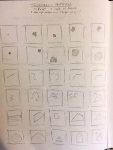
It’s important and very useful to draw out thumbnail sketches to play around with different ideas, shapes, designs, line weights and much more before starting any creative project. Drawing out thumbnails allows for less error when  working on a bigger frame or only 1 draft… In fact, much like creating written material,  I think that thumbnails are drafts for visual art mediums.

Goals


My goal is to learn the basic concepts of graphic design, so that I can incorporate these skills into my interests of making things. I hope that by the end of this class I will be creating things that look much cleaner, more focused and in a way that makes it clear for the audience to understand my perspective & thought process.

I find that a lot of tattoo art is very inspiring. One of my favorite shops – BangBangNYC has a lot of great artists in the Lower East Side. Aside from having it’s own special meaning for the tatted person, it can open up dialogue or social connections to others that may have not connected to otherwise. Other things that inspire me are Interior design, self-sustainable lifestyles, accessible healthcare and community organization.

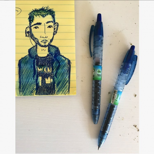
My preferred design process starts with illustrated sketches on whatever paper is nearby when ideas come up (napkins, newspaper, lined paper…)
I like to work with smaller notebooks. I use mostly pilot pens and use spit to smudge, fill in, shade and/or color. Most of the time my design process is spontaneous, and planned when there is a drink n draw on my calendar.

I would really be interested in collaborating on creating tattoo designs, skate decks and types (short, long, short/long…), interior design related things ( prints, layout planning and multi-use furniture)


Save

Save

Save

Save