

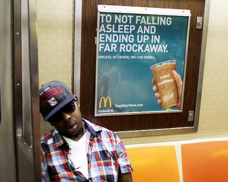
I like the way this ad’s visual hierarchy interacts with people around it. I think it is successful because it is bold, all caps and works very much like coffee/ caffeine does- obviously this guy in front of the ad needs some because he most likely will wake up in Far Rockaway.3
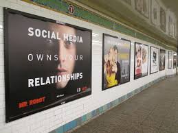
Mr. Robot ad uses visual hierarchy in the ad. I see “social media” and “relationships” in bold then the image of the actor. Across the person’s lips reads in a much lighter line weight “owns your” which gives the impression of being a whisper.
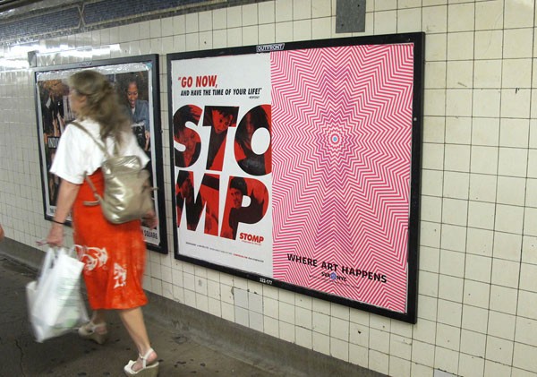
I was automatically drawn to this poster in a rush, the vibrational pattern grabbed my attention immediately. This SVA poster uses repetition and movement to make a high vibration background, contrasting more solid looking “SVA” vertically placed letters stand out first, then “where art happens” in black smaller text and placed left to right.

