Postcard 1
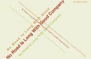
In this postcard 1 I use the font Helvetica
and place the texts cross from different
direction because I want to design it to looks
like a Swiss style. Also I use threes colors for
the text on each line with different size
type in order to make hierarchy.
Postcard 2
In this postcard 1 I use the font Gill Sans.
I design this postcard simple and clean.
I put hierarchy on the text. Bold on the
word “company” because I think this word
is more important and meaningful from the quote.
Postcard 3
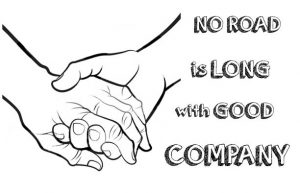
In this postcard 1 I use the font Orange
Juice where I download online. I use a
sketch showing two hands holding.
The reason I use this sketch is because
I think this show the meaning of friendship
and together.


