Concept in Illustration

Featured

Class

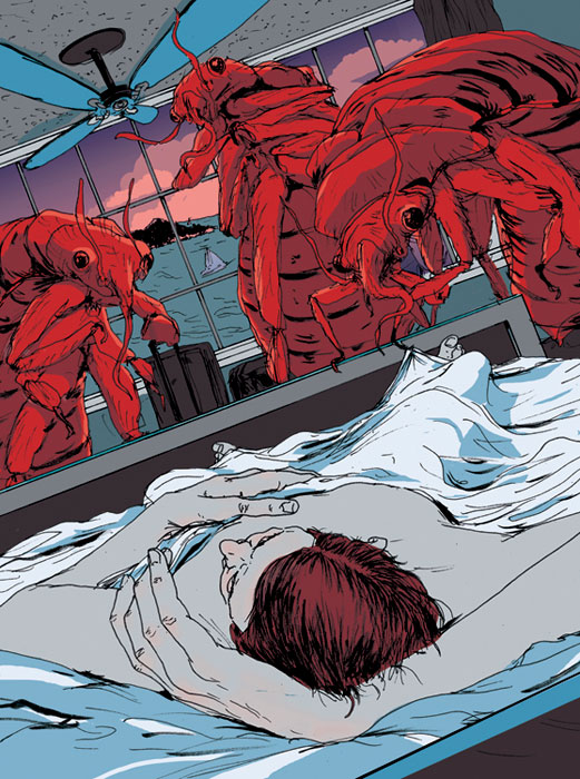
Find an editorial Illustration you admire. Such as this amazing illustration by Mike Byers on the topic of Bed Bugs.  🙂   Read the subtext about the illustrations and where / how they were used.  Analyse what metaphors they chose to illustrate the subject matter. Observe the way the artist has conceptualized their subject.

Pay attention to what methods they have used:


Fusion

Juxtaposition

Replacement

Exaggeration

Symbolism

Displacement

Period Imagery

Style


Here’s a few places to start looking:

https://society+of+illustrators+competition+editorials

http://theinspirationgrid.com

https://www.creativebloq.com


But most of all, just look.


SARA

Marcos Chin’s insight into editorial Illustration process

Hello Class-
Illustrator Marcos Chin an award winning artist whose work has appeared as surface and wall designs, on book and CD covers, advertisements, fashion catalogues, and in magazines.  His editorial illustration work has appeared in Time, Rolling Stone, The New Yorker, GQ, Sports Illustrated, The New York Times and others.  He recently posted about the editorial process he learned in school and how his process has evolved.  Check it out!

Marcos Chin Process

Whenever I work on editorial projects I distill the brief, or article into one or two simple sentences because it helps to focus my imagery towards communicating the essence of the story. I learned this from my teacher in art college @pauldallas_art … Nowadays I sometimes I go even further and distill the story into only a few words. I learned this method of working while teaching alongside my friend @chrisbuzelli who taught me to locate the action within the story and then visually describe it. Doing so will aim to help create pictures that have a strong idea and immediate read without being too obvious, or cliché… I’ve incorporated this way of working into my illustration practice and now I feel like I have a new super power 

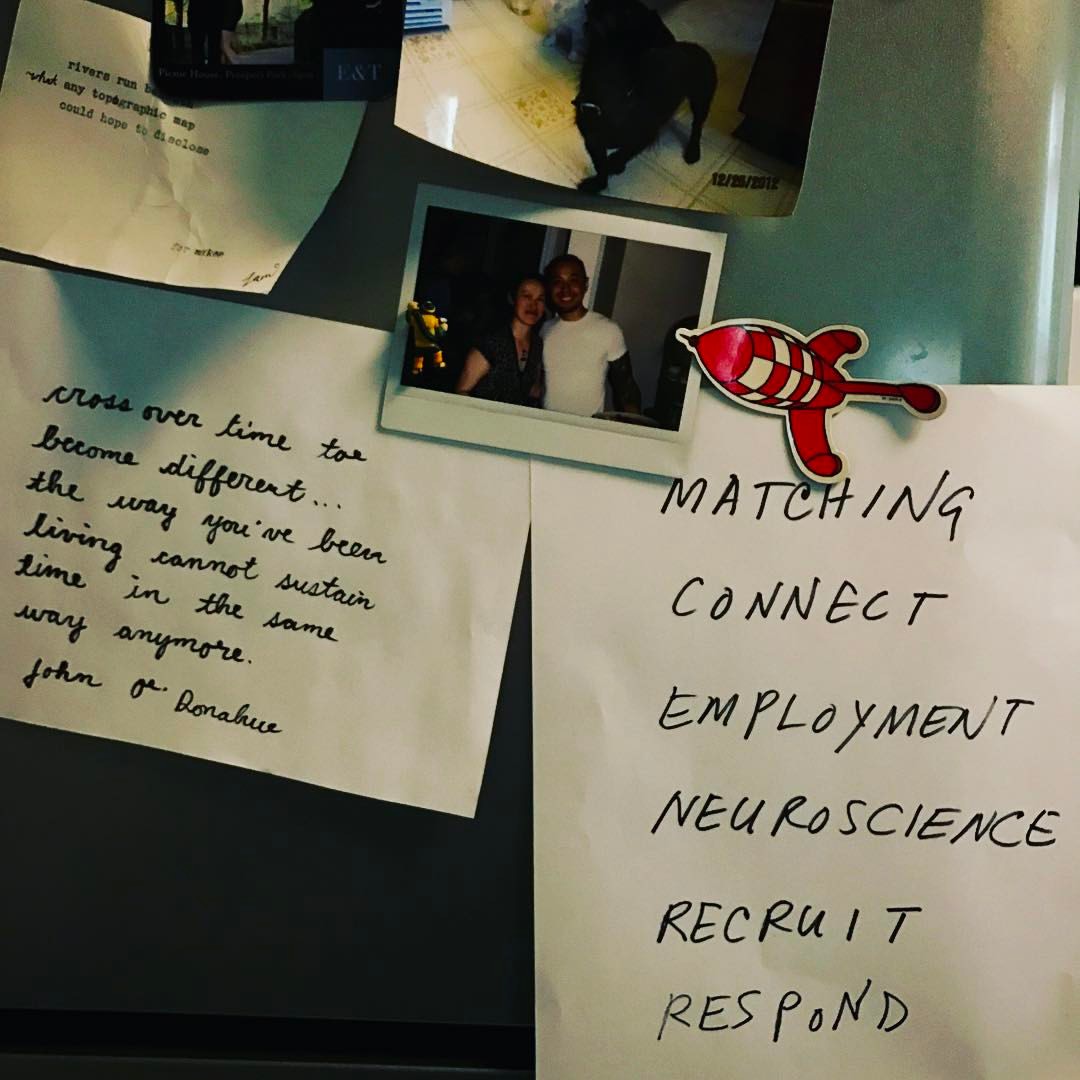
I’m going to have this piece of paper up where I can see it while I brainstorm concepts for an editorial project I’m working on right now. #marcosprocess #match#connect #respond #ocaduillustration


Week 2 – How Next Level Design is Driving the Beer World

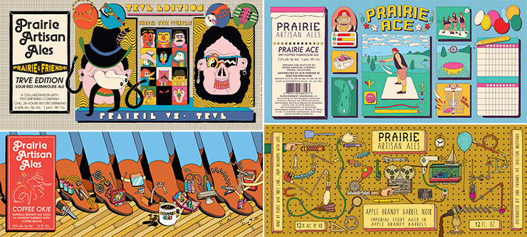
This Article by Veronica Meewes for the online design magazine PUNCH, explores the “new generation of eye catching label design” with a close up on five example breweries and the inspiration behind the labels that have become “ their visual calling card.”

After reading this article, consider how YOUR label design is a visual calling card for the product.  

  • Write a few sentences describing the intention of your label.
  • Find a label design which uses illustration in a manner you find interesting, eye catching or inspirational.
  • POST the designs along with your comments on them for DISCUSSION next week.

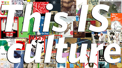
Week 2 – John Hendrix, This is Culture.

Please Read John Hendrix, This is Culture.

THEN, RESPOND TO IT IN OUR DISCUSSION FORUM:

In a few sentences discuss the article.  Consider questions like:

What does Hendrix Define Illustration as?

What does he mean when he calls illustration a powerful, profound, and unpretentious shaper of our visual lives” ?  

Be sure to read eachother’s observations BEFORE posting your own.