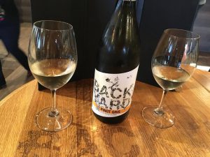
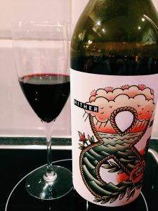
Two illustrations that I am very fond of are from these wine bottles. One is from Backyard Vineyards Wine, and the other is from Hither and Yon wine. The first wine bottle from Backyard Vineyard was Illustrated by Fabien Barral. What I like about the design was that The words looked like a garden, and was wrapped in vines, making the artwork so live like. For Hither and Yon Wine, the illustration was done by Chris Edser. I really loved the artwork there because the Ampersand or the & symbol was designed like a tattoo in my Point of View and the detail caught my attention. The Colors from this bottle label goes from Light to Dark which I really love the most
COMD 2313 Illustration 1, FA2017
Just Another WordPress Site


