This whole endeavor was a great experience. I learned more on being a creative, Visual metaphors and how to communicate with parents. In Faculty Commons, I saw a new view of the college and the process of advertising. I loved the communications between the clients as well as the communications I’ve had with the senior designer mentors. Overall everyday , was a new experience and something new was learned.
Entry 16
Have you ever reached the end of a project, or work and wished it continued? This was the lukewarm feeling I had in the final weeks of my internship. I was happy that I finished, not because I hated it but because by the end of the semester I knew that all my other classwork and projects would soon overwhelm me. The internship, however, was so fun, although I haven’t met anyone in person since I started in the summer; I got the chance to meet everyone during the holiday party. Everyone was friendly and we joked a lot about school and the fact that now I was basically the only one on the design team that was a student. Ending the internship on a pleasing note made all the work I’ve done over the semester even better. For my client the Dental Hygiene Clinic, I finished the work for them right on the reading day. It was such a relief to see all my hard work pay off.
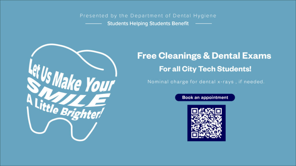
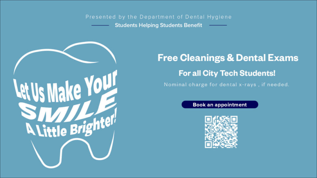
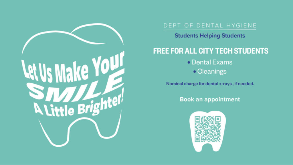
Ironically, despite it being done and the client loved it, I still felt like I could further the design. For my second client the Eyeglasses clinic, I did not finish till the last day of the internship. The client didn’t answer my emails till the last moment, which was very frustrating. However, I finished the final pieces and emailed them to them. Hopefully, soon everyone will see those designs on the tv monitors of the Academic, Naam, Pearl, and Voorhees Buildings.
Final Presentation
Entry 15
This is App Review week and for this week I wanted to review one of the apps I found. That app I found was Clip Studio Paint. Some may not know but despite me being a designer, I love to illustrate and design characters. I usually draw traditionally, which is paper and pencil, but wanted to learn how to draw digitally. This year I entered the world of digital illustration and was looking for an app to draw in . Some people recommended Photoshop, but I felt it was way too complicated others Procreate, however I’m not really an apple person. Finally One of my favorite art youtubers recommended Clip Studio Paint. Ironically It was around 4th of July and Clip Studio paint was having a Presidential sale, and I bought the entire Program.
Ive been using Clip Studio Paint for 6 months now and I am in love with the program. Clip Studio Paint is an Illustration interface, where people create illustrations as well as manga’s and comics.

This interface is well known for its amazing assets and effects that make it amazing. To me it is a simplified Photoshop when it comes to illustrating with additional features. When you first open the interface you are on the home screen, which shows your recent pieces of works on the top and below that all the new updates and information that you might want to know.
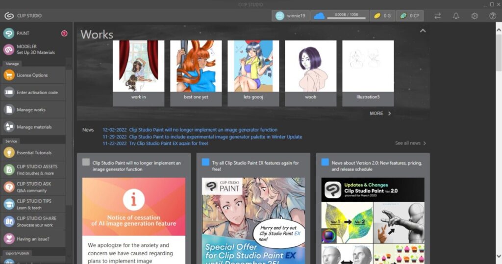
On the left you have a toolbar with licensing info, Managing your works and materials and other services. Under the services tab you have essentials tutorials, which is a basic tips on managing the interface and the tablet you might be on; for me I have a Huion Tablet and it was very helpful when starting the program . It basically there for beginners and those who never used the program before.
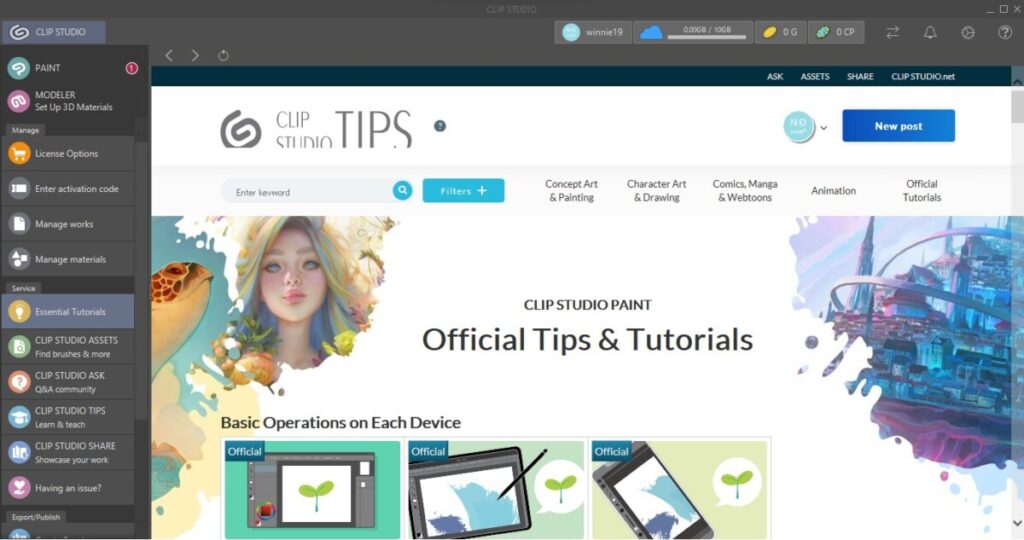
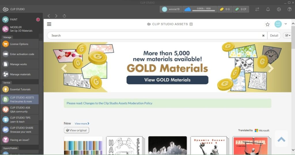
Secondly you have Clip Studio Assets which is where you can find anything you might need for your illustration. Brushes,Pens, Gradients, Objects, 3d aspects and more essentials. I go there for the assets that I don’t want to spend that much time on for example lace or any specific brush I might need.
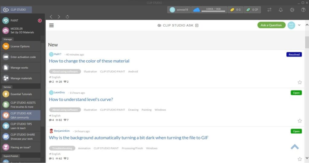
Under that is Clip Studio Ask which is a Q&A board where you can ask others using the program any illustration questions or advice on illustration. I really love this aspect of being to communicate with other illustrators and ask them any question you would like and everyone using could responds and give you advice.
The other two below that is Tips ad Share. Tips are where anyone using the app could share a video on how they make their illustration. Whether it be how they make a background or how they color a specific way. Share is basically a page where you could share the most recent work you did and get feedback and support from the illustration community.
To get to the workplace you would click the Paint option at the top left corner which would lead you to the workspace.
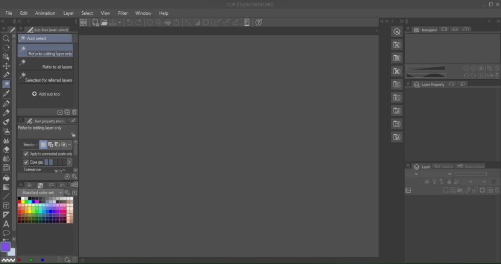
There you will find on the left a Preview window which shows the whole piece as your working, the Materials menu and the Layers menu. The Materials menu has assets you can use to make your illustration precise, for example they have 3d models just in case you need to get a pose right or 3d rooms so that you can see perspective.
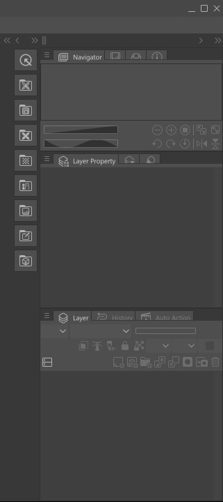
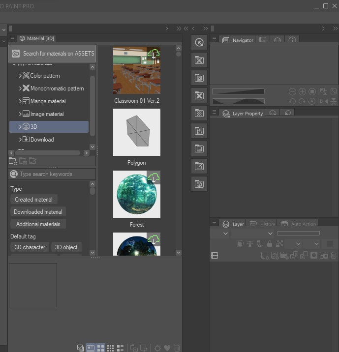
On your right you have your toolbar , tool effects and at the bottom your color menus.The toolbar contains the pen, selection tools, pencils, the move tool, the perspective tool, paintbrush tool, background/effects tool, the eraser, warp tool, gradient tool, shape tool, text tool , and textbox tool. The tool Effects bar contains stabilization , and size. Lastly, on the left is the color menu which includes the color wheel, the standard color sheet and a whole spectrum of color.

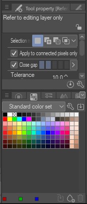
Overall the entire app/ interface is amazing and I recommend it to all Illustrators, Comic book/Manga creators, and others who just enjoy illustration.
Entry 14
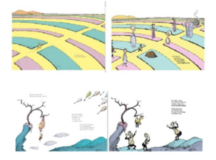
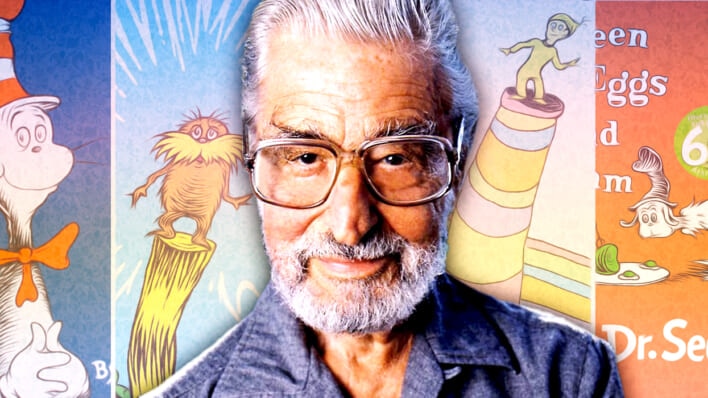
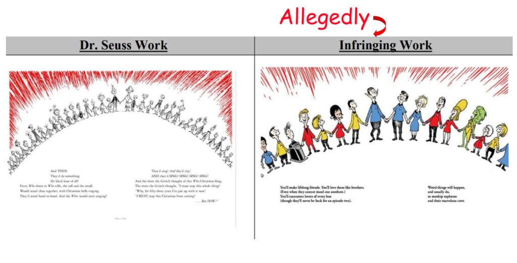
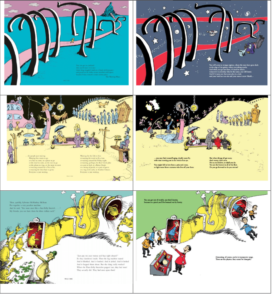
Studying Ethics is an interesting thing, its interesting to see everyone different opinions and thoughts on each topic. Its a question on deciding which side is the good person ad which side is the bad person based on the evidence but also on your moral beliefs. The Case Study I’ve chosen to discuss is the “Dr Seuss Enterprises vs. Comic Mix. Dr Seuss is a well known child book author that is known for his rhyming and illustration style. In this Case study Dr Seuss Enterprises sue Comic Mix for copyright infringement of “Oh The Places You’ll Boldy Go!” In which Comic Mix claimed their book to be a parody of the Dr Seuss book. Some may see it as a parody, however for me , the books are way too similar in layout, illustration style, wording and imagery. It feels like exactly the same book here so I believe that Dr Seuss is in the right.
Entry 13
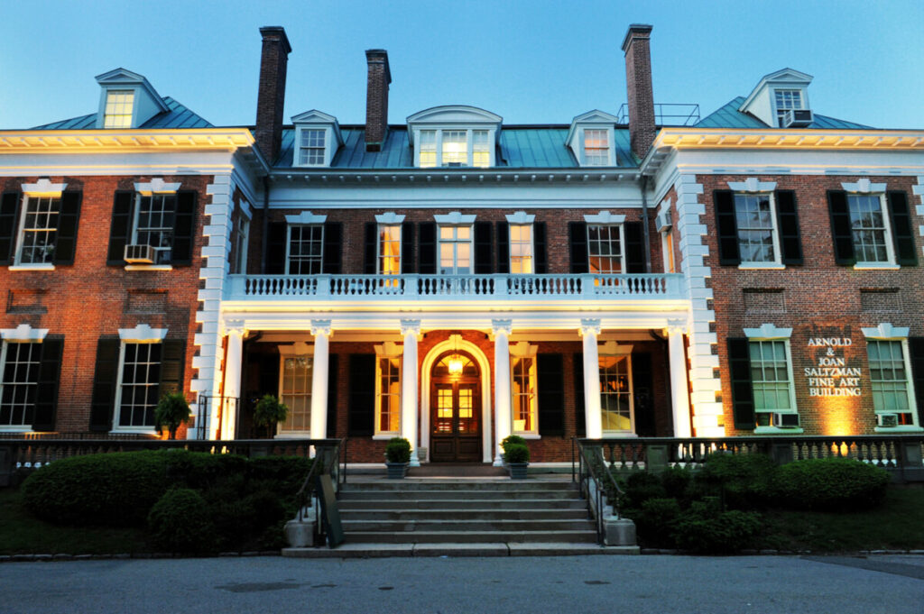
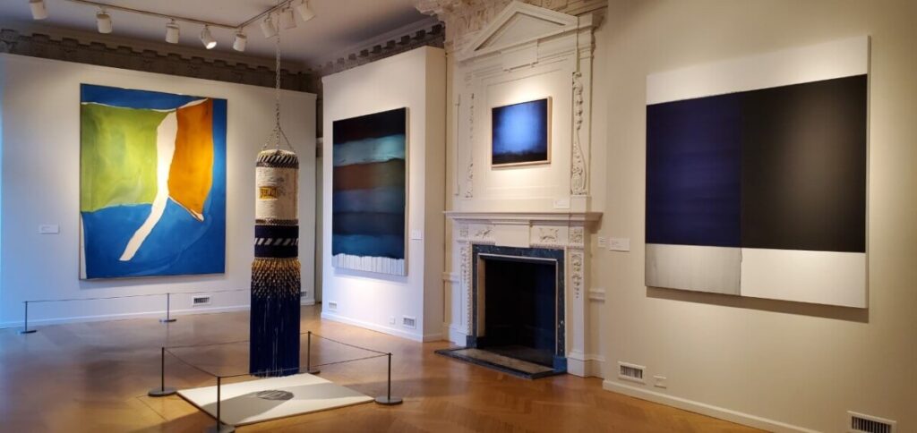
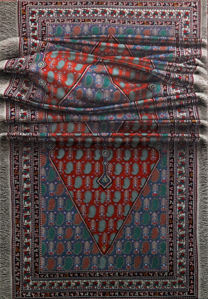
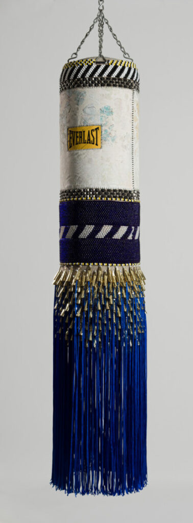
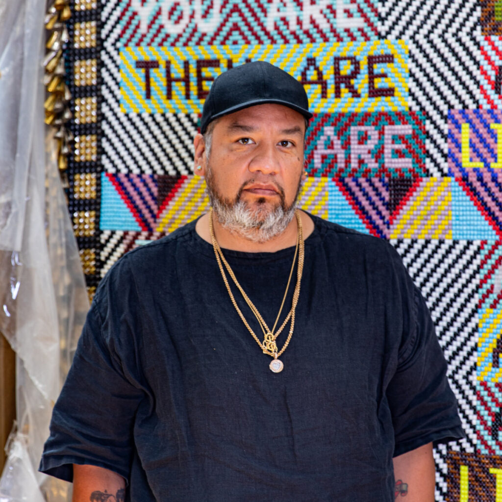
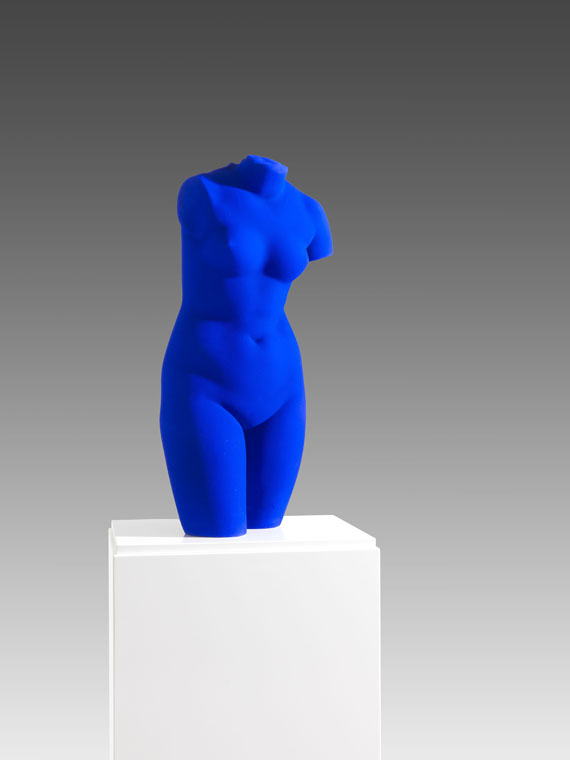
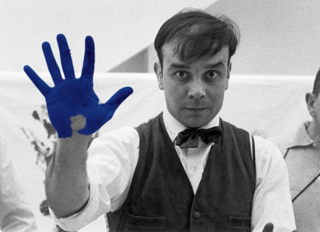
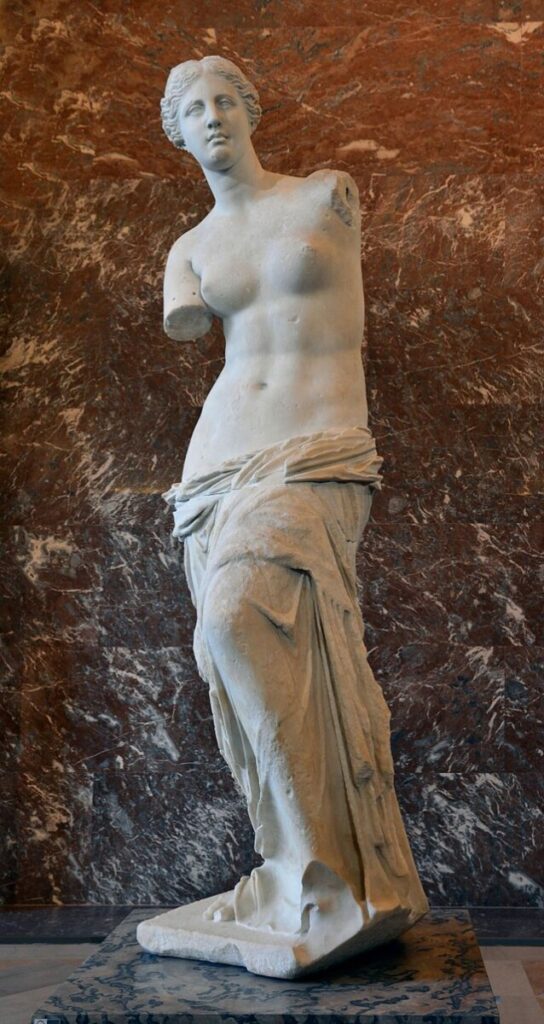
Have you guys visited a museum? I have an Its something that most people find boring but , I really enjoy. So when I learned that we were not going to be able to attend the Museum of the City if New York in person I was a little bit disappointing. However we attended a virtual tour of the “Blue ” exhibit at the Nassau Museum of Art, that is located in Roslyn Harbor, NY. The “blue” Exhibit was presented by the curator and director of the Nassau Museum of Art , Dr Charles A Riley. He presented what he calls the “blue period”, which are all the aspects and paintings within the museum that are the color blue. I think that the music and the paintings paired together with his explanations, prevented the virtual experience from being extremely boring. Within this exhibit I loved the paintings by Antonio Santin, the punching bag by Jeffrey Gibson and the piece by Yves Klein. The piece by Antonio Santin is called “Toast to Ashes” and is an oil painting on a canvas that is 215 x 150 cm. I love how realistic the painting looks. To be honest while taking the virtual tour I actually though they just hanged rugs and called it a day, I was shocked to find out later that this is a painting. The piece by Jeffrey Gibson is called “Deep Blue Day”and is a vinyl punching bag that repurposed with recycled wool blanket, repurposed painting, leather fringe, tin jingles,and beads to create an amazing piece. What I like about it is the fact that he used something completely unusual to create a piece of art. Finally , the piece by Yves Klein is called” Venus Bleue”, is Dry blue pigment in synthetic resin on a plaster statue of the Venus. This Venus is 27 1/8 x 12 ½ x 9 7/8 inches, and blue however the original Venus de Milo is Made of Parian Marble and is larger than life size, standing 204 cm (6 ft 8 in) high. I loved how dramatic the color looks on the Venus, It so a deep blue and is so calming.

Entry 12
Have you ever been nervous to present? The knowledge that I was about to present to people within the advertising agency made me so anxious. However I pushed through it and presented the best I could. It probably didn’t help that we were presenting first and that they had asked our group questions , but not the other groups. It was interesting to see all the other ideas that the other schools (Tennessee State University and the University of Illinois) came up with and the different approaches that they had. In the end even though we didn’t win, it was a great networking event. The company hosting the event; Omicron Health group sent out a sheet of all the students and people within the industry, so that we all could connect on LinkedIn . Not only that but they gave us all a lesson on how to break into the advertising agency and spoke on some of the difficulties that they faces to reach where they are. Later on in the week we met up with the heads of the company and they gave us amazing feedback and said that they were not going to forget us. They were going to pair us with someone within the agency, to help us break into the industry and to help us career-wise. Not only that but for those within our group that were seniors and graduating, they were going to skip the line of those applying to the company and get first dibs on interviews to get whatever job within the company. For those who were seniors but not graduating till later, we were also getting that opportunity, but also we were going to get a paid summer internship at the company. Below is one of the Instagram ads created for the event.

Entry 11
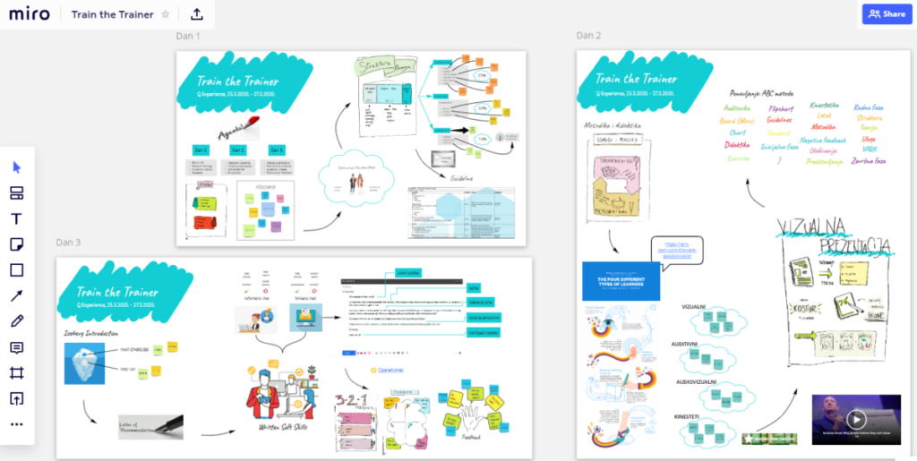
Over the last four weeks, I’ve been attending a network event which was a design competition. This design competition was hosted by Omicron health group, who are a healthcare marketing and communications network in New York City. For the event I was working in a group with 4 others students from City Tech and was advised by Professor Josh Kapusinski, who is an Assistant Professor at City Tech , and teaches motion design at the college. The third week we prepped for the presentation that would be presented the 4th week. Over this whole process, I learned more about group work, and how work is managed within an agency. Due to the fact that our schedule prevented up from meeting in person, we created a group chat, as well as creating a workplace in Miro Board to communicate and share ideas. Miro Board is a visual platform in which a team can write down ideas, create post its and share ideas. It basically like a digital whiteboard . On the Miro Board first we identified our audience, who were young adults ages 18-25. After, we started to brainstorm reasons why our target audience might not take the booster. The reason we came up with was that, there was no longer an urgency to get the booster despite the rising risk. Lastly was came up with a concept of how to reach our audience. Which was to focus on their desire for being in control of their life; we decided to reach through an app, a filter on Tiktok, and ads on both Tiktok and Instagram.


Entry 10
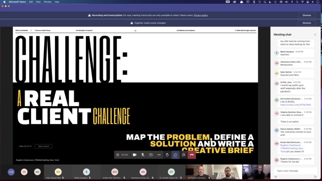
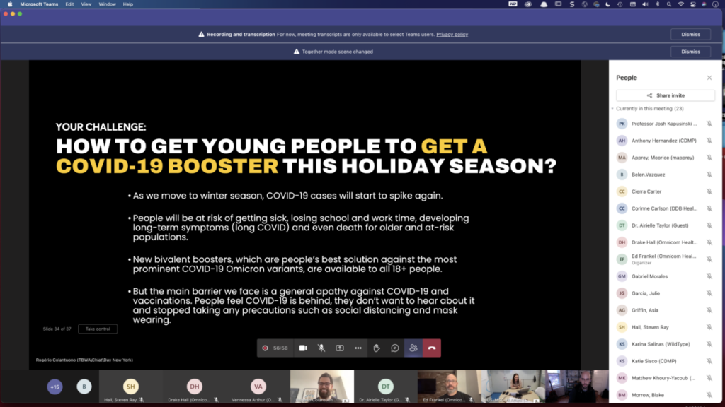
Over the last four weeks, I’ve been attending a network event which was a design competition. This design competition was hosted by Omicron health group, who are a healthcare marketing and communications network in New York City. For the event I was working in a group with 4 others students from City Tech and was advised by Professor Josh Kapusinski, who is an Assistant Professor at City Tech , and teaches motion design at the college. The second week we learned about target audience and how defining your target audience helps reach them effectively. At the end of the slideshow, One of the employees of the company introduced the project and the challenge we were answering. We were to find a way to convince young adults to get the booster as the holidays approach. Not only that but they paired us with two advisors to help us along the way. Our two advisors were Corrine and Matthew from DDB , which is one of the advertising companies under Omicron Health Group. They helped guide out though process and helped motivate us to push forward.
Entry 9
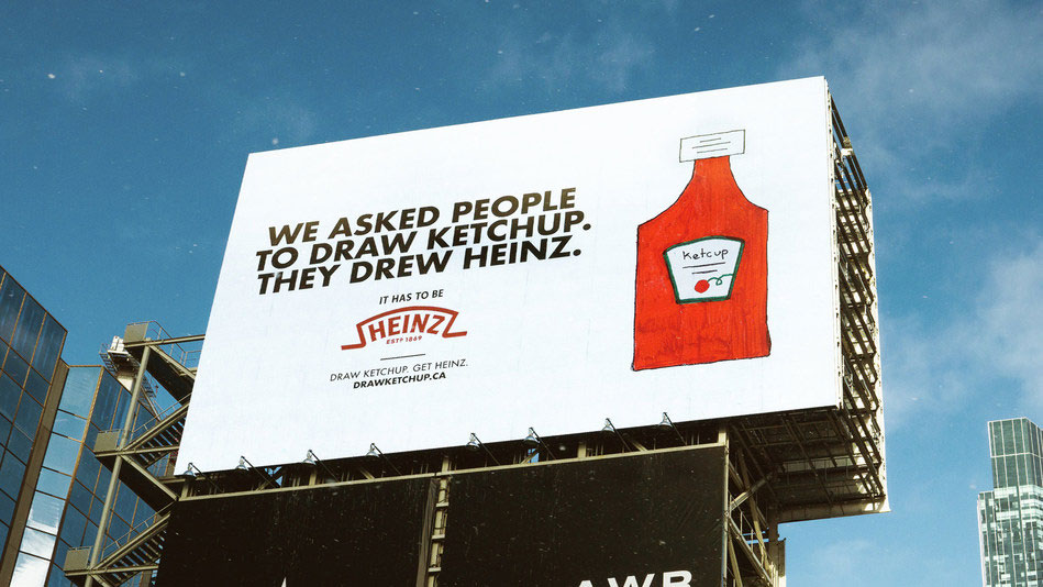
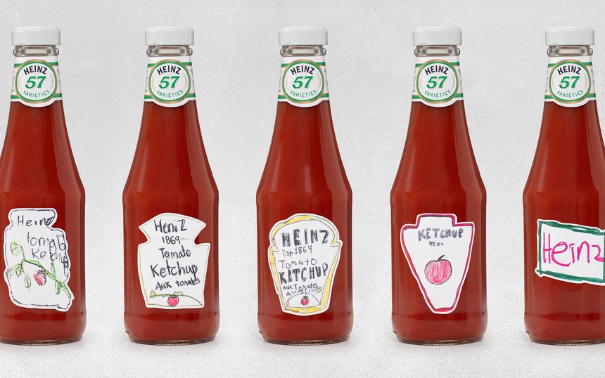
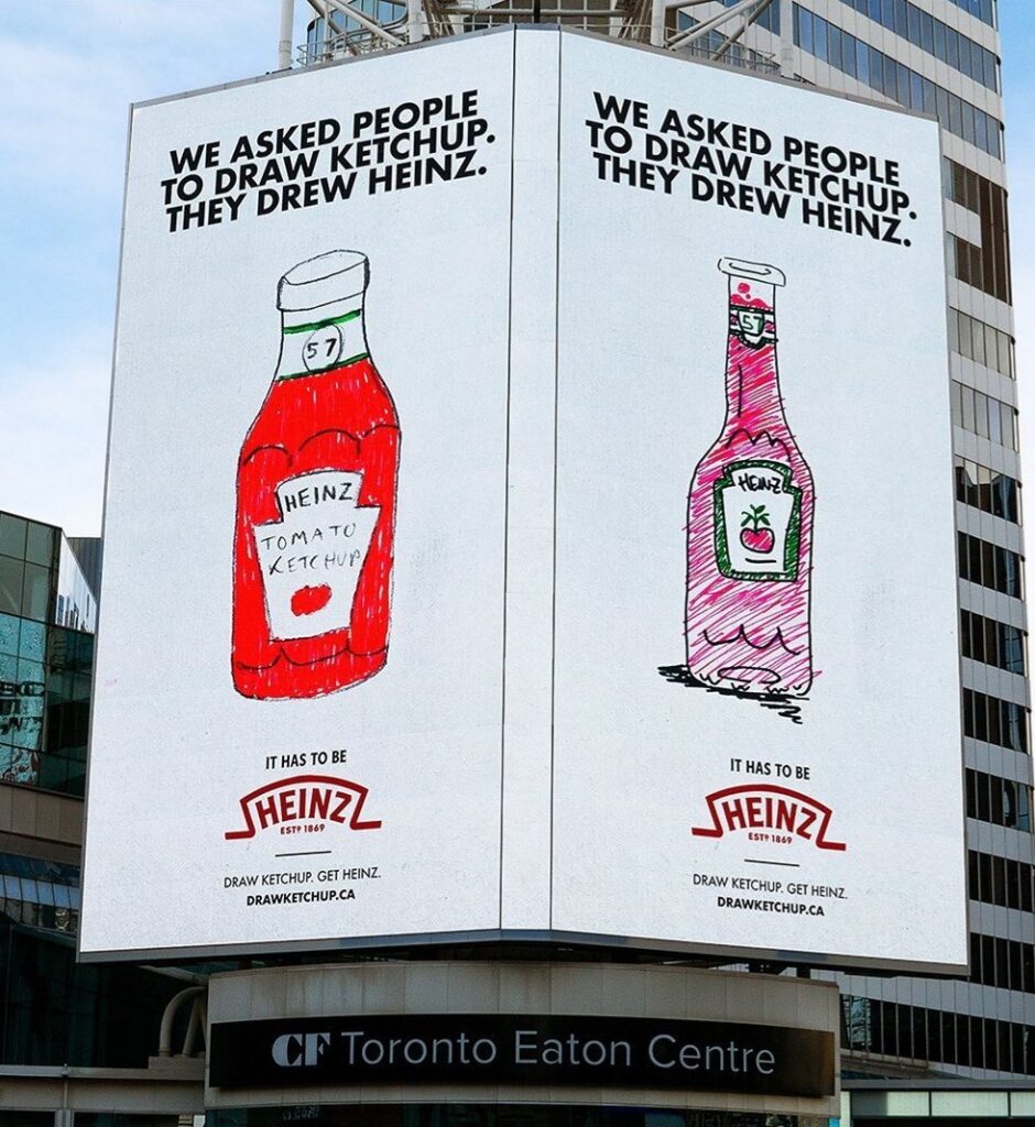
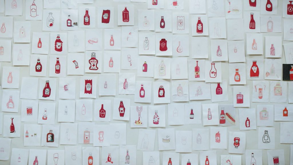
Over the last four weeks, I’ve been attending a network event which was a design competition. This design competition was hosted by Omicron health group, who are a healthcare marketing and communications network in New York City. For the event I was working in a group with 4 others students from City Tech and was advised by Professor Josh Kapusinski, who is an Assistant Professor at City Tech , and teaches motion design at the college. The first week we learned on culture and how it relates to design. One thing I remembered from the first week was a campaign they showed on ketchup. At the end of the video/campaign they realized that when everyone hears the word ketchup, no matter from where you are, you think of Heinz. They had asked everyone around the world to draw a ketchup bottom, and ironically and funny enough all the people drew Heinz bottles. Heinz used some of the drawings as their ads. What do you think of when hear the word ketchup?
