March 11th,
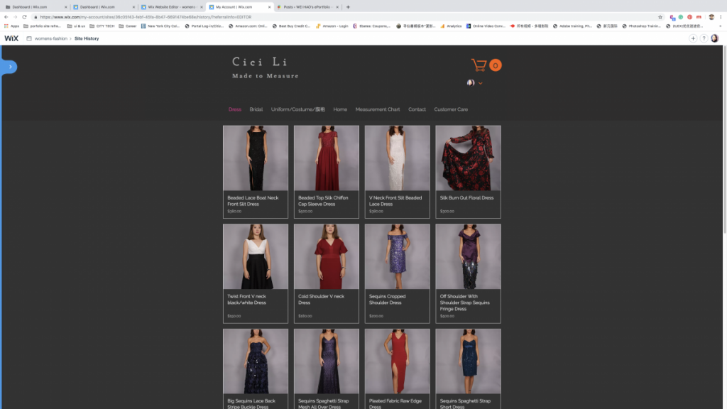
After evaluating the existing website from my client and researches from others, I collected some issues need to fix.
 Home page of the existing website
Issues:
- The whole page layout is boring, needs a more exciting layout.
- The overall color theme is too dark, color contrast isn’t very strong.
- The branding needs to work on it.
- Navigation and the website’s workflow needs to fix.
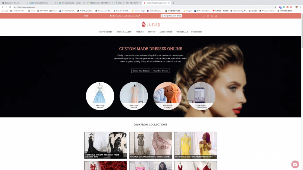
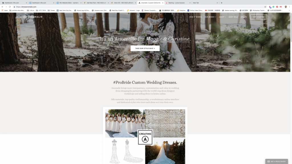
Research from other custom made dresses website:
- Use a clean bright background
- Clear color contrast
- Uses not only san-serif fonts but also serif fonts to fit the classic and fashion topic.
- A clear “call of action”
- A well-formatted grid system.
 Example #1 Lunss Custom Made Dresses Online
 Example #2 Anomalie Custom Online Wedding Dress
Solutions:
- Planning a site map and user flow
- Changing the layout
- Change the color theme
- Fix the typography


