Project #3 10/17:

“A defining characteristic of New York City is its economic diversity, the juxtaposition of people of disparate circumstances in limited space.”

“The gap between top and bottom is greater in New York than in most cities in the country and people at the extremes often live closer together.”

“And as the population swelled and real estate price soared and crime wanted, the affluent pushed deeper into neighborhoods they had once shunned.”

All of these three passages are stated form the article,”Here, Poverty and Privilege are Neighbor; Income Gaps are a Source of Resentment and Guilt” by Janny Scott and all support each other because in New York City, it’s always a busy city and very crowded with people as the population increase. Therefore,  New York had to restricted the limited space it has left. With all the people currently living in New York City, all streets, houses and buildings are very close to each other even the neighbors do either live extremely close or living together with no choice, considering to the limited space that I’ve talked about earlier. Most New Yorkers would describe New York City very expensive for the real estate price soaring, tight for the building and/ or other facilities being too close to each other and somehow rarely unsafe for all the crime happening around the streets and it could be any day now hearing police sirens suddenly appearing out of nowhere. These passages describes the life of New Yorkers  and knowing that one day after another will never be the same.

project 3: Juxtaposition

 I was eager to discover the other Las Vegas, the real Las Vegas

While this quote isn’t about New York, it certainly relates to it. Vegas has the same style of flash as some parts of New York, such as Times square, and Rockefeller center, and being someones whose been to Vegas,  it does feel like that there are parts about it that we as tourists should know about, things that’ll make your experience better than any gimmicky hotel ever could. When traveling anywhere there are sites you’ll see, and sites you should see. Some of my favorite places to visit in New York are many locations even other New Yorker’s don’t know about.

You start building your private New York the first time you lay eyes on it. 

Every one has that one place in the city they always go to, whether they’re bored, or trying to show out-of-town relatives a good time. My personal favorite places are east 86 st. from 5 av to Lexington (also a block or so away from the MET) and the North woods (I only go at night, and i even spent my new years there, my sister and i played winter Olympics on the frozen lake). Your own personal New York could also just be your neighborhood, i was born here and still live in the same place, so these familiar locations shaped me growing up.

On the Upper East Side of Manhattan, where the palatial town houses and co-ops of Carnegie Hill bump up against the tenements and public housing projects of East Harlem, there is a census tract just north of East 96th Street where the average income in the top fifth of the spectrum is $561,762, and the average in the bottom fifth is $11,634.

This paragraph stood out to me because this is my neighborhood, On 5th av is central park, but from Park av to Madison is where the railroad starts, its where this railroad starts is where this dramatic shift in income changes.  But no matter where apartments or houses near parks will always cost more, and it’s almost double for getting a view of it, and while the railroad may not have any correlation to the buildings there,  when ever i passed it, even as a child the change was obvious.

These three quotes all represent my New York, and how I’ve always seen it, from being flashy and maybe easy to see to my favorite locations and even the huge income gap that is clearly visible from outside my window. These quotes add to my personal New York.

Project 3: Juxtaposition

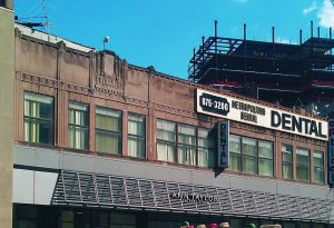
I chose this building for my project because it stood out to me. When i was in High school, i had an art history class, and the one art period i remember most vividly was the Art Deco period during the roaring twenties. I would say it’s because, in my eyes, its the most distinctive, that and my teacher also assigned us homework about it; look for anything around the city that was Art Deco, so it just stuck, and now i’m always subconsciously looking for buildings like this. This structure caught my eye because most Art Deco buildings are taller, and this one was just two stories, i can’t imagine what it was when it was first built, maybe an office? maybe it was always a dentist? I’d like to know more about it’s history, who designed it, and what was it’s intended purpose.

Project#3: Juxtaposition


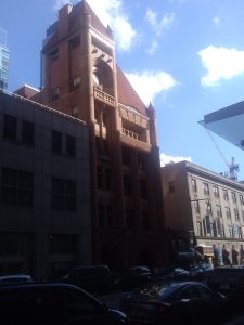
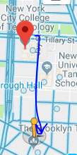
I chose this image of a building for my juxtaposition project. To get to this building, If  standing  right outside the main doors of the Namm hall building, you must turn  right and  walk straight ahead across the street. After walking across the street you begin to see the building about halfway across the block.

I chose this image of this particular building because it stood out more. The architectural design is different from the rest of the buildings around it. The buildings around it has your usually rectangular shape, but this building has more interesting shapes such as the the triangular pyramid roof, and the cylinder pillars,and little cone like shapes on some parts of the building.

Project 3 : Juxtapositions

If you keep walking straight past the family court and the Starbucks, you’ll find the subway station. I took this photo at the ACF station. I noticed on my way there people were buying food at the Nathan food stand and cars were trying to come out of the parking lot. It was noisy because it was a street full of people and the area near the train station was closer to a shopping area so naturally, it’s a busy street. I chose this photo because the back clearly shows a more “modern” or clean building in the middle of much older buildings that have stains on them. It is also the tallest building compared to the small pizzeria shop. The glass reflects much more light compared to the foreground of this image which already gives the building a much more dull look.

“Thousands of people pass that storefront every day, each one haunting the streets of his or her own New York, not one of them seeing the same thing.” The Way We Live Now: 11-11-01; Lost and Found

“One day the city we built will be gone, and when it goes, we go. When the buildings fall, we topple, too.” The Way We Live Now: 11-11-01; Lost and Found

Project #3: Juxtaposition

To get to this building i exited through Namm Hall and made a sharp right turn down jay street, kept walking straight, past the train station and stopped at the end of Jay street. From across the street i could see this building.

Considering how busy Jay street is, it was loud, kind of hot and smelled strange. But i had seen this building earlier and it caught my eye then. This building was erected during The famous Art Deco era in american architecture (during the 1920’s), There signature style is vertical lines, and arching shapes. Examples of other building created then are The Chrysler building, The Empire state building and 30 Rockefeller Plaza.

What made this Building stand out to me was the fact that it was Art Deco, and covered in signs, taking away some of the buildings design, and blocking it. The old 1920’s design with modern day hygiene signs, and above an Ann Taylor, it looks ad if it’s almost forcing it to be more 21st century.

10/10 Project #3: Juxtaposition

The first and second image was taken in the Korean War Veterans Park (address: 277 Cadman Plz , Brooklyn, NY 11201) and it’s a 5 minutes walk from City Tech to this park. To get to this destination from City Tech is first it’s recommend exiting from the Pearl Building, next make a left until reaching Johnson St then make a right to Cadman Plz W and the park is on your right. This is a memorial park for the veterans that fought during the Korean War and pretty much there’s trees covering from the sun, pigeons everywhere on the grass land and people sitting on the benches. It’s pretty empty because since it’s a ceremony for the veterans, it deserves to have some space and respect. In the first image, it is a pole that has a sign on the bottom saying “To Honor All Who Served Korean War 1950-1953.” The second image is similar to the previous image and it’s a sign that pretty much says the same quote with more details which is actually right in front of each other from a close distance.  I decided to choose these two images and identify them as a juxtaposition because both images are signs that relate to the atmosphere of the park and share the same perspective.