Color Interaction Parings: Phase 1

Based on the articles presented, it seems that color, which was once thought of as a constant, is in fact, relative.  According to Josef Albers in The Magic and  Logic of Color;

“In visual perception a color is almost never seen as it really is”

So color is subjective, meaning in one way or another we all see color a little bit differently than the person next to us. from what I was able to gather based on my very small knowledge of color theory, it appears that having your color, lets say a green, beside or surrounded by a darker color, preferably one very different from it, such as a black, can make the color look darker, than if it had a white background, and comparing them, it almost tricks your brain into seeing one darker or lighter than the other.

Color Interaction Parings: Phase 3

Step 1 – Color Research Process.

Outgoing/Curious/Relax/Sports/ Hiphop

Step 2 – Color Mockups 

I picked the red color for my partner Olando because to me it resembles energy for sports. In the video it talks about being in a red room makes you talk more so I think red can also represent outgoing. Our shared color is green because our favorite colors are mint/lime and dark green. The green shows relaxation as well.

Step 3 –  Icon Research Process

Olando's icon
Evelyn’s thumbnails

I chose a fox to represent Olando because when I think of curious and active I think of fox’s being a hunter of some sort always moving. Besides that, a fox is generally quick when they move and that reminds me of Olando’s love for sports, the energy you can get from hip-hop, and being outgoing.

Step 4: ICON MOCKUP

This took 2 hours

Color Interaction Parings: Phase 2

Shifting Value
Shifting value with color
Shifting hue
Shifting Hue and Value


This part of the phase took me a good two hours and a half to get done. It was a bit hard at first because I had to find out how to adjust different colors together and to make colors seem compatible. The last two was kind of hard for me too in a way because I didn’t understand the difference between the last two.

Saturation Studies Phase 4: Deliver

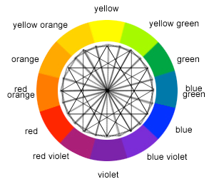
In this project i learned a lot about colors. In phase 1 we started out with a color wheel and slowly progressed to more colors.  In phase 2 we were required to paint and mix colors. Mixing the colors to get muted colors confused me a bit because the colors always comes out looking like a dirty green. But after practice and couple tries i got the colors to come out looking right. This project also used software on computers which i enjoyed. In the future i hope there will be more projects like this.

Phase 1

Phase 2

Phase 3

Color Interaction Parings: Phase 1

In this article by Maria Popova, I learned that color is both mental and physical. In the article the author states that we see but at the same time we don’t see. The author also quotes, “In visual perception a color is almost never seen as it really is — as it physically is. This fact makes color the most relative medium in art”. This quote to me means that color can be seen in different perspectives than just from what’s actually there. I also learned about the after-image effect. The ‘afterimage effect’ demonstrates the interaction of color caused by interdependence of color. Color comes in many shapes and forms and can be expressed through many other things. Another thing I gasped from this article is the concept of illusions and how color makes illusions more visible and more effective.

Source: https://www.brainpickings.org/2013/08/16/interaction-of-color-josef-albers-50th-anniversary/

Color Interaction Parings: Phase 1

I learned that colors have “physical facts and physic effect. Factual color is how we first perceive a color through experience. Actual color is achieved because “seeing one color makes our eye want to compensate by seeing its complement” That’s why when we see the two X’s there appears to be two colors when it’s actually three, the yellow, purple/gray and the X. Optical mixture changes the way we perceive color too, changing one color can make the whole image look different (brick example). She says a quote “Practice before theory” which basically means you have two types of knowledge. Knowledge by description (direct knowledge through background knowledge) and knowledge by an acquaintance – perform it via experience (as you see/perceive it) (Color in context)

The article is about how our brain there’s an afterimage effect. Our brain likes to stick with what it expects which is why we see an illusion. In the audio Alber says “The majority of the people miss the true reality” which means our brain is wired to perceive things quickly just enough for our survival that we don’t stare long enough to actually “see through” what’s happening around us. In the article, if you stare long enough at the dot, you can see yellow diamonds on the right because of the contrast reversal. What I learned from this is that if we stare hard enough and try to pay attention to detail, we can see colors that others normally wouldn’t see at first glance. (The Magic and Logic of Color)