The objective of this project is based on color and combination itself. There is a lot of colors that are mixed between two and depending the value of the color. The most challenging one so far due to this project was phase #3, which is in a group of 3-4, we have a word and we need to describe it with two words of sense. Once we chose our two sense, we would individually work in adobe illustrator (Ai) and redesign with a poster provided for us. I’ve enjoy and learned a lot about coloring, combination and the meaning itself. I am looking forward for the next project.
Saturation Studies Phase 3: Develop
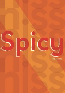
The two words that describes warm is “Spicy/ Hiss”. I think it might sound catchy and have a strange taste besides the theme color I chosed in this poster. The word “Spicy” has this 3D feature and I think it has a strong sense of describing warm and the word “Hiss” is placed at the background of the poster, repeating itself vertically with less opacity on the texture. When I think about the word “Hiss”, I would imagine it less visible and directly spread out.
Saturation Studies: Phase 2
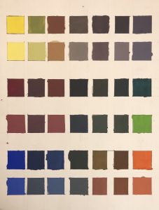
These are guide colors that explains the mixture between two color and relationships. There are three sets and each set has two rows, the top is the original color and the bottom is for light colors that white color is added as well. This project is used with a Bristol paper and gouache paint. It took some time to get the function of mixing for a color and to be considerate of the proportion of paint used. To be honest, it was quite stressful but I did quite enjoy mixting and discovering colors.
Duration : 1-2 days (first day- 3-4 hours).
Saturation Studies: Phase 4
Phase 1
Phase 2
Phase 3
Saturation Studies: Phase 3
Saturation Studies: Phase 2
This is my saturation chart.
This took about 1 to 2 hours
Saturation Studies Phase 4: Deliver
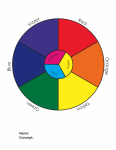
In this project i learned a lot about colors. In phase 1 we started out with a color wheel and slowly progressed to more colors. In phase 2 we were required to paint and mix colors. Mixing the colors to get muted colors confused me a bit because the colors always comes out looking like a dirty green. But after practice and couple tries i got the colors to come out looking right. This project also used software on computers which i enjoyed. In the future i hope there will be more projects like this.
Saturation Studies Phase 3: Develop
Saturation Studies: Phase 2
This is my painting chart. The whole of this phase was to understand the mixing of colors and how saturation affects primary colors to create new colors. As you could tell I had a hard time with this. At first I had gotten the hang of the first two boxes on each side of the chart but towards the middle i kind of gave up partly because I ran out of paint. All in all, I watched a youtube video after and I had gotten the hang of it.
Hours: I spent about 3-5 hours on this phase of the project.
Saturation Studies: Phase 1
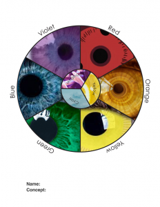
For my color wheel I wanted it to be based off eyes, I did different eye colors that exist and some eye colors that are fictional. The reason I chose eyes is because eye color varies and its very distinguishable. So I thought I would search up different eye colors. Three of my eyes are not fictitious and the others are.
Time spent: I spent about two to three hours doing this phase of the project.


