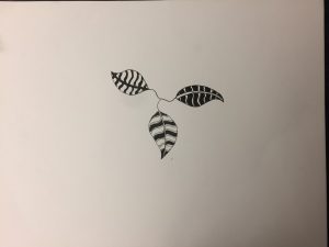
Omnipotent

Word: Omnipotent (adjective)

Definition: Having very great or unlimited authority or power.

Source: https://www.dictionary.com/browse/omnipotent

Encounter: I encountered this word at a subway station poster and i thought that it would be a good word to let others know about.

Comprehension: The meaning o this word can be used to described anyone or anything that is in position of authority or an higher power. It applies both mentally and physically based on the context.

Value-Added Portraits: Phase 1


Broad

High-key

Low-key

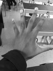
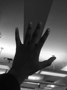
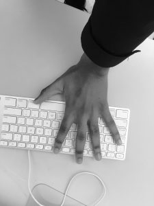
In these 3 photos, the lowkey value is the darkest, it has a darker background and primarily focuses my hands.  It was taken in the classroom next to the window shade. The highkey has a lighter background and also focuses on my hand. The broad photo was taken in the class computer desks on a keyboard as the background. Each of these creates the gist of my hand being in different surrounding but in the same place at once.


Project 3 Draft

Introduction:


For my juxtaposition project i took ann picture of two buildings that happen to intersect between each other. One building was  roughly rigid, eroded, and looked very old. On the other hand the other building was more like a common style skyscraper . The juxtaposition in this picture was the view/perception of what’s considered new and old. It’s crazy to think that in a civilization/economy as advanced as New york city is so ancient but also advanced at the same time  in the exact same space.


Section 1: Similarities

Although my juxtaposition flick may look like two regular buildings that happen to intersect. It’s way more than than it appears to the naked eye. They have similarities such as that they both have adjusted windows which happened to be organized in the same way. The other similarity is that they both just happen to be on the same space going back to my first point which supports juxtapositions being in a mutual area. Another similarity that these two buildings have in common is that they share the same background. The background is the clouds and the blue sky that alternates the pictures.


Section 2: Differences


On the other hand the juxtaposition photo that I took has many differences. One major difference is the height difference. Nowadays New york city is known to be the major city that has a whole bunch of skyscrapers. The difference in height explains the age of the buildings. Usually in new york city if a building is small it’s usually old unless it’s some kind of store. Also the taller the building (example skyscrapers) the more innovative and new it is. Also in the new building, the outside layer of the walls looks very new and clean. It’s also looks as if the building was made for some kind of professional business. On the other hand the shorter building is more old and eroded. Signs of erosion on walls usually mean one of two things. Either the building is old or its sanitary condition isn’t up to par. These differences prove my point on how much juxtapositions can be two different concepts but similar things.  


Section 3: More about juxtapositions


Although my juxtapositions have many differences and similarities, the environment that they are in matters also. When i took that photo the surroundings around me were very urban. First and foremost in order to travel to where my juxtapositions were you had to just walk around the block from city tech until you got towards the bookstore and you would see the two buildings. In terms of sensory experience while I was taking this picture I smelled halal food from the halal cart that just so happened to be on the same sidewalk i was standing on. I imagined a whole herd of people walking in to get some food after a long days hard work. In terms of sound there was a whole bunch of noise comig from the cars tat were in traffic and all around me i heard phone calls. Also the middle school kids just so happened to be going home from school and stuff and maybe probably about to get lunch.


Conclusion:


In short juxtapositions just so happens to be around us without us even noticing. Just like the picture I happened to take. It brings all things into may aspects. Many aspects such as locations, sensories, sensations, touch and many other things happen to be in place. Similarities and differences are what makes my juxtaposition photo meaningful. Time frame also plays a huge aspect on my points and opinion within the photo.

 

Sound Visualization Mashup: Phase 3

My Mashup Animation:

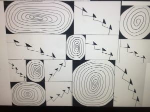
Description: My animation includes a whole bunch of swirls and triangles. I also put two songs called “Stargazing” by travis Scott and “Zeze” By Kodak Black. I did more of a freelance moving with my animations. I included a little bit of opacity but the movement makes up for that.

Hours: I spent about 4 days working on this project.


Sound Visualization Mashup: Phase 1

Youtube links:

https://www.youtube.com/watch?v=VDucBuu66Bo

Paragraphs:

When I listened to my first song “20 mins” by lil the artist of lil uzi vert I was intrigued because of the beat. The beat was very jumpy and consistent in my opinion. In terms of patterns I thought the patterns was repetitive. Also I feel as if the shape was circle-like in a hypnotizing type beat. These observations kind of makes me drawn to the music in a way.

Now for my second song, I though the beat was more relaxed in a way. I thought that the the beat was more smooth in the way that makes people want to listen to it. In terms of the pattern the beat was very consistent and unexacting at the same time. In terms of shape I felt as if the beat more of a triangle shape type beat. These observations actually made me more in tune with the song.

Hours:

I spent about 15-20 mins drawing the sound of the music.

Urban Artifacts: Phase 4

Revision:

In my opinions I though this project was kind of cool. I mean it did take a while to finish the project but honestly I though I could’ve been done in a shorter amount of time. Although some parts were unclear to me, I should’ve made more effort to understand some parts of the project. Honestly my planning should’ve ben more on point because I assumed this project was a bit less complex than it actually was but it turns out I was a little bit wrong. I also learned that materials are very important when it comes to some projects that involve thought and precision. I plan to apply what I learned in this project through other projects so I can be more open minded and organized.

Links:

Phase 1:  https://openlab.citytech.cuny.edu/ways-clone-2/2018/09/05/urban-artifacts-phase-1-8/

Phase 2: https://openlab.citytech.cuny.edu/ways-clone-2/2018/10/21/urban-artifacts-phase-2-8/

Phase 3: https://openlab.citytech.cuny.edu/ways-clone-2/2018/10/21/urban-artifacts-phase-3-9/

Urban Artifacts: Phase 3

Short Description: 

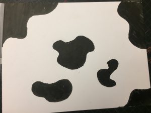
This part of the project is related to the previous project because, I’m using the same photos from the previous project. The only difference is that I updated my refined sketches to make it appear more of an inked composition.


Hours:

I spent about Two Days working on my Inked compositions. It took me two days because I had to think my way through the inked compositions and I also thought about ways to edit the drawing to make it look presentable to the audience and to also feel satisfied with my work.