Reflexive

Reflexive (adj.)

On Merriam Webster, meaning “marked by or capable of reflection”, I found this word in the passage “How better photos can help you document, and shape, your neighborhood” by Patrick Sission.

” Use the camera as a reflexive tool.”,

now understanding the meaning, the sentence becomes

“Use the camera as a means to reflect, or to look back on and see yourself”

Computations

Computations (n.)

On Merriam Webster, meaning ‘the act or action of computing: calculations’,  I found this word in the passage “the tool, Wind Sand and Stars“, by Antoine de Saint-Exupery.

“All of man’s industrial efforts, all his computations and calculations…”

i Understand this word as computer related, so it would be doing calculations via computer or even using a calculator.

so this sentence becomes “…all his computations (computer calculations) and calculations…”

Bungalow

Bungalow (n.)

On Merriam Webster, meaning “A one-storied house with a low-pitched roof,” i found this word in the passage ‘Here, Poverty and Privilege are Neighbors’,  by, Janny Scottmarch, in the sentence “…modest row houses, apartment buildings, dilapidated bungalows..”

this sentence now becomes “modest row houses, apartment buildings, dilapidated one story homes”, and because of it’s strange sound, i don’t think i’m going to forget it’s meaning.

Urban Artifacts: Phase 4 Deliver

 I thought this project was overall fine, i wish i could have used lines and color, but maybe for i future project i might be able to. This project helped me learn that there are many little details in our environment that we often overlook, but it’s good to stop, and appropriate it once in a while.

I think for this project i could have benefited from working more slowly,  like having more time to design the pictures and really working on it, and moving a bit slower when doing my designs in ink.

For our next project i want to focus more on the design element, and give myself more time with the concept so that i can make it more appealing to look at.  Phase 3       Phase 2      Phase 1     

project 3: Juxtaposition

 I was eager to discover the other Las Vegas, the real Las Vegas

While this quote isn’t about New York, it certainly relates to it. Vegas has the same style of flash as some parts of New York, such as Times square, and Rockefeller center, and being someones whose been to Vegas,  it does feel like that there are parts about it that we as tourists should know about, things that’ll make your experience better than any gimmicky hotel ever could. When traveling anywhere there are sites you’ll see, and sites you should see. Some of my favorite places to visit in New York are many locations even other New Yorker’s don’t know about.

You start building your private New York the first time you lay eyes on it. 

Every one has that one place in the city they always go to, whether they’re bored, or trying to show out-of-town relatives a good time. My personal favorite places are east 86 st. from 5 av to Lexington (also a block or so away from the MET) and the North woods (I only go at night, and i even spent my new years there, my sister and i played winter Olympics on the frozen lake). Your own personal New York could also just be your neighborhood, i was born here and still live in the same place, so these familiar locations shaped me growing up.

On the Upper East Side of Manhattan, where the palatial town houses and co-ops of Carnegie Hill bump up against the tenements and public housing projects of East Harlem, there is a census tract just north of East 96th Street where the average income in the top fifth of the spectrum is $561,762, and the average in the bottom fifth is $11,634.

This paragraph stood out to me because this is my neighborhood, On 5th av is central park, but from Park av to Madison is where the railroad starts, its where this railroad starts is where this dramatic shift in income changes.  But no matter where apartments or houses near parks will always cost more, and it’s almost double for getting a view of it, and while the railroad may not have any correlation to the buildings there,  when ever i passed it, even as a child the change was obvious.

These three quotes all represent my New York, and how I’ve always seen it, from being flashy and maybe easy to see to my favorite locations and even the huge income gap that is clearly visible from outside my window. These quotes add to my personal New York.

Project 3: Juxtaposition

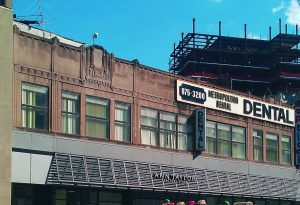
I chose this building for my project because it stood out to me. When i was in High school, i had an art history class, and the one art period i remember most vividly was the Art Deco period during the roaring twenties. I would say it’s because, in my eyes, its the most distinctive, that and my teacher also assigned us homework about it; look for anything around the city that was Art Deco, so it just stuck, and now i’m always subconsciously looking for buildings like this. This structure caught my eye because most Art Deco buildings are taller, and this one was just two stories, i can’t imagine what it was when it was first built, maybe an office? maybe it was always a dentist? I’d like to know more about it’s history, who designed it, and what was it’s intended purpose.

Project #3: Juxtaposition

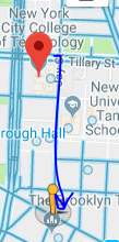
To get to this building i exited through Namm Hall and made a sharp right turn down jay street, kept walking straight, past the train station and stopped at the end of Jay street. From across the street i could see this building.

Considering how busy Jay street is, it was loud, kind of hot and smelled strange. But i had seen this building earlier and it caught my eye then. This building was erected during The famous Art Deco era in american architecture (during the 1920’s), There signature style is vertical lines, and arching shapes. Examples of other building created then are The Chrysler building, The Empire state building and 30 Rockefeller Plaza.

What made this Building stand out to me was the fact that it was Art Deco, and covered in signs, taking away some of the buildings design, and blocking it. The old 1920’s design with modern day hygiene signs, and above an Ann Taylor, it looks ad if it’s almost forcing it to be more 21st century.

Avatar and Bio

  I’m Sam, and all i pretty much do is draw. As of late I’ve mostly been doing Fine arts, and some creative work on the side. My passions is art, whether it be 2-d work, sculptural or film, it’s all i want to do, and i can’t think of doing anything else. Recently my inspiration has shifted form people and anatomy to nature and texture. My main goal is to build up a better portfolio so that i can apply to art school, either LCAD or RISD. Further than that , my absolute dream would be to work for an animation company (Laika) and help create stop-motion films.

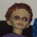
The avatar i chose is of yellow-ish gaunt doll, vaguely alien looking, with short red hair, straight bangs, dark sunken in blue eyes and wears a purple shirt, with a tiny smile, out-turned ears and is facing something unseen off to the upper right of the image. The doll is seated in a black bean-bag chair with a tye-dye blue pillow to their right. The image itself is low in saturation making the colors look muddy and gray-ish.  I had chosen this image because of a joke i made with a friend, saying that i look a little like a puppet if i made certain face. I saw this image and it immediately  reminded me of myself, not because i look sickly, but by the vibe it gave off, the doll looked like it was relaxing and that’s always what i’m trying, and failing, to do.

This image can definitely be misleading, seeing it with out knowing me at all, could give someone the impression that i’m a horror fan, and while that’s a little true, it doesn’t guide my aesthetic that much. I even heard one of my classmates ask if its Chucky, it’s not Chucky, but i have no idea where this image originates from. It could also be interpreted as someone who likes to scare people, some could think i set my icon up as something  “weird” to weird others out, when in actuality i don’t find this icon weird, or creepy or anything else, at all. I think it looks a little bit like me and that’s it, i even have two other puppet related images saved that also share a small resemblance to me. I want this image representing me because while i do connect with it, it also represents my aesthetic, and the type of art and feeling within my art that i try to create. But to add on to something i mentioned earlier, yes i’m trying to relax, i may not look like i am, or sometimes i struggle and maybe it’s obvious, but deep down, i’m okay, i’m an optimist.

My bio, or profile, i feel could be used to connect me with others who also share similar interests with me. I know what it’s suppose to be used for, but in reality i doubt it’ll work like that. And knowing how i’m like, i don’t think many people will take their time to read something that’s 4 paragraphs long. I think that an outsider reading my bio might consider me to be and artist, maybe even a dedicated one.  I’ve established my style, aesthetic, and i’m studying fine arts, i think with this profile i’d like to meet someone who also plans on applying to some of the same colleges i do, because all i do now is think about applying.

Sound Visualization phase 1

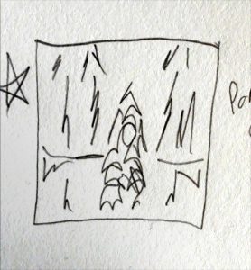
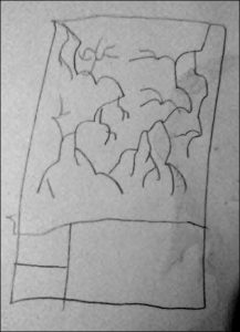
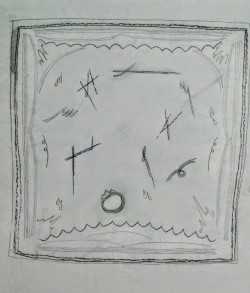
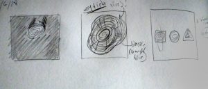
I chose the song “the skin of my yellow country teeth”, because i love the vocals, and the strain and cracks of the singers voice and i wanted to recreate it using line art and direction.  The song is almost 6 minutes long, and to properly illustrate it i had to listen to it over 15 times. The thick dark lines boxing in the symbols are the vocals, the four lines followed by arches are repeated phrases, and the shapes within the box are keywords that stood out to me.

smudges and line marks indicating vocals and instruments in song
The Skin Of My Yellow Country teeth by Clap Your Hands Say Yeah