Fuselage

noun

“the central body portion of an aircraft designed to accommodate the crew and the passengers or cargo” – Merriam-Webster dictionary

The word was encountered through the reading “Wind Sand and Stars” by Antoine de Saint-Exupéry

The sentence that this word was used in was “It is as if there were a natural law which ordained that to achieve this end, to refine the curve of a piece of furniture, or a ship’s keel, or the fuselage of an airplane, until gradually it partakes of the elementary purity of the curve of ‘a human breast or shoulder, there must be the experimentation of several generations of craftsmen. In anything at all, perfection is finally attained not when there is no longer anything to add, but when there is no longer anything to take away, when a body has been stripped down to its nakedness.”

The author was trying to convey the idea that perfection is only achieved when the object or machine is reduce to its most simplest state. They use the word fuselage to talk about the airplane which they then compare to a human breast or shoulder. This comparison is used to show that when the airplane’s body (the airplane as a whole), ship or furniture is easy to utilize and recognize it has reached perfection. Like for example you wouldn’t image a plane any other than its original shape that looks like a bullet with two wings attached on the sides. And if you did think about a airplane you wouldn’t think that it would do any other function than flying state to state.

Definition

Field Trip Cooper Hewitt Design

The one work I found compelling is “1001, COMPARTÉS CHOCOLATIER” because the chocolate was so beautifully packaged and had colors one wouldn’t normally see when purchasing a bar of chocolate. Description: A wall of chocolate all packaged differently every 4 to 3 chocolate bars. They are very colorful with green, blue, and mostly red patterns. Some of them have images such as a grizzly bear riding a wave or two legs with red heels. On the bottom of the case, there is chocolate with nuts, white and brown chocolate with a diamond design, pastel purple chocolate with a black splatter, and two more at the end which I’m not exactly sure what they are. Source: (Jonathan Grahm, Courtesy of Jonathan Grahm)

The medium used for this was handmade chocolate bars and packaging

The work I think classmates may have missed is “1203, ORGANOID ORGANIC ROSE BLOSSOMS WALLCOVERING, 2016” Because it looks like a regular wall but it is actually petals, herbs, and flowers pasted on the wall with slight texture. The scent is faint but it smells like rose tea. Description: A wall divided in three that reach almost the ceiling in pure red that you need to go closer to notice that it is created from multiple petals. It feels rough almost like dried paint but mostly is quite smoothed out like a normal wall with patterns on it. It almost looks like wallpaper if it wasn’t for it being divided. Also, it was at the farther end of the room where there were rocking chairs which almost seemed like just an info center about layouts and blueprints. Source: (Martin Jehart, Organoid Technologies Gmbh)

The medium used for this was “Alpine hay, rose petals and buds, self-adhesive foil backing” (Description)


Sound Visualizations: Phase 1

22 minutes

The sounds I hear in the beginning are chimes so I drew the firework looking symbols to represent that. Then it slowly eases to more instruments like the circles. The circles represent the main rhythm while the other lines represent the xylophone. The long lines on the side are the computer-generated sound and long part is the violin and electric piano. You also hear a triangle with the violin which is represented by the stars. The vocal is shown through the curvy lines and the triangle is the guitar. And finally, the new instrument at the end is shown through the spiral.

The way I drew it was to be moved slowly from the top left corner down the page and back up. The observation shows how I tend to focus more on the tiny chimes on the side and the slow repeated generated sound and tend to forget the guitar is there. You can also see that the beginning of the song intentionally starts out quiet and gets busy before ending quietly too.


Song

Patina

noun
“a surface appearance of something grown beautiful especially with age or use” Merriam-Webster Dictionary.

This word was encountered through “Wind Sand and Stars” by Antoine de Saint-Exupéry.

The sentence the word was used it was “Every machine will gradually take on this patina and lose its identity in its function.”

When the author uses this word he’s trying to say that every machine ages and becomes irrelevant as new technology gets developed. As the machine’s functions get replaced by a better technology people still love the old machines for the purpose they have served at the time that it was first introduced. The author could also be questioning in this sentence why the old is still loved or, trying to argue that humans dislike change even if it’s for the better which is why they choose to admire the old.

Urban Artifacts: Phase 4

Time: 45 minutes

Manhole cover – Star bracelet

I learned that a stable figure can still be interesting with good composition and scale. This project reminds me of a stencil project I did back in high school and detail didn’t matter there. A stable figure is a 30/70 while an ambiguous is almost a 50/50 when it comes to background and figure. What I could have done better was made it more of a solid black until the marker strokes disappeared. I will bring this into my next project by attempting to work slower and more accurate. 

Phase 1: Discover
Phase 2: Define
Phase 3: Develop 

Ways of Seeing [Role 1]

Quotes and timestamps that lead me to the main idea
“The invention of the camera has changed not only what we see, but how we see it” [3:10] Camera’s take pictures that can be reproduced so that everyone can see it instead of needing to be in one place [3:33] The camera made paintings reproducible and even though people say it’s for expanding culture. Because it also tied back to profit and money people who buy these copies might not buy it for its “unique original meaning” [11:18]
“Reproduction of works of art can be used by anyone for their own purposes” [21:10]”because they were really looking and really relating to what they saw to their own experience” [27:42]
“You receive images and meanings which are arranged” [29:12]

What I got from this video in the [20:00~30:00 section] is that art is viewed and explained through many different types of people with different experiences [example with the children] which is why reproduced paintings can be changed in many ways when it comes to the meaning. How the camera chooses certain details in a specific order can tell a story. The camera chooses how you see detail and if it’s zoomed out then you wouldn’t see much detail compared to if you were there in person. He also gives the example of how you can crop an image and change its meaning which causes the intention of the painting to fade. If you see a painting through a camera it’s hard to catch the details unless the painting is zoomed in or the camera pans.

The main idea is that in order to fully experience a painting, you need to be there. The camera changes how you see paintings because you can miss some details or only focus on certain details which changes the entire meaning of the image. If you see other information in text, images or a video before seeing an image it could tell a different story than what is intended to tell. But if you’re there in person to see a painting it would be different because all you’re seeing is the image itself and it’s up to your interpretation without other people manipulating the meaning.

Urban Artifacts: Phase 3

I finished the stable image in class and chose to shrink it and move it more towards the top of the page (I centered it in this image but not on canvas). The way I drew it looks like it could be hanging from somewhere and it looks more interesting to me. This is stable because the background surrounds the object. 30/70 ratio.

I finished inking the other image also in class but had to go over it again at home because my marker was dying. This is clearly ambiguous because compared to the bracelet there is a 50/50 relationship between the background and figure which makes it unclear what the figure is.

The story between the two images is that the bracelet fell into the manhole.

I think this was about the last 45 minutes of class, it took me 5 minutes for the first one because I made it smaller.

Avatar [Revised]

My interest in art began this April 2018. This caused me to begin taking art more seriously as a potential profession or something that I would like to work on and improve gradually. My favorite colors are mint and lime. My rule for myself is to be forgiving to others and to believe in the possibility that anyone can change because they have the free will to do so.

My passion for art takes form as both digital and watercolor style. I like to invest my time in backgrounds and pixel art. I draw with colorful pastel colors to saturated colors depending on my mood. Throughout my years of experiencing various video games, I was inspired to aim to become a concept designer. My goal in five to ten years is to have a portfolio with various art pieces that could be used for game design. Throughout college, I hope to achieve a degree of some sort.

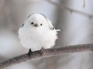
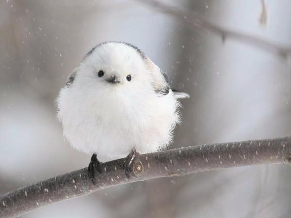
My avatar is a white bird and I chose a bird avatar to represent simplicity because generally it is white and round which is easy to draw and people can easily distinguish that it is a bird. The white color represents purity which reflects me as a person because I always have a pure intention when saying things or doing things and I try my best not to harm others. The idea of being harmless is embedded in this image as a cute small bird.

My icon can be misinterpreted as someone who likes birds. One can misinterpret it as someone who wants to be away from society because birds tend to fly away when people come. A majority of people may misinterpret me as a biology major or aiming for an ornithologist career. My aesthetic in art, however, is generally colorful images that utilize pastel colors. This bird is white and light grey and it falls under a tint which I personally find beautiful. My profile picture could possibly guide people towards what I find interesting when they could assume I draw in a cute style or that I like small animals. The way that the bird is perched on a branch and may seem to be watching your every move might cause people to feel a little unsettling represents me, but I tend to watch people so that I don’t end up confused when everyone else is working.

Overall I hoped this bird would convey that I’m friendly and this matters especially when getting to know people because I don’t want people to automatically assume my personality based on the things I may say or my gestures in class. The first impression always matters, but I tend to always look comfortable in class so people may assume that I might be demotivated or tired. Since I do most of my work on Open lab people will see my icon more than they see me in class because I tend to go straight home after class is over. So I’m hoping that when people see the bird they might think that I’m just there kind of like how the bird is framed in the picture standing on a branch. I want my profile picture to be interpreted as a person that comes and goes, watches what’s going on before going to the next assignment, and flying away.

I expect my avatar to develop as I meet new people who maybe share the same interests as me so I can get more specific with my image. As of now, I’m not that comfortable sharing my interest or rather I don’t have anything I’m specifically interested in which caused me to pick an animal I liked. Hopefully with the updated avatar after a few classes, I would be able to successfully convey my skill in the arts by uploading a picture of a piece I’m really proud of or representing a group that I fit in and am apart of.


Urban Artifacts: Phase 2

Sorry in advance if it’s too light (About 4 hours)

The first two sketches are stable and I plan on skipping the detail when it comes to phase 3. It’s stable because the background surrounds the keychain and bracelet so the figure is clear. I The other two sketches are ambiguous because it’s supposed to make your eyes move from the gray areas back to the empty white areas.

Dichotomy

noun

” something with seemingly contradictory qualities” – Merriam-Webster dictionary

The word was encountered through the reading “Wind Sand and Stars”  by Antoine de Saint-Exupéry

The sentence that this word was used in was “Numerous, nevertheless, are the moralists who have attacked the machine as a source of all the ills we bear, who, creating a fictitious dichotomy [fake contradictory], have denounced the mechanical civilization as the enemy of the spiritual civilization.” (Note: Fictitious means not real/fictional)

The author was trying to convey the idea that people should still be able to explore who they want to be whether it be an artist or thinker, instead of going straight into thinking about business or war. The central idea of this excerpt is that the machine/mechanical civilization and society as a whole isn’t taking advantage of the human potential. Connecting the theme back to this quote, the author is trying to say that moralists create a false contradictory because they’re saying that machines are the root of all evil but that’s not true, there are many factors that are “source of all the ills we bear”. If this was to relate back to the design process I think that it would be what the industry wants in design vs human potential in exploring things that they can create.

Definition    l    Image that summarizes the definition