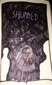
This piece, entitled ‘Shunned’ shows 3 figures, one in the background, one in the midground another in the foreground. Directly above the middle figure is the word ‘Shunned’ written in large letters, and it is this man that is trapped between the two blank figures, since he is the one being shunned, combined with the use of a dark heavy marker this artist further tries to fully direct the viewers attention toward the figure, and also way from it.
Didactic two
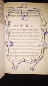
This piece centers around the definition of ‘Weal’ that which is best for someone or something. The illustration depicts ole figures linking hands and forming a circle around the word, and the original text featured in the book. These figures come together in a supportive circle, much like other illustration featuring of people on earth standing together holding hands.
Didactic 4
Didactic 4: sociology
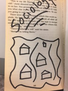
This part is the book is located in the middle part of the book. It represents the idea of societal structure. So for this part, I gave the illustration of houses that happen to look alike and separated by a river. This part of the book also represents one of the main themes in this book which relates to balance and fabrication.
Didactic 3
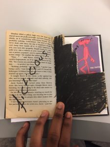
Didactic 3: Carousing
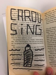
This part of the book illustrates a bottle of liqour on a page sourounded by liqour. It also illustrates the idea of alcohol and how its portrayed in society. Also the liquid around the bottle doesn’t represents liquor, it also represents those people who happen to be engaged in drinking or alcoholics. It also shows how people tend to drown in their own problems hence the alcohol drowning them because they involve themselves in alcohol. Liquor only makes things worst not better.
didactic 2
Didactic 2: Fictitious
This part of the book is located towards the end section of the book. I drew a pink panther because it illustrates the theme of fabrication. I also cut up squares to give the illusion of the pink panther walking down the stairs. Its fictitious due to the fact that panthers cant walk like a human because they crawl on the ground. Also the theme of fabrication plays a big role in this book because its shows how creative the book can get when there’s no limits.
didactic 1
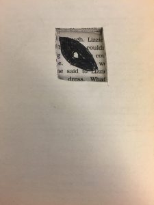
Didactic 1: Omnipotent.
This part of the book represents the word Omnipotent. I illustrated an eye. I drew an eye because an eye represents the sight and vision. Omnipotent has to do with the overwhelming dominance. I cut up a box and drew an eye because the eye can see everything that is going on around him. An eye also represents dominance because being a blind leader won’t work because in order to have complete control of every aspect you need to see and have visions of the future. Lastly dominance can put things in order.
Saturation Studies: Phase 4
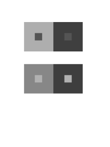
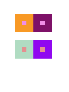
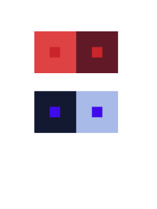
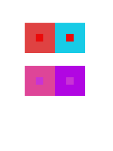
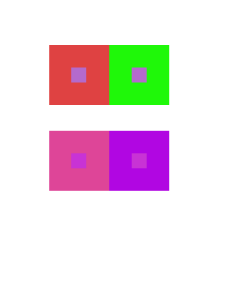
This project taught me the different aspects of the color wheel and the different shades of color. There are more to color than we all think that there is. Color reflects senses and also reflect our past and future. I also learned new terms that I wasn’t as familiar with in my past knowledge on art. I had a difficult time mixing the colors in phase 2 of the project because to me I guess it was a bit confusing. The other parts had its fair share but all in all this project wasn’t as hard as I thought it would be.
Saturation Studies: Phase 3
The temperature of my group was cool and we also got the poster named “Ween”. My group decided to have the word soft echo. The sense relating to Soft was the sense of touch and the sense relating to echo was the sense of sound. For a cool temperature some would usually think of blue of green but I thought of the color white and orange. The color white is known to reflect heat is that was the reasoning behind picking white. The color orange may seem like its the color that relates to heat but I look at it as a cool breeze while the sunset is coming closer toward the ocean breeze. I wanted to use a Helvetica font but for some reason my computers fonts were not changing my word into the font I wanted. But al in all this is the poster we thought of.
Time: This part of the phase took me about 2 hours because there was a lot of thought put into deception and alignment.
Project#5:Phase 2 : Color Interaction Studies
Catalogue Entry
The glossument book called i heard the book called my name is originally remade from a book called i heard the owl call my name. In this book, it contains vocabulary that the artist discovered and learnt throughout the first semester of the first college year. The pages in the book are covered in black paint and the idea was inspired by blackout poetry from “A Humument” by Tom Phillip. The author is not much of a artist so it was a first time experience. This glossument book was made by Giraffe, a first year college student.
Giraffe made a lot of research before starting this project to make sure the book isn’t wasted. Giraffe’s inspiration was from a ted talk video that was showed in class and some articles. One article Giraffe learned from was “What is Blackout Poetry?”. The article was the first step for Giraffe, her first time doing blackout poetry. The article gave her guides for blackout poetry, what to do right and what not to do. These research has gave Giraffe many ideas on how to customize the glossument book using a different way of blackout poetry.
The author’s concept was to cover the pages in black and use a folded paper with writings and drawings on the inside, when seeing the folded paper, you will be required to open it and read it, similar to opening a book again. The author wanted to give the readers a sense of a new book when opening the page within the glossument book instead of just having a feeling of opening the book before it was edited. Giraffe wanted to draw the readers to the book like its calling them to open my paper just like the title of the book, “I heard the Book Call My Name”. The material used for the pages in the book was gouache paint, sketchbook paper, pencils and inking pen.
The process on making this project requires a great sacrifice of the book. You would need to rip some pages out due to the fact that the sketchbook folded paper takes up the space and also paint every two pages with black paint. It takes a lot of time because the paint, two pages because the pages are very thin and can be paint through. It also needs to dry before being able to paint the next page. After the pages of the paint drys the artist folded and cut up sketchbook paper and glued it to the painted page. Then comes the glossary words and art that is drawn and written into the sketchbook paper. The author used only one concept, blackout poetry and didn’t want to use others because it wouldn’t look organized, she wanted to stick to one thing only.
The theme of Giraffe’s book is a plain simple book. She didn’t want to make it complicated and confused the readers and lead them to something else and this was the first time for her when it comes to art. She mostly just enjoys working on digital so she decided to work on a theme that suits her. Some colors she used in this glossument book is black and white. This project was a simple project it wasn’t all that hard but it takes time. Giraffe has used that time to create pages in a page in her book.

