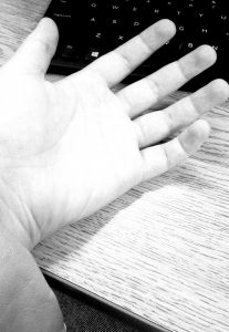
High Key image is meant to be more pale, with more lighter tones and almost has pure white in the image. This composition makes the photo look almost colder, maybe even with more added sunlight, and very little black. photo was taken underneath a bright light.
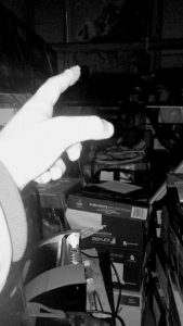
Low Key image has a bright hand in the frame, but very little white in any other part of the photo. All potential brightness is directed towards the hand. The rest of the photo is darker with tones of gray. The way this photo was lit, it gives off the impression that this photo was taken at night with a flash illuminating it.
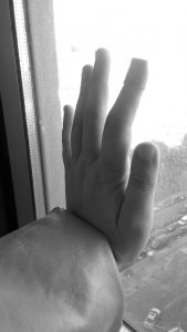
Broad Range this last photo has tones of gray, black and white mixed throughput to create a full gray scale. The palm, while not shown, is facing towards the outside, towards the light, meanwhile the back of the hand is receiving little light. This image, in my opinion, feels more natural, having the most ranges in tone, while the others feel more forced. I would say this is because having a range like this is more natural.


