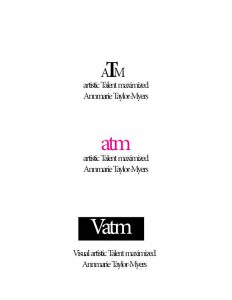
The top image was designed to express my initials as a brand and my tag line as a message of who I am and what I represent as a brand ATM represents access to money hence success. The T was designed to be much larger to represent the talent being maximized.
The Middle image was in lower case and was designed to be connected as one unit and use one of my favorite colors to make the logo pop.
The third image was designed to highlight the image by using a black background.


