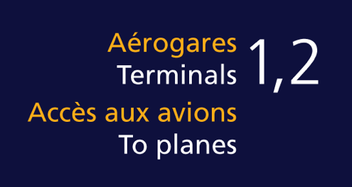
Frutiger is a sans serif typeface designed by the Swiss type designer Adrian Frutiger in 1968 specifically for the newly built Charles de Gaulle International Airport in France.
The goal of this new typeface was create a clean, distinctive and legible typeface that is easy to see from both close up and far away. Extremely functional.
Adrian Frutiger worked carefully on the letterforms so that characters and words could be recognized even in poor light conditions or when the reader was moving quickly past the sign. He tested with unfocused letters to see which letterforms could still be identified.
typefaces like Helvetica, Frutiger and Clearview, and very often used in airports and for signage. They are part of what is considered wayfinding – finding your way – and you can read an interesting article about it here.

