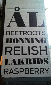
As someone who goes to Chinatown frequently, I usually see the facade of this Danish eatery. The restaurant wall features ingredients used in Danish cuisine with alternating Serif and Sans-serif typefaces. I like the alternation of typefaces because it conveys a sense of unity and grounding within the design.


I really love this kind of designs, where the solely use of type and simple shapes conveys a beautiful and expressive message.