I now know what I am: an aspiring Learning Interface Designer.
It’s from this cool blend of User Interface Design and Educational Psychology. Basically, I have always been interested in finding ways to teach core skills using simple-to-understand interfaces, both in my professional and my personal work. One thing: I do not think the interfaces necessarily have to be digital to be a part of this field.
I am bringing this up here because of a few reasons:
- I have been trying to articulate what I am for years now, and did not find the exact term until I joined the Living Lab 2nd Year Fellows and started doing some real research into instructional design.
- I have never been wholly a graphic designer or an artist but some weird mish-mash of both and neither. No wonder, maybe I am something else entirely!
- I thought it might be of interest to those of you starting your teaching careers– switching to an academic career can be extremely rewarding, so dive in!
I have a title, what now?
I actually have been thinking about that a lot, especially since I have to develop my Professional Development Plan this week. It’s this 7-year strategy tracing a possible trajectory to tenure, and it really gives you some perspective. I am now considering a master’s degree in Educational Psychology–Hunter has a great one, right up the road. I am also toying with the idea of heading towards a doctorate eventually, a thought that just delights me. See, I hold a master’s in 2D or Graphic Design. That is what is called a terminal degree: there is nothing higher in that field, at least not on a wide-spread basis. Oh, to be a doctor! My mom will be thrilled!
But seriously, I’m just so glad to have a solid direction. I have been searching for a long time, and had not come up with anything satisfactory until now.
Some examples of my work
Professionally, I have been an interaction (web primarily) designer for the last 12 years. My original background, however, is in Fine Art, specifically printmaking. I love printed ephemera, specifically pieces geared towards persuading consumers. I have been developing a series of “products” over the last 15 years, these little printed conceptual art pieces meant to address some of the ills of modern life. You may or may not agree that these are specifically pieces of interface design.
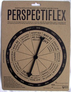
The Perspectiflex
This is a simple letterpress and die-cut piece that I produced in 2010. The whole idea is this: Say you are aggravated by someone. You could stew endlessly about it, thus ruining your day. OR, you could take this device, put the outer ring on the proper pronoun and spin the spinner to discover a possible reason for that person’s behavior. Repeat this until your annoyance ebbs.
The Ardor Arbitor
 This piece was created in 2008, and is silkscreen and xerography. The whole idea: using a simple system of stickers, you go out into the world and learn to judge levels of sincerity around you so that you can then go home and judge your own.
Okay, these are both fairly lighthearted examples, but the core sentiment is what counts: I like to make small interactive things to help people learn small but hopefully profound skills.
I am trying to put this skill to work in my teaching to come up with ways to give my students what they need in as kind and compassionate a way as I can. None of these pieces will be as idiosyncratic as the artwork, but who knows? I may stumble across some way to teach something in a new way. So far, I have just been churning out handouts and example files for my students, all of it very simple and low tech:
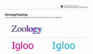
Here is the top half of a class worksheet I devised to teach the art of kerning, which is the ability to balance the spaces between letters in a word. It is a subtle skill, not easily transmitted.
The pink words are the exemplars, all properly spaced (in my opinion). The blue words are just raw type, rendered by the design program we were working in with no intervention. The student works on the actual file in the program, so he can move things around and edit them.
The student is invited to modify the spacing between the blue letters and then drag their attempt over the pink, thereby getting some feedback without my having to hover nearby.
This is all well and good, and it has worked pretty well in class. Only, there is now an online exercise that does this all beautifully: Kern Type, a kerning game by Method of Action. Go give it a whirl, it’s gorgeous. That is what I want to do, to make systems or devices or interfaces that teach core skills in a succinct and lovely way.
It gives me chills just thinking about it.


